Design · History · Typography
The Golden Age of Typography: From Gutenberg to the Enlightenment
Long before digital screens, our written words underwent a profound metamorphosis. While Gutenberg’s initial press merely mimicked the heavy, dense handwriting of medieval monks, the true design revolution arrived centuries later. During the Renaissance and Enlightenment, master designers replaced that suffocating ink with elegant, mathematical grids, forging the crisp, engineered typography that forms the foundation of all modern communication.
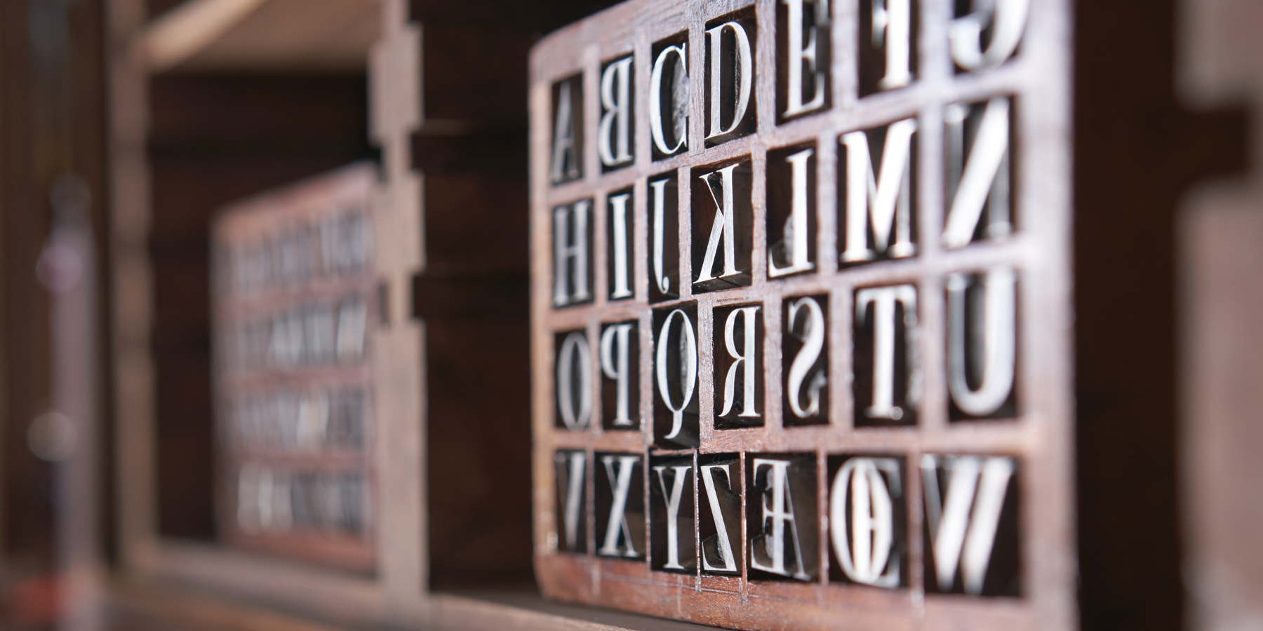
If you open the font menu on your computer right now, you will be greeted by a list of names that sound like a roster of European nobility: Garamond, Baskerville, Bodoni. As inhabitants of the modern digital age, we interact with these typographic interfaces every single day. Yet, we rarely stop to ask where the precise, geometric architectures of these letters actually came from.
Following the invention of the printing press, Renaissance and Enlightenment designers transformed the printed letter from a dark imitation of handwriting into a mathematically engineered structure that still defines how we read today. The story of how we got our modern alphabet is a fascinating journey—one that shifts visual communication out of the hands of the medieval calligrapher and places it onto the drafting table of the scientist and the engineer.
Here is how the raw, heavy mechanics of the early printing press evolved into the refined, scientifically precise fonts we use on our screens today.
The Weight of the Written Word
When Johannes Gutenberg successfully perfected his movable type printing press in Mainz, Germany around 1450, he invented a revolutionary machine, but he did not invent a new aesthetic.
At the dawn of the typographic era, the ultimate goal of a printer was to compete directly with traditional calligraphers by imitating their work as closely as possible. Early typographic fonts were designed to perfectly mimic the dark, dense, and highly compressed textura handwriting of the medieval monks and scribes who had monopolized book production for centuries. Gutenberg meticulously cast his lead alloy type to replicate the heavy, sharp angles of a hand-drawn quill stroke.
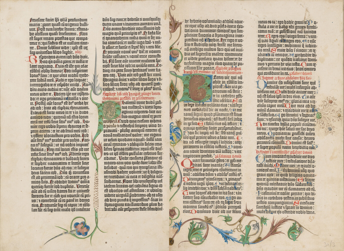
The resulting pages of his famous 42-line Bible were magnificent, but they were visually heavy. The ink saturated the substrate, creating a dark and impenetrable wall of text that was difficult to read over long periods. Gutenberg had successfully mechanized the reproduction of words, but the visual language itself remained tethered to the past.
Early printing was, essentially, just automated handwriting. A new visual language was desperately needed to lighten the page and improve legibility for a growing, literate public.
The Renaissance Roman and the First Type Foundry
As the printing press spread across Europe, its epicenter shifted south to the bright, intellectual hubs of Venice and France. Here, the heavy, Gothic aesthetic of Germany collided with the light, humanist philosophies of the Renaissance, sparking a total rethinking of page layout and letterform design.
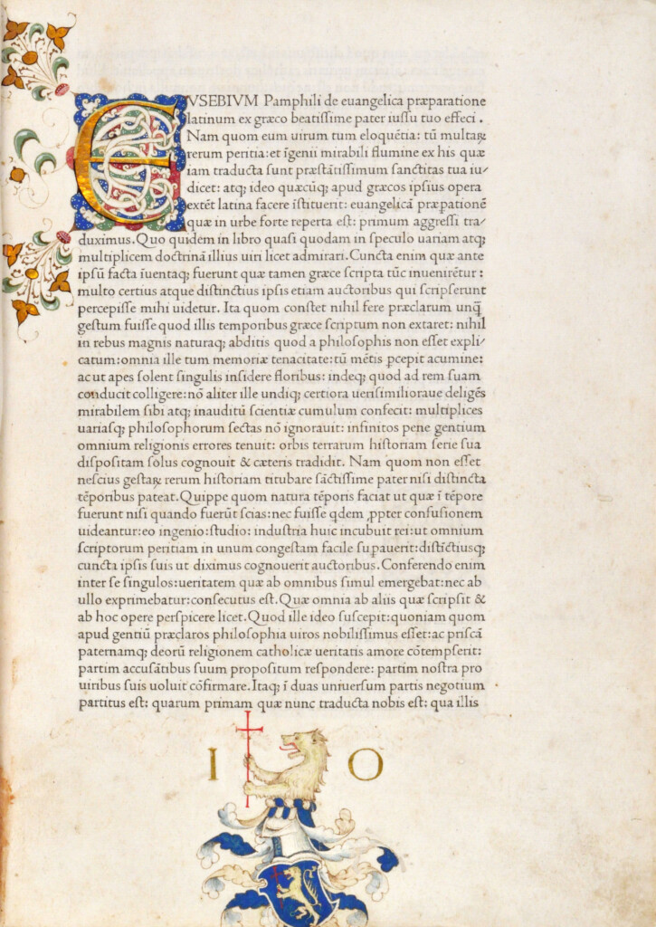
In 1470s Venice, a French punch cutter named Nicolas Jenson took the first major leap. Jenson created a lighter, highly legible “Roman” typeface that broke away from the dense textura style. Jenson’s true genius was his focus on the negative space. He meticulously designed the spaces inside and between the letters, creating an even, harmonious tone across the entire printed page.
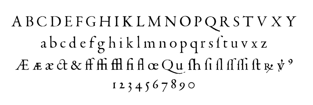
A few decades later, the golden age of French typography began. Around 1530, a visionary named Claude Garamond took an unprecedented step: he established the first independent type foundry. Before Garamond, a printer had to act as a scholar, publisher, typefounder, and bookseller all at once. By selling cast type ready to distribute into the compositor’s case, Garamond entirely separated the architecture of the letterform from the mechanical printing press.
Stripped of the burden of the printing process, Garamond could focus solely on the visual perfection of the alphabet. His fonts achieved a masterful harmony between capitals and lowercase letters, allowing for closer word spacing and unparalleled legibility. By the sheer, undeniable quality of his designs, Garamond played a major role in eliminating heavy Gothic styles from compositors’ cases all over Europe.
This was the precise moment type design became its own unique profession.
The King’s Grid: Calligraphy Meets Engineering
For over two centuries, type designers like Jenson and Garamond drew their inspiration from human gestures—specifically, the fluid, organic motions of a scribe’s inked quill on paper. But as the 17th century came to a close, the scientific revolution was in full swing, and a dramatic philosophical shift occurred.
In 1692, the French King Louis XIV ordered a committee of scholars to develop a completely new typeface for the Imprimerie Royale. This new alphabet was not to be based on the subjective hand of an artist, but on strict, objective “scientific” principles. Headed by a mathematician, the academic committee drafted the new letters on an incredibly precise mathematical grid. A single square was divided into 64 units, and each of those was further subdivided into 36 smaller units, creating a master grid of 2,304 tiny squares per letter.
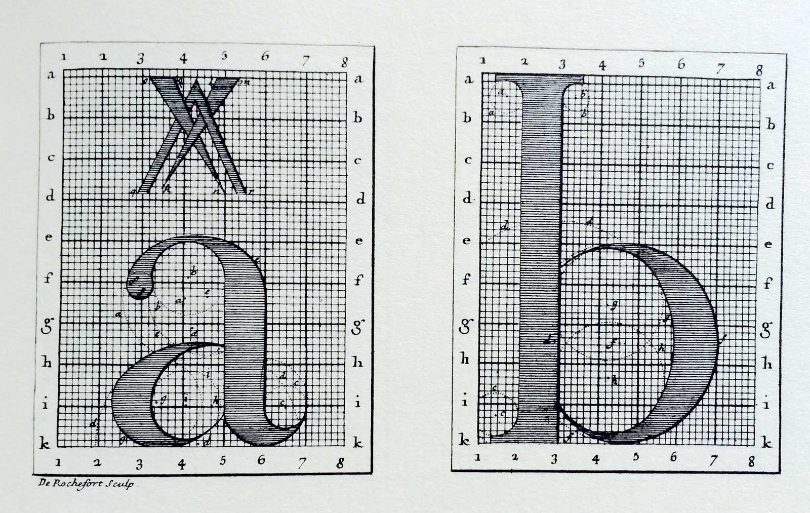
Master alphabets of this new font—dubbed the Romain du Roi (Roman of the King)—were exquisitely engraved into copperplates by Louis Simonneau, before punch cutter Philippe Grandjean translated them into metal text type. The resulting design exhibited a sharp increase in contrast between thick and thin strokes, razor-sharp horizontal serifs, and perfect geometric balance.
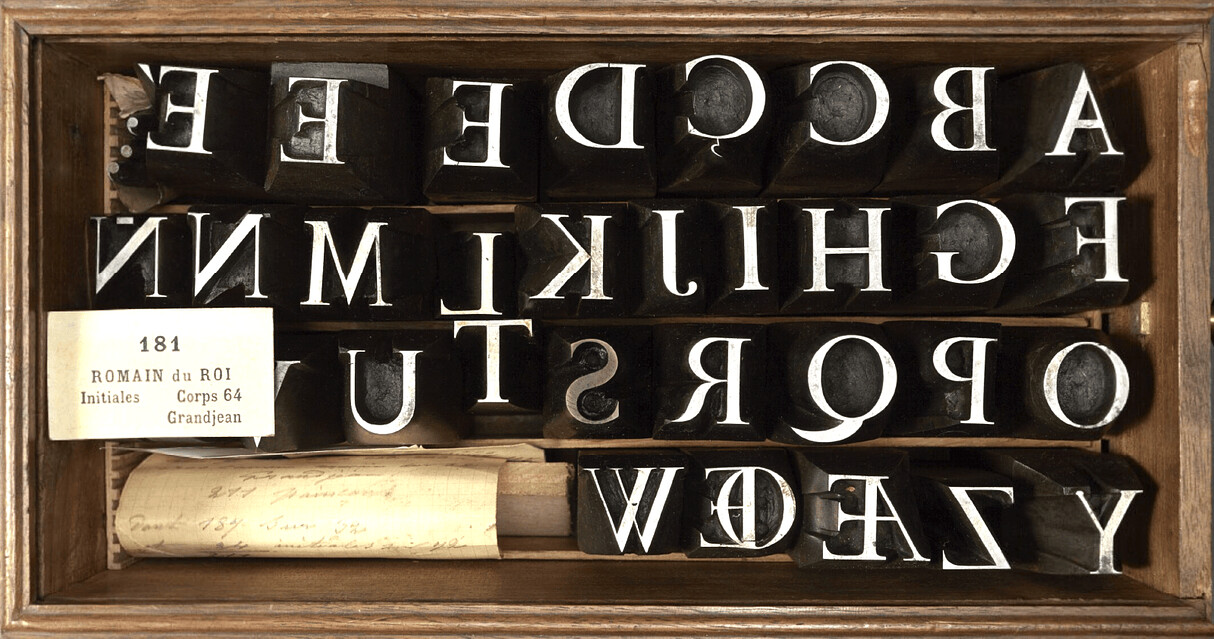
The engineer had officially replaced the calligrapher. Typography had shifted from an organic, hand-drawn art into a rational, mathematical science.
The Pinnacle of Reason: Baskerville to Bodoni
The grid-based logic of the Romain du Roi set off a chain reaction across Europe that culminated in the 18th-century Enlightenment. Designers began a relentless pursuit of pure geometric perfection.
In England, John Baskerville rejected the intricate, heavily ornamented pages of his contemporaries in favor of pure typographic elegance. He created “transitional” typefaces with an even higher contrast between thick and thin strokes. To ensure his delicate hairlines printed flawlessly, Baskerville improved the printing process itself, utilizing smooth, hot-pressed wove paper and generous amounts of white space.
Finally, in the late 1700s and early 1800s, an Italian typographic genius named Giambattista Bodoni (alongside the Didot family in France) pushed this aesthetic to its absolute limit. Bodoni stripped away all remaining traces of rococo ornamentation and calligraphic curves. He created the “Modern” style of typography: characterized by extreme, dramatic weight contrast, straight hairline serifs, and a purely vertical, mathematical axis.
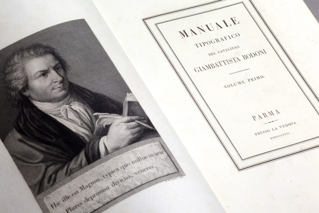
Bodoni’s pages were hailed as the typographic expression of neoclassicism—a return to pure, structural virtue. Through the meticulous calculations of these Enlightenment masters, the printed alphabet had achieved its most refined and intellectual form.
The Looming Roar of the Machines
By the early 19th century, the printed page was a realm of quiet, delicate, and perfectly pristine geometry. Graphic design had evolved from the messy, dark mimicry of medieval manuscripts into a pristine science of legibility and mathematical proportion.
But the intellectual elegance of this golden age of typography was about to be abruptly upended. As the 1800s progressed, the quiet workshops of the master typefounders would be drowned out by the incoming roar of factories, steam-powered rotary presses, and the explosive rise of mass commercialism. The delicate hairline serifs of Bodoni were utterly incapable of grabbing the attention of a busy citizen on a crowded, industrialized city street. The world was about to demand something much louder.
In our next post, The Industrialization and Its Effects on Society, we will explore how the relentless pace of the machine age completely fractured this typographic purity, giving birth to massive, fat-face display types, explosive advertising, and the chaotic visual landscape of the modern era.
More writing
The Architecture of Information: Swiss Design and the Grid
After World War II, a rapidly globalizing world needed a universal visual language that could cross borders without cultural misunderstandings. Explore how the pioneers of Swiss Design stripped…
Art Directing America: The Golden Age of Editorial Design
In the post-war era, American art directors broke free from traditional grids to turn the printed page into a cinematic, cultural experience. Explore how the visionary minds of…

Designing the Corporation: American Modernism and the Rise of Visual Systems
In the post-war era, American businesses rapidly evolved into massive multinational corporations that demanded rigorous visual order. Explore how modernist designers like Paul Rand and Lester Beall tamed…