The Architecture of Information: Swiss Design and the Grid
After World War II, a rapidly globalizing world needed a universal visual language that could cross borders without cultural misunderstandings....
In the years following the devastation of World War II, the global landscape underwent a profound and rapid transformation. The world was suddenly shrinking into an interconnected web of multinational commerce, rapid scientific advancement, and international transit. As borders opened and global trade exploded, the graphic design industry faced an unprecedented communication challenge.
In our previous post, we explored how the American art directors of the New York School conquered the mid-century advertising world using the “Big Idea“—an approach that relied on clever, deeply subjective visual puns, biting cultural commentary, and outrageous humor. However, the witty, culturally specific intuition that worked brilliantly on a newsstand in Manhattan did not translate well across oceans. A visual pun that relies on American idioms or local humor is rendered completely incomprehensible when exported to Tokyo, Paris, or Zurich.
Furthermore, as corporations expanded into massive global entities and scientific institutions required the sharing of highly complex data, subjective illustration and clever advertising copy were no longer sufficient. The modern world required a neutral, objective visual language. It needed a universal “operating system” that could organize complex information and cross language barriers without any cultural misunderstandings.
The answer to this new global reality did not come from the bustling advertising agencies of New York. Instead, it emerged from the quiet valleys of Switzerland—a country historically defined by its strict political neutrality and a population that had to navigate multiple distinct languages on a daily basis. Here, a radical new philosophy of visual communication was born, one that sought to engineer the perfect, invisible page.
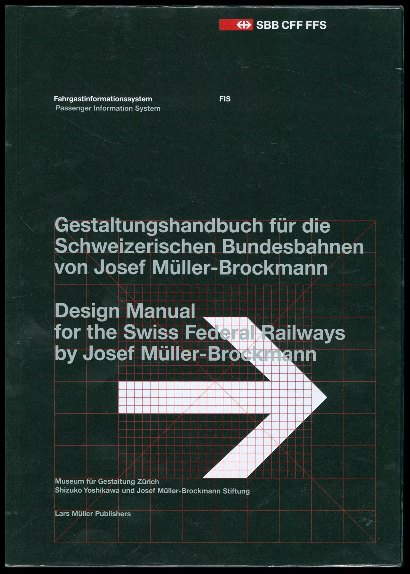
The designers who championed what became known as the International Typographic Style (or simply, Swiss Design) fundamentally rejected the idea that graphic design was an art form meant for personal self-expression. To them, the messy, brilliant human intuition celebrated by the New York School was a flaw. They believed that personality, humor, and decorative quirks distracted the reader from the true purpose of a design: the clear, unadulterated delivery of information.
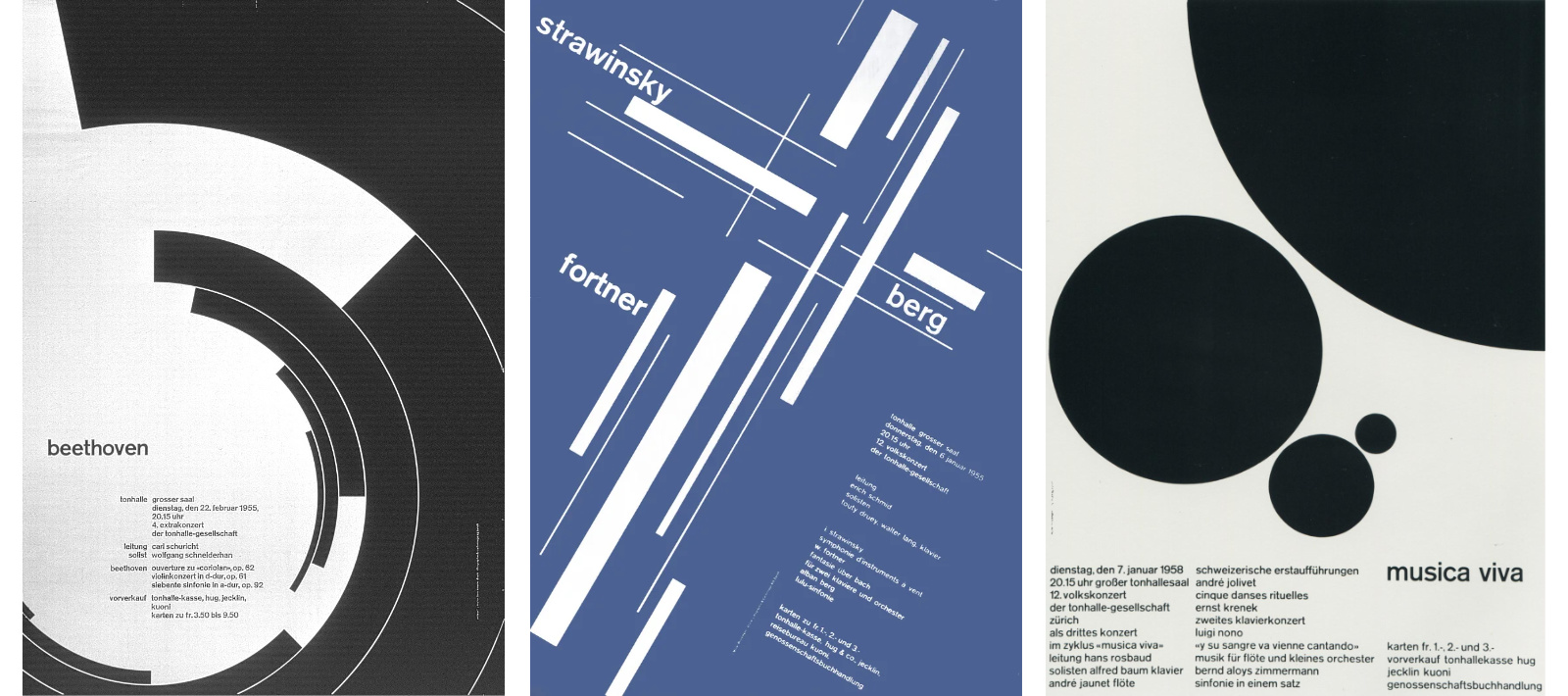
Pioneers of the movement, such as Josef Müller-Brockmann, argued that graphic design was a socially useful, highly disciplined mathematical science. The designer’s role was not to be an “artist,” but to serve as an objective, invisible conduit for the message. To achieve this infallible clarity, Swiss designers turned to the ultimate tool of mathematical order: the grid.
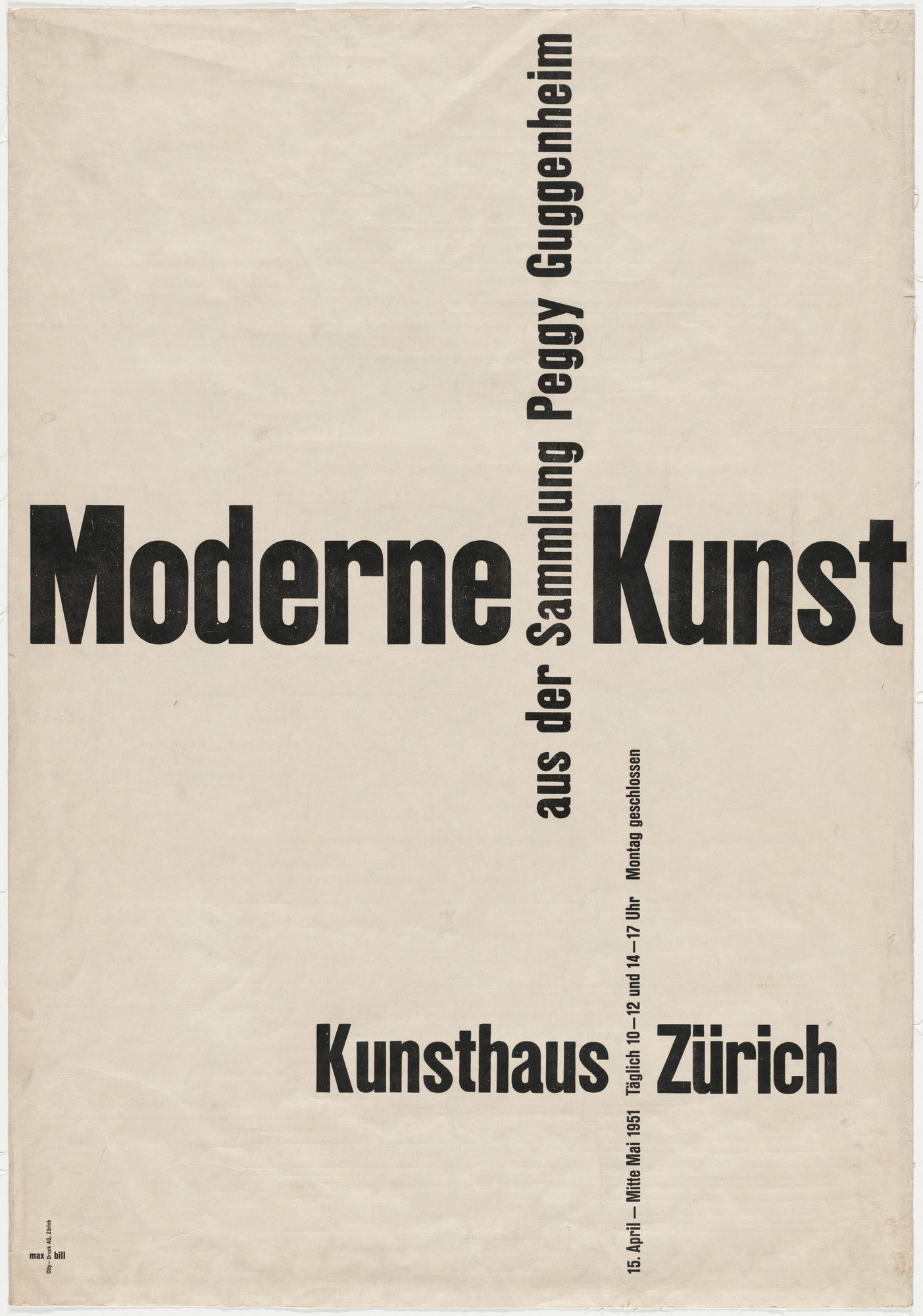
While the early roots of grid-based design can be traced back to the Bauhaus and De Stijl, the Swiss elevated the grid to a strict, universal doctrine. They treated the blank page as a structural foundation, meticulously dividing it into mathematical proportions to determine the exact placement of every margin, image, and column of text. This eliminated the need for intuitive guesswork. The grid created a sense of absolute harmony and proportion, allowing the viewer’s eye to effortlessly navigate the page.
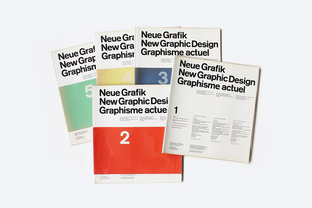
Müller-Brockmann and his contemporaries propagated these rigid, objective standards globally through their influential journal, Neue Grafik. Through their meticulous engineering, layout was permanently transformed from a subjective art into a structural science.
If the goal of graphic design is absolute, universal objectivity, a massive problem arises with imagery: how do you remove human bias from a picture? The Swiss answer was simple but radical: you stop drawing.
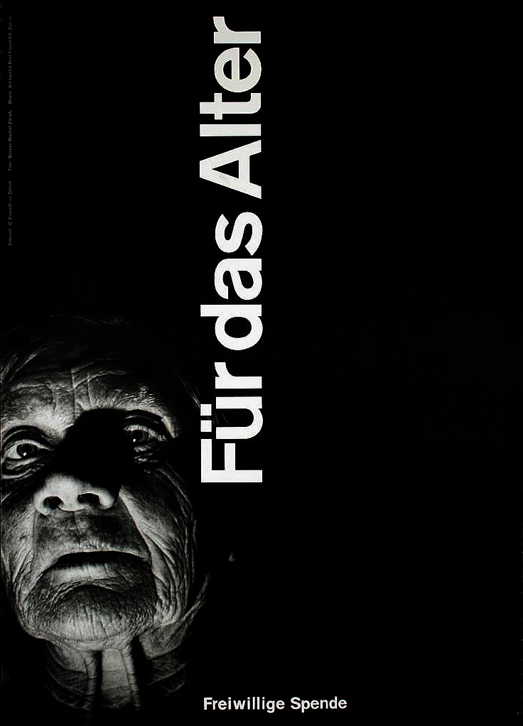
Hand-drawn illustrations inherently carry the personal bias, emotional state, and stylistic quirks of the illustrator. To remain totally objective, Swiss designers abandoned illustration entirely in favor of stark, factual photography. Photography was viewed as a mechanical, scientific medium that presented cold, hard facts without the filter of an artist’s hand. Carlo L. Vivarelli perfectly demonstrated this philosophy in his famous 1949 poster Für das Alter (For the Elderly). Rather than drawing a sympathetic portrait of an aging man, Vivarelli used a highly textured, tightly cropped photograph of a weather-beaten face, juxtaposing the organic human element against razor-sharp, geometric typography. The contrast intensified the meaning without resorting to sentimentality.
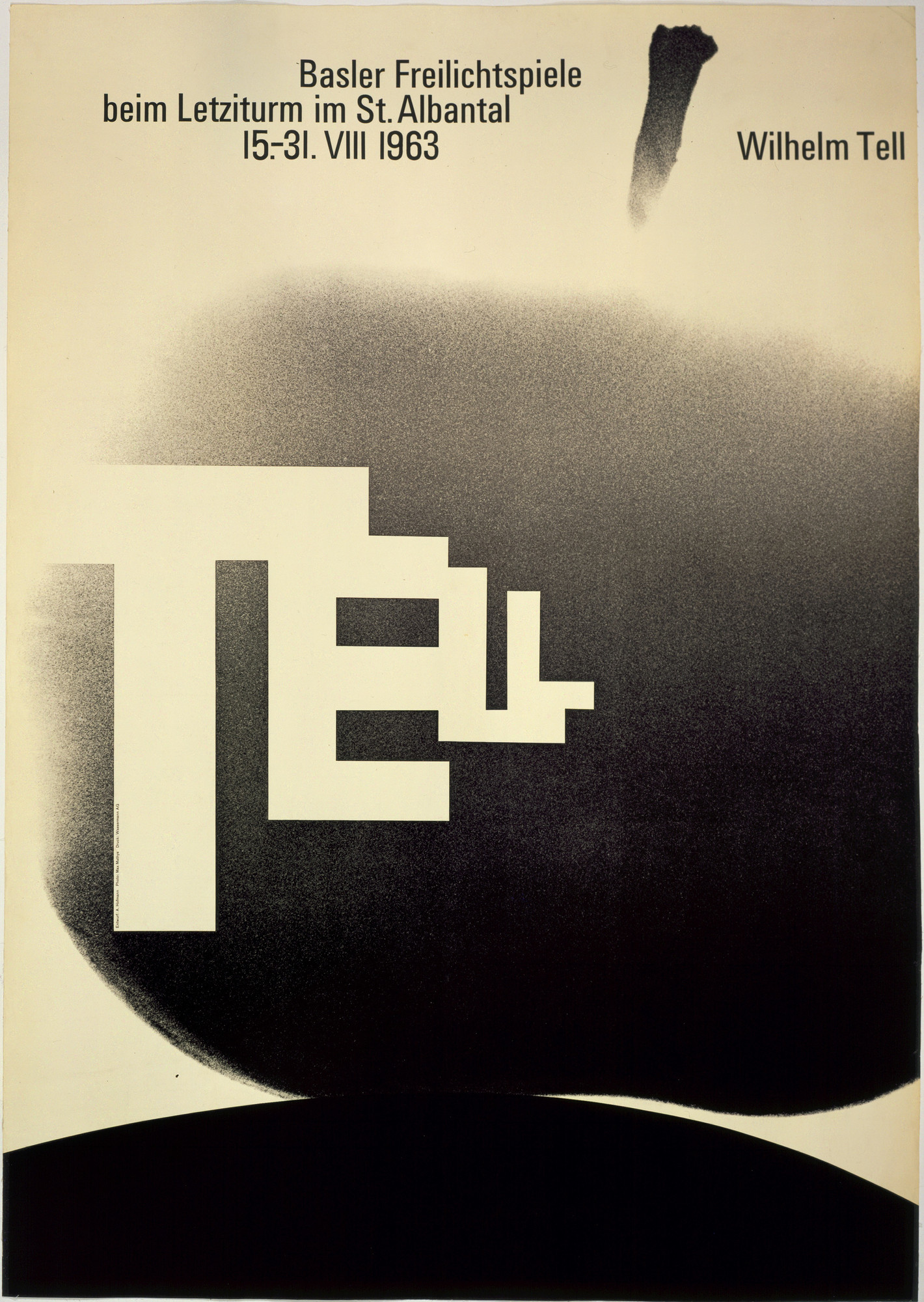
Similarly, Armin Hofmann utilized high-contrast, objective photography in his iconic 1963 poster for the open-air theater production of Wilhelm Tell. Hofmann stripped away all decorative elements, using a large, stark photograph of an apple as the focal point, while the large sans-serif typography implied an arrow aimed directly at the target.
To accompany this factual imagery, the typography itself had to be engineered for pure neutrality. This era saw the refinement and explosion of modern sans-serif typefaces like Helvetica and Univers.
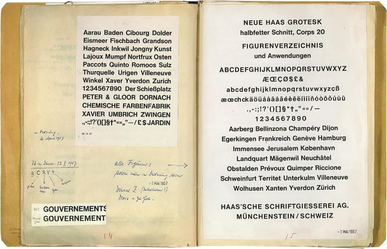
These typefaces were meticulously designed to be highly legible and completely devoid of any historical ornamentation or emotional baggage. They were the typographic equivalent of clear glass—allowing the reader to see the information perfectly without ever noticing the typeface itself.
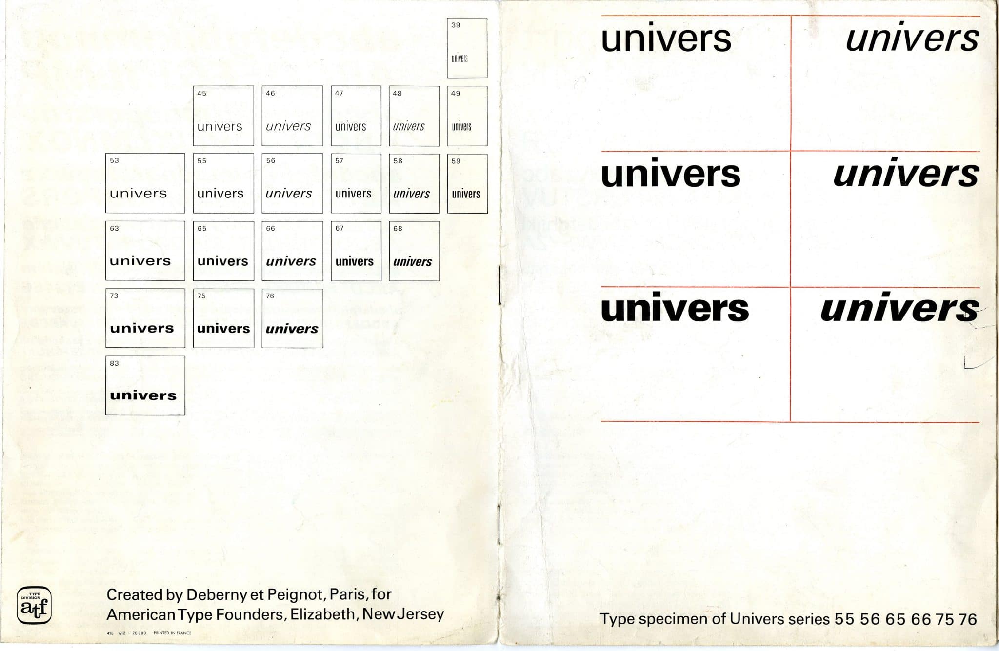
The impact of the International Typographic Style extended far beyond the walls of the art museum. This mathematical purity proved to be the perfect “operating system” for a world drowning in data. By combining the absolute structure of the grid with neutral typography, designers evolved from layout artists into modern information architects.
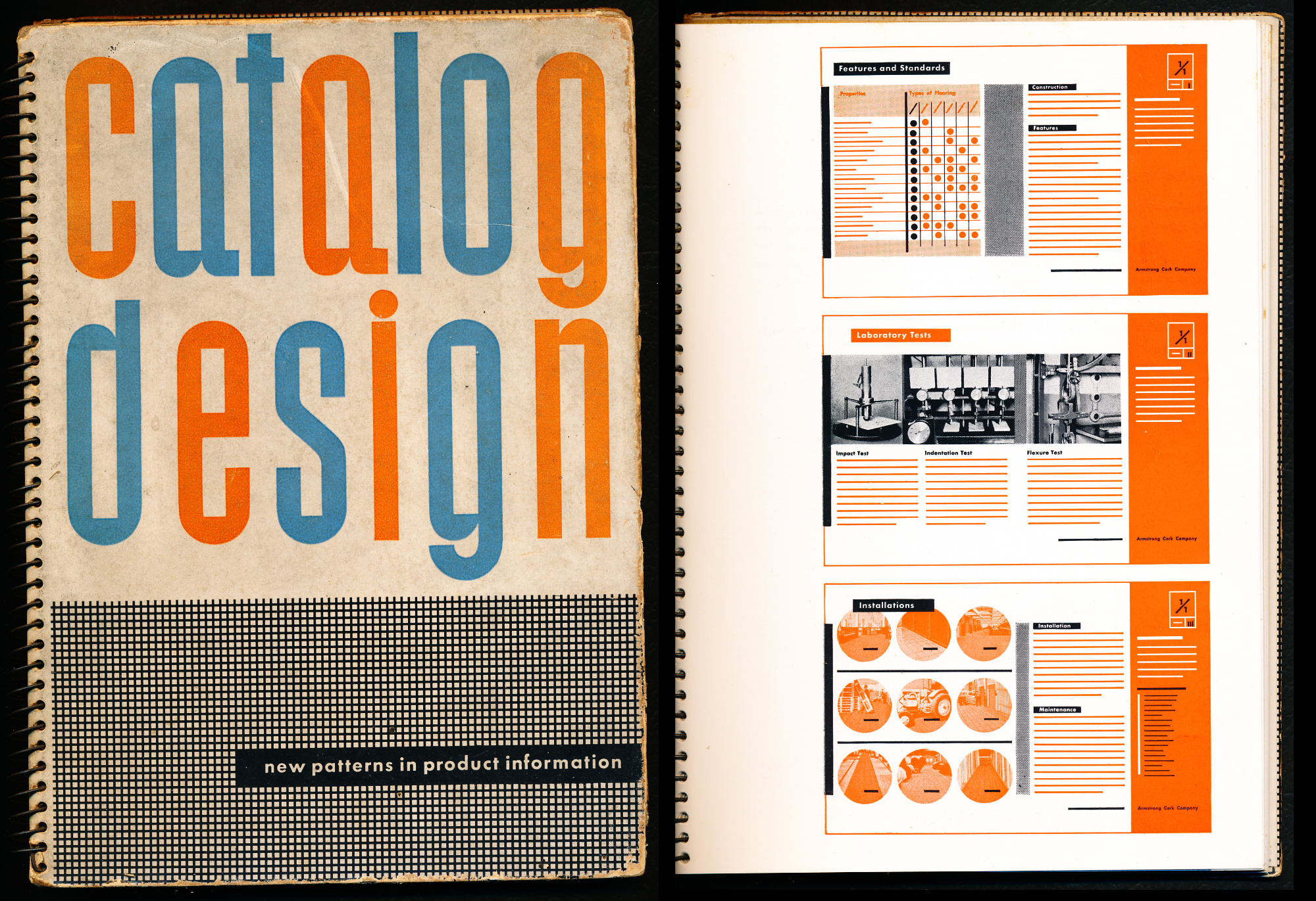
This evolution was championed early on by the visionary designer Ladislav Sutnar. Working in the United States in the 1940s, Sutnar applied rigorous, objective principles to organize massive, overwhelming amounts of industrial data for Sweet’s Catalog Service. Sutnar realized that to guide a reader through a complex catalog, the fundamental unit of design could not be the single page; it had to be the “visual unit” of the double-page spread. He rejected traditional, static margins and used bleeds extensively to open up the canvas. He utilized shapes, lines, and specific colors purely as functional elements to direct the reader’s eye, creating a logical flow of information that preempted modern UX/UI design by decades.
The ultimate triumph of this Swiss methodology arrived in 1977, when the legendary designer Massimo Vignelli applied the grid to the sprawling bureaucracy of the United States government. The U.S. National Park Service was producing thousands of informational brochures for hundreds of different parks, resulting in a chaotic, disorganized visual mess. Vignelli solved this by creating the “Unigrid” system.
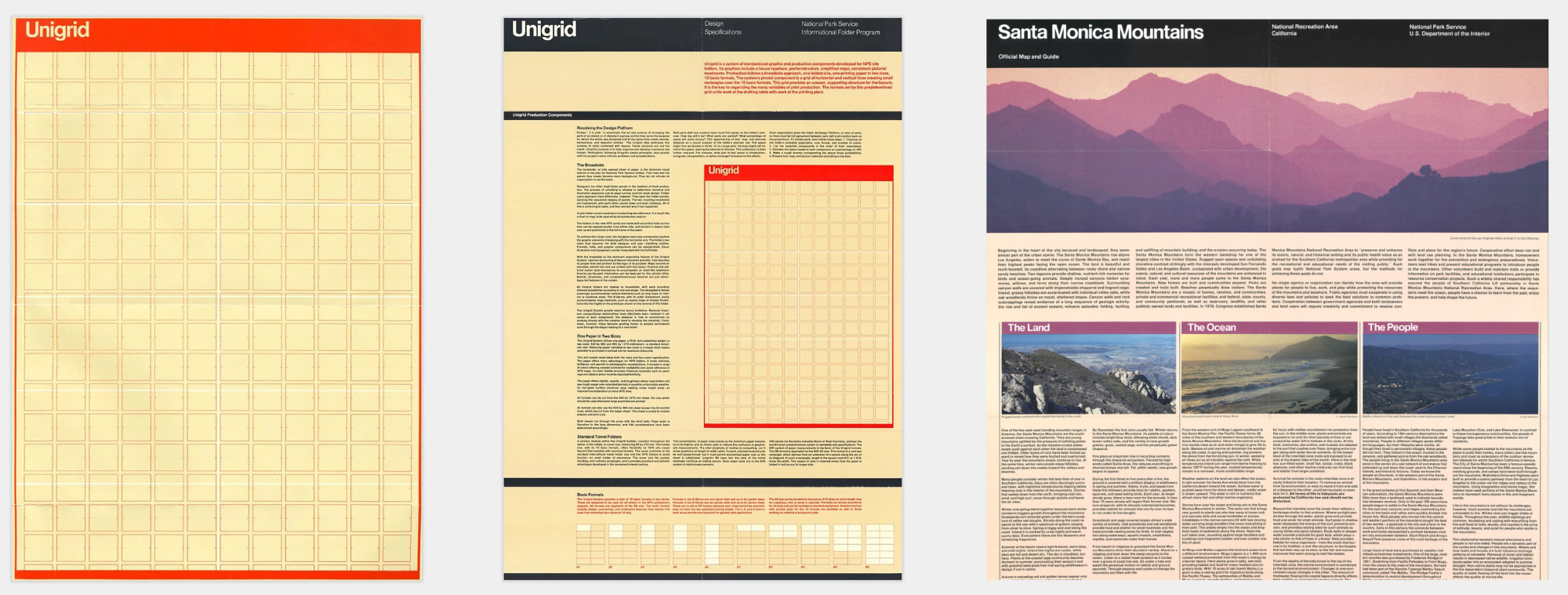
The Unigrid was a standardized, modular format that established strict mathematical rules for typography, margins, and photographic placement across the entire National Park Service. This system enabled the government to present a unified, easily navigable, and highly professional visual identity to millions of diverse visitors. It proved that the Swiss grid was not just an aesthetic choice; it was an incredibly powerful structural tool capable of taming massive institutional chaos.
By the 1970s, the Swiss Grid had achieved total global victory. It had become the unquestioned, dominant standard for corporate identity, government communications, transit systems, and international branding. It was undeniably clean, remarkably functional, and mathematically perfect.
But human beings are not mathematical equations. While the International Typographic Style succeeded in eliminating all personal quirks and subjective humor from the page, it also eliminated warmth. Total perfection can, over time, begin to feel sterile, cold, and authoritarian.
While the corporate world happily embraced the invisible precision of the grid, a radically different movement was quietly gathering strength. Behind the Iron Curtain in Poland, a generation of designers operating under strict state control realized that cold objectivity could not speak to the trauma and complexity of the human condition. As we will explore in our next post, these designers were about to abandon the mathematical grid entirely. They would bypass government censorship by weaponizing surrealism, dark humor, and deep psychological emotion, reclaiming the poster as a profoundly powerful, deeply conceptual art form. The era of perfect order was about to be challenged by the return of raw, conceptual human emotion.
After World War II, a rapidly globalizing world needed a universal visual language that could cross borders without cultural misunderstandings....

In the post-war era, American art directors broke free from traditional grids to turn the printed page into a cinematic,...
In the post-war era, American businesses rapidly evolved into massive multinational corporations that demanded rigorous visual order. Explore how modernist...

Following the strict, functional rules established by the Bauhaus, the Roaring Twenties demanded a visual language that was fast, luxurious,...
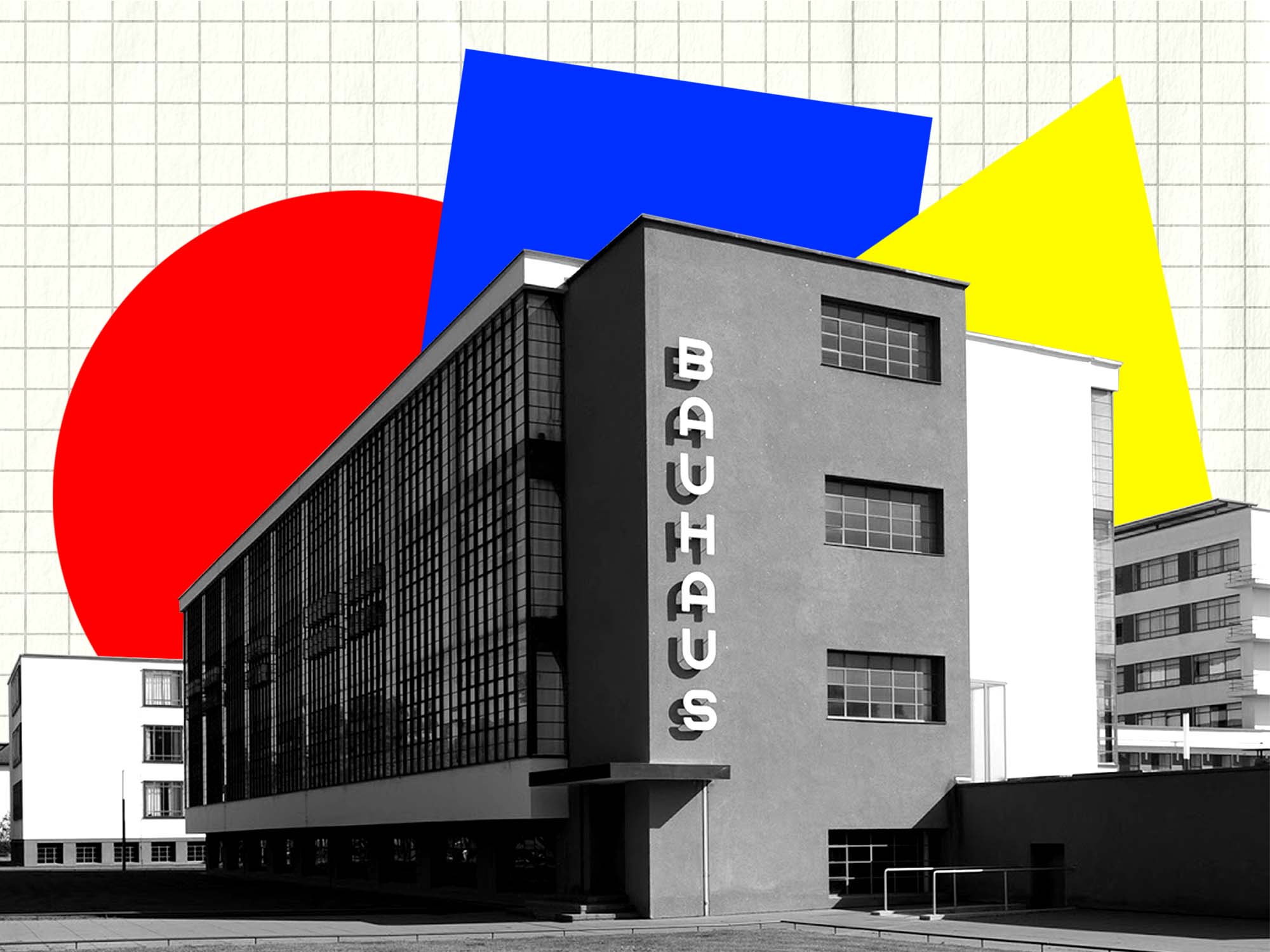
Following the chaos of World War I, Walter Gropius founded the Bauhaus to rebuild society through a unified approach to...

During the global conflicts of the 20th century, graphic design was mobilized as a powerful weapon of mass communication. Explore...
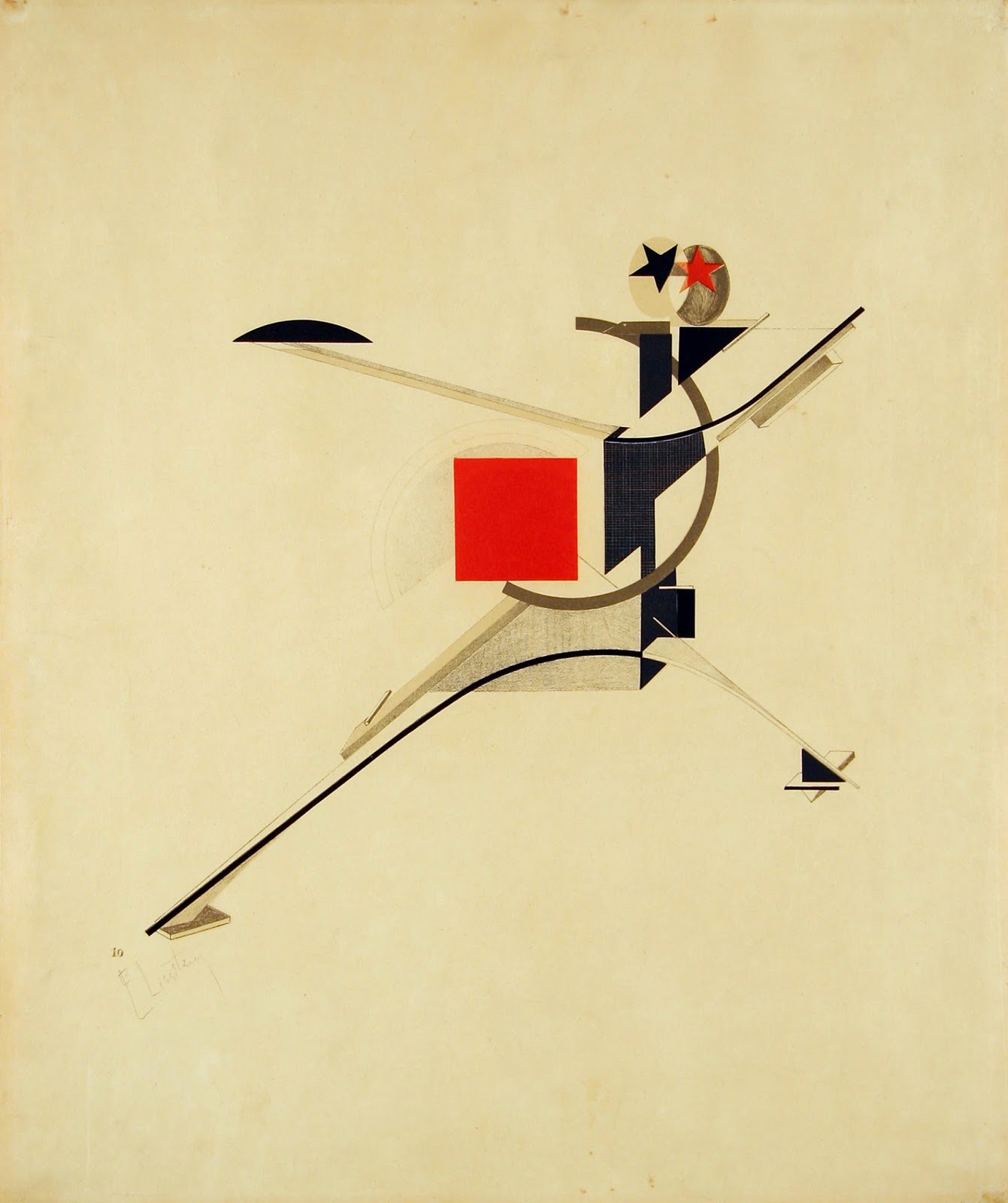
Rejecting the elite concept of "art for art's sake," the Russian avant-garde transformed abstract geometry into a tool for mass...
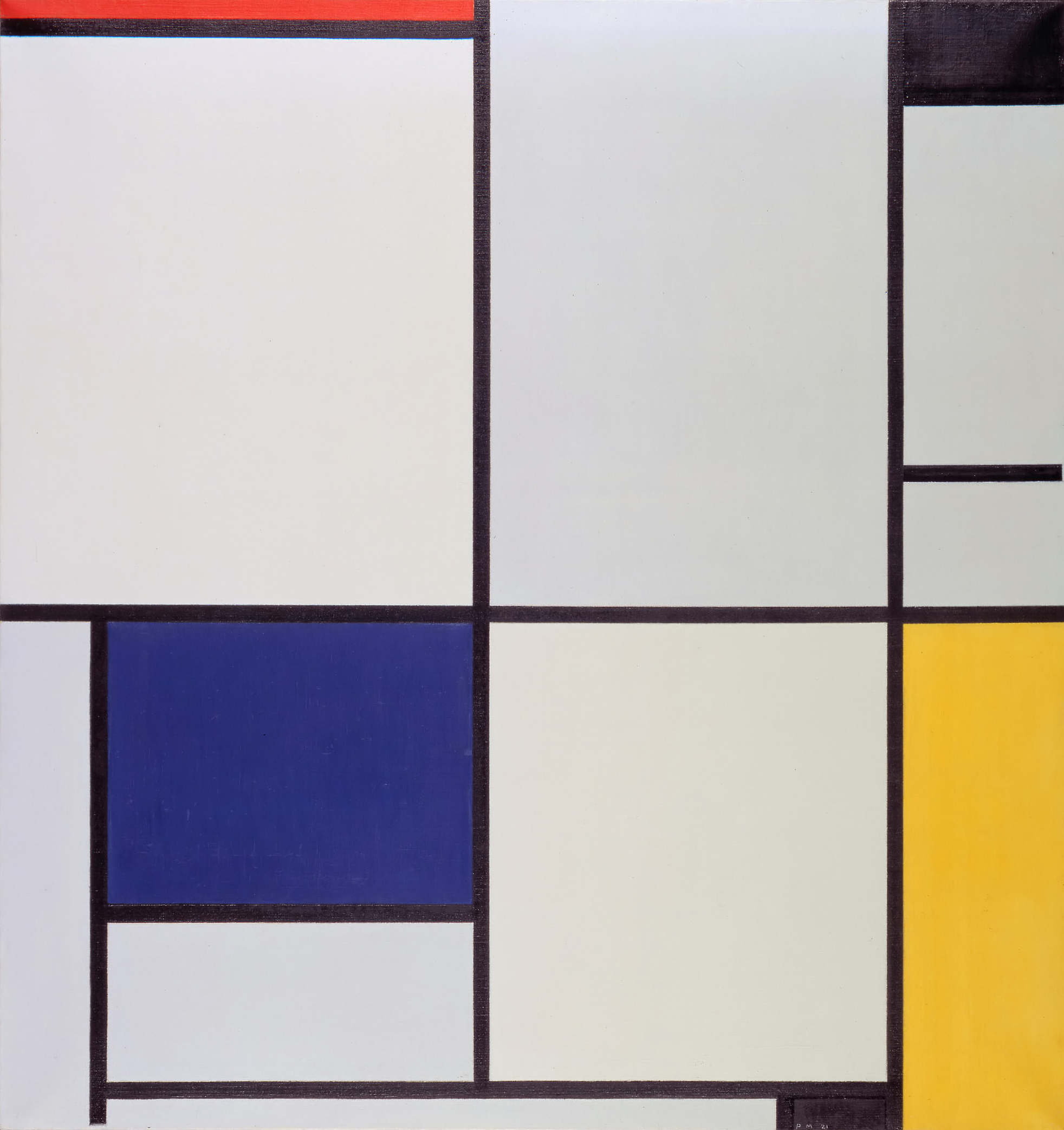
Emerging from the psychological wreckage of World War I, the Dutch De Stijl movement sought to build a utopian society...
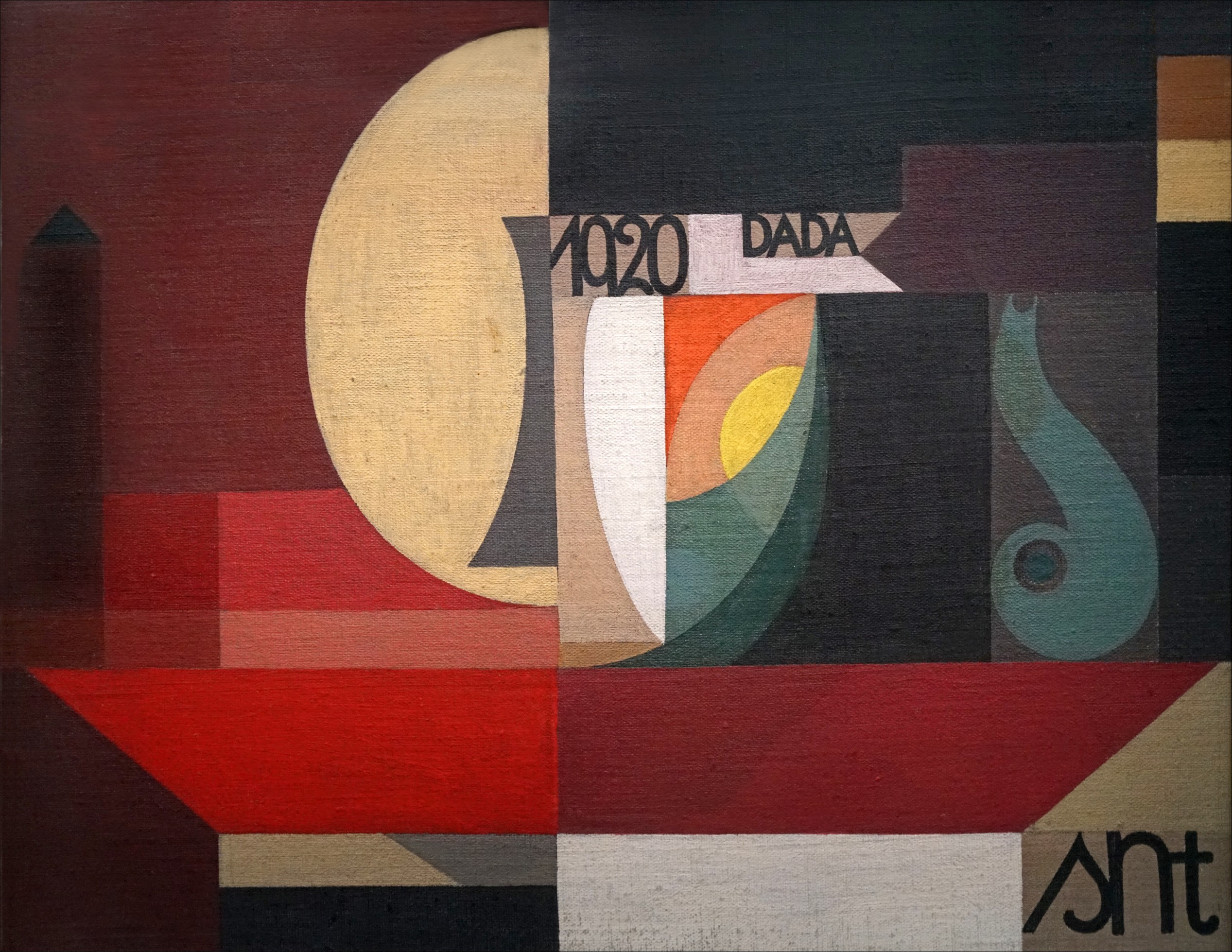
Traumatized by the senseless slaughter of World War I, a rebellious group of anti-war artists completely rejected the harmonious design...
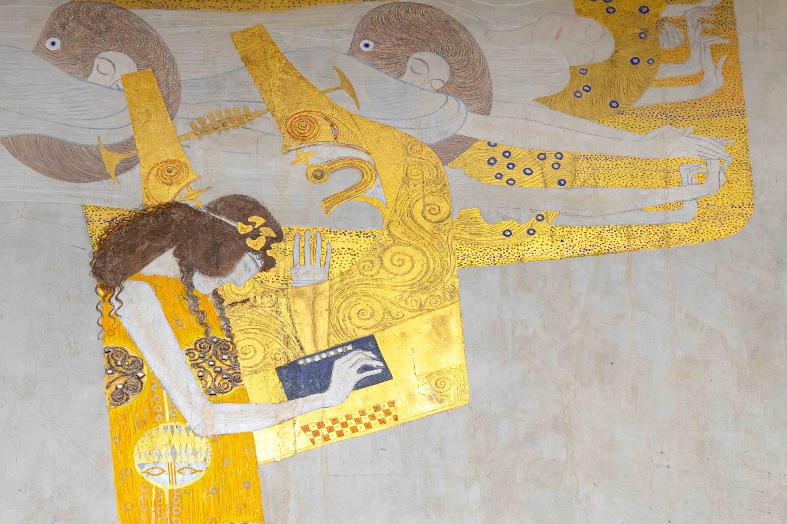
By the 1890s, graphic design was lost in a tangled, organic forest of twisting vines and dense Victorian clutter. Discover...

If you open your font menu today, you are looking at centuries of design history. Discover how the raw, heavy...

Long before Gutenberg developed the printing press, the foundations of the modern page were being masterfully engineered in the East....
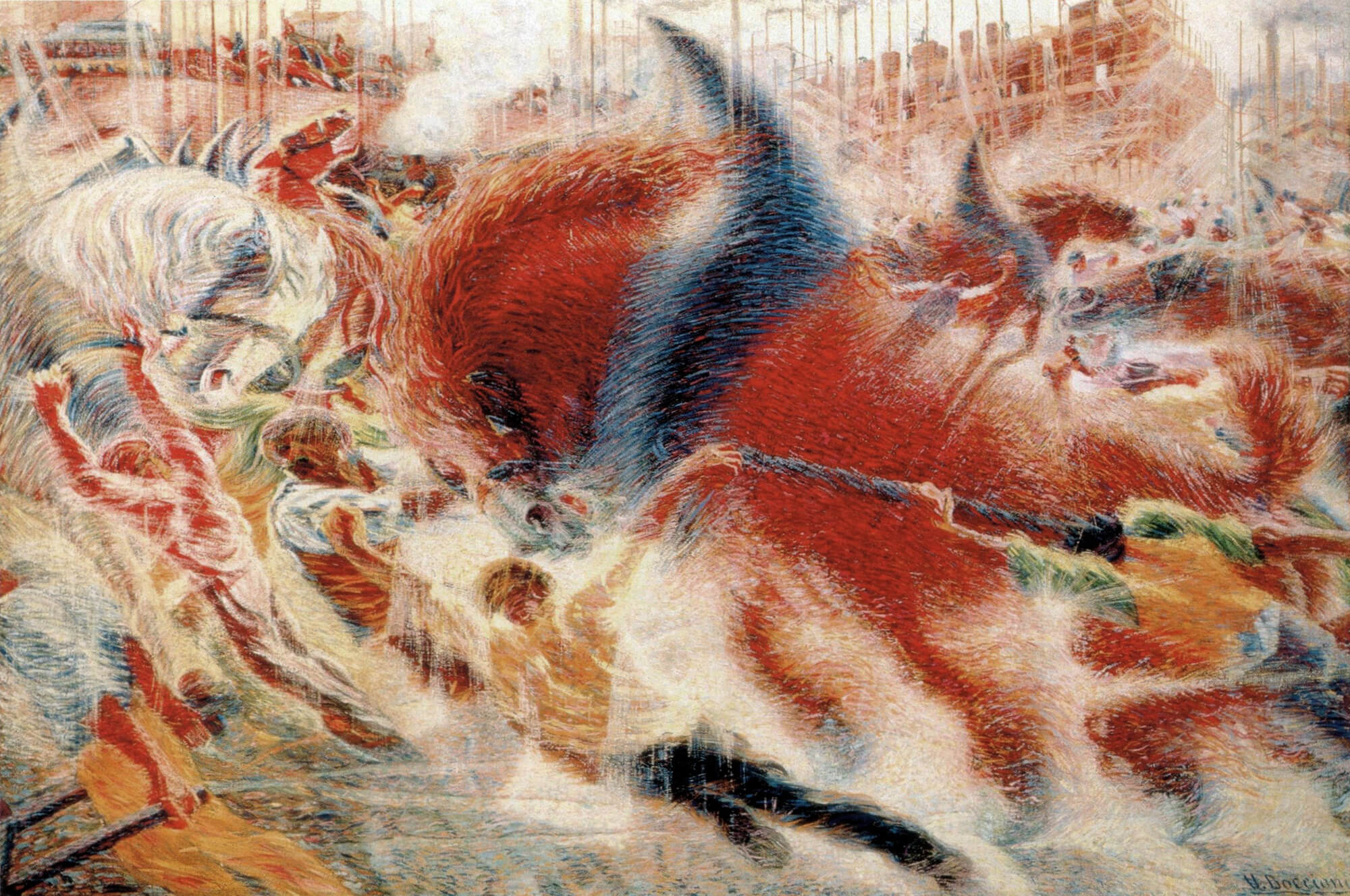
In the tumultuous early 20th century, marked by a whirlwind of new inventions and a shift from agrarian to urban...
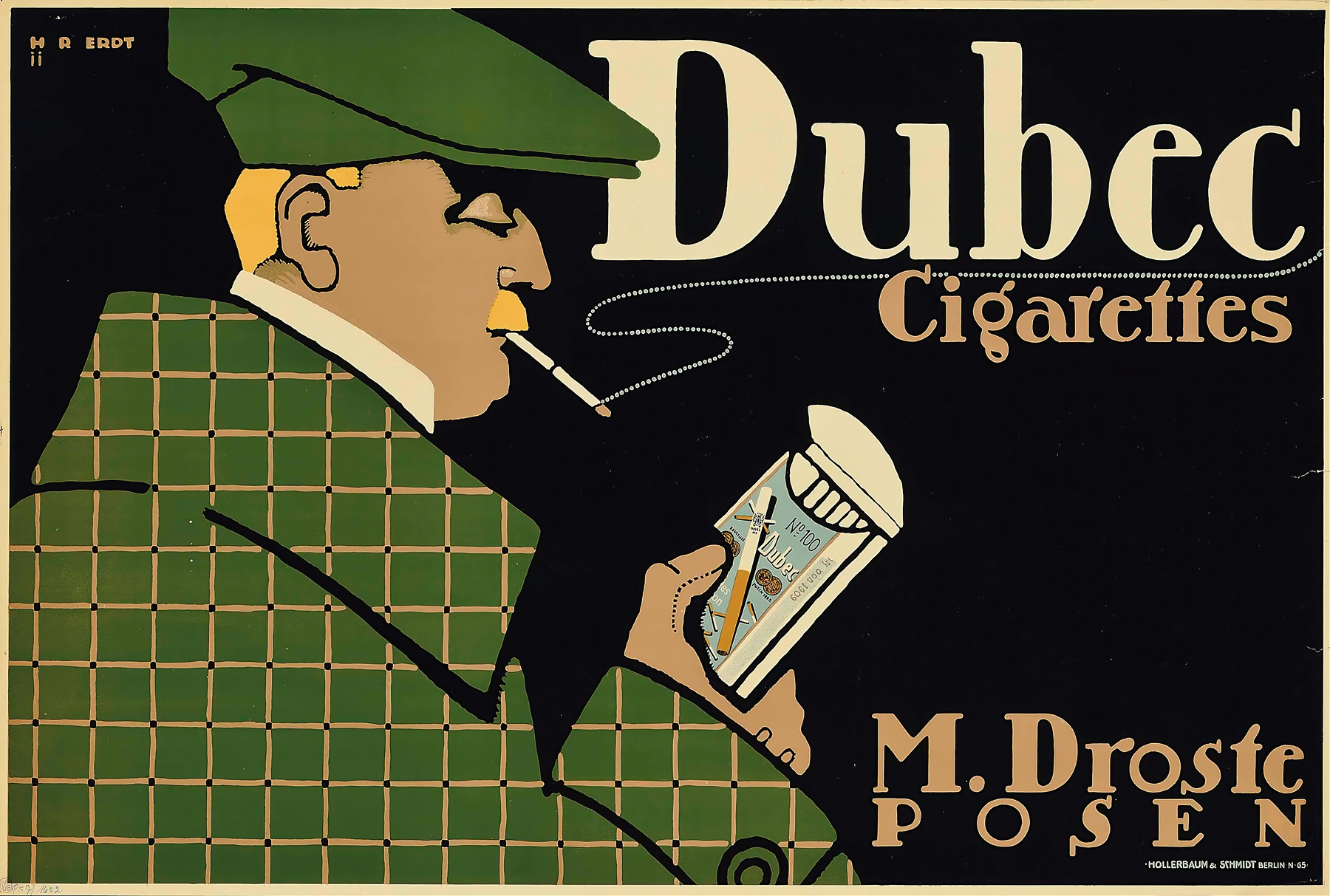
As the twentieth century unfolded, emerging artists sought inspiration beyond the intricate designs of the Victorian era, Art Nouveau, and...
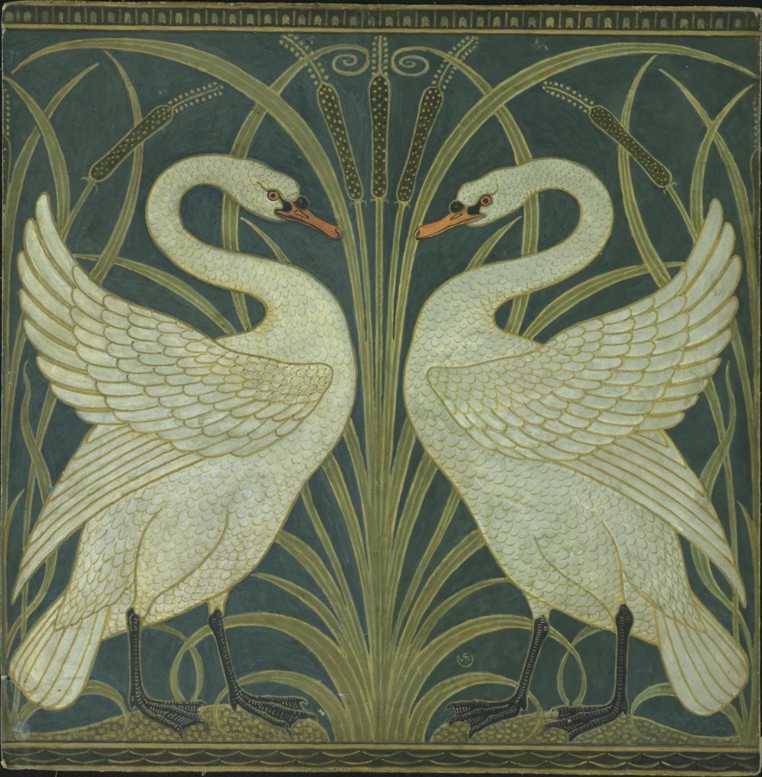
The Art Nouveau movement, which flourished in the late 19th and early 20th centuries, was characterized by its ornamental and...
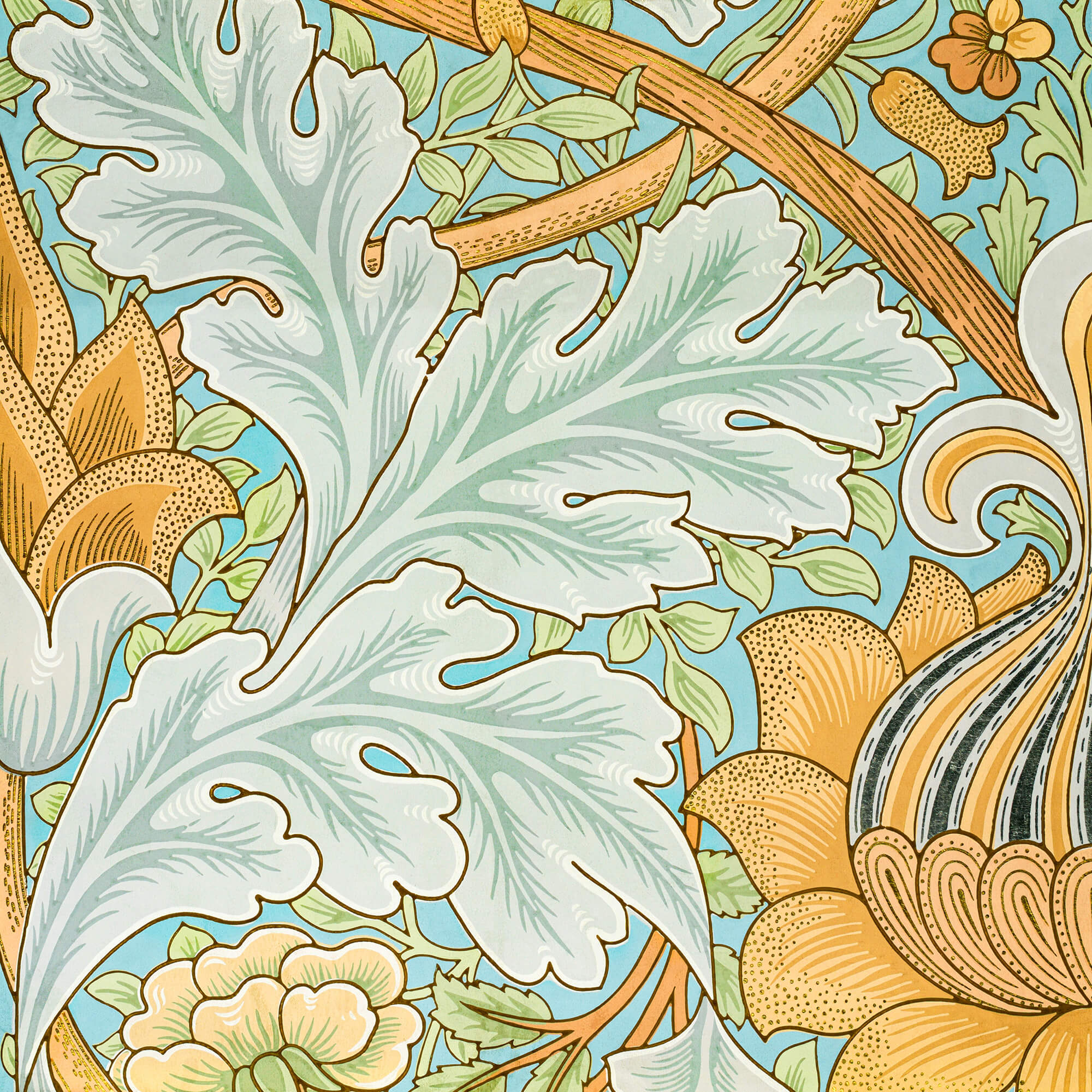
As the 19th century unfolded, the city of Paris became a hotbed of optimism and creativity, fueled by a confluence...
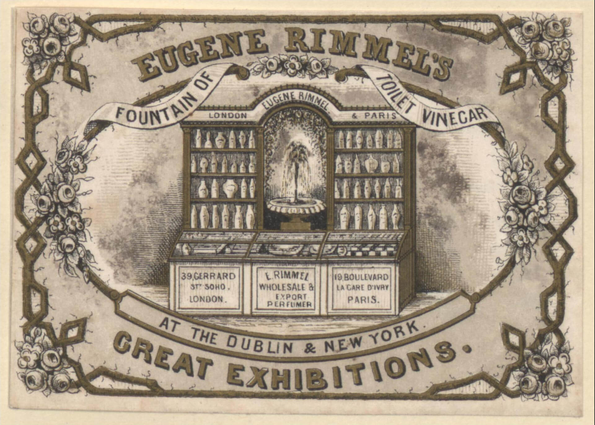
In the mid to late 19th century, the technological change was a big driving force, just like today. The new...
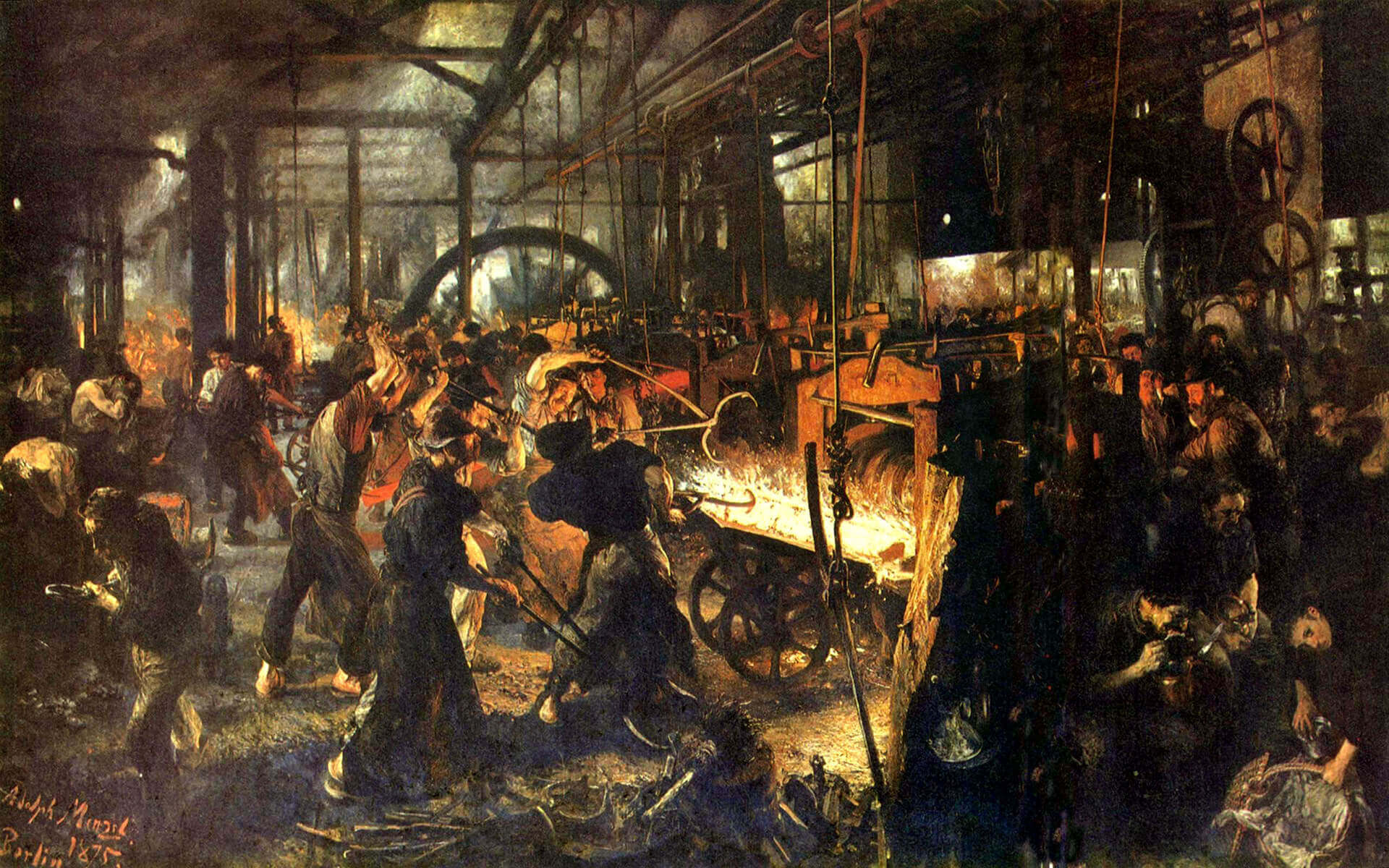
While these developments were happening, the deskilling of the craftsman and manufacturing of mass-produced items, expansion of factories and even...
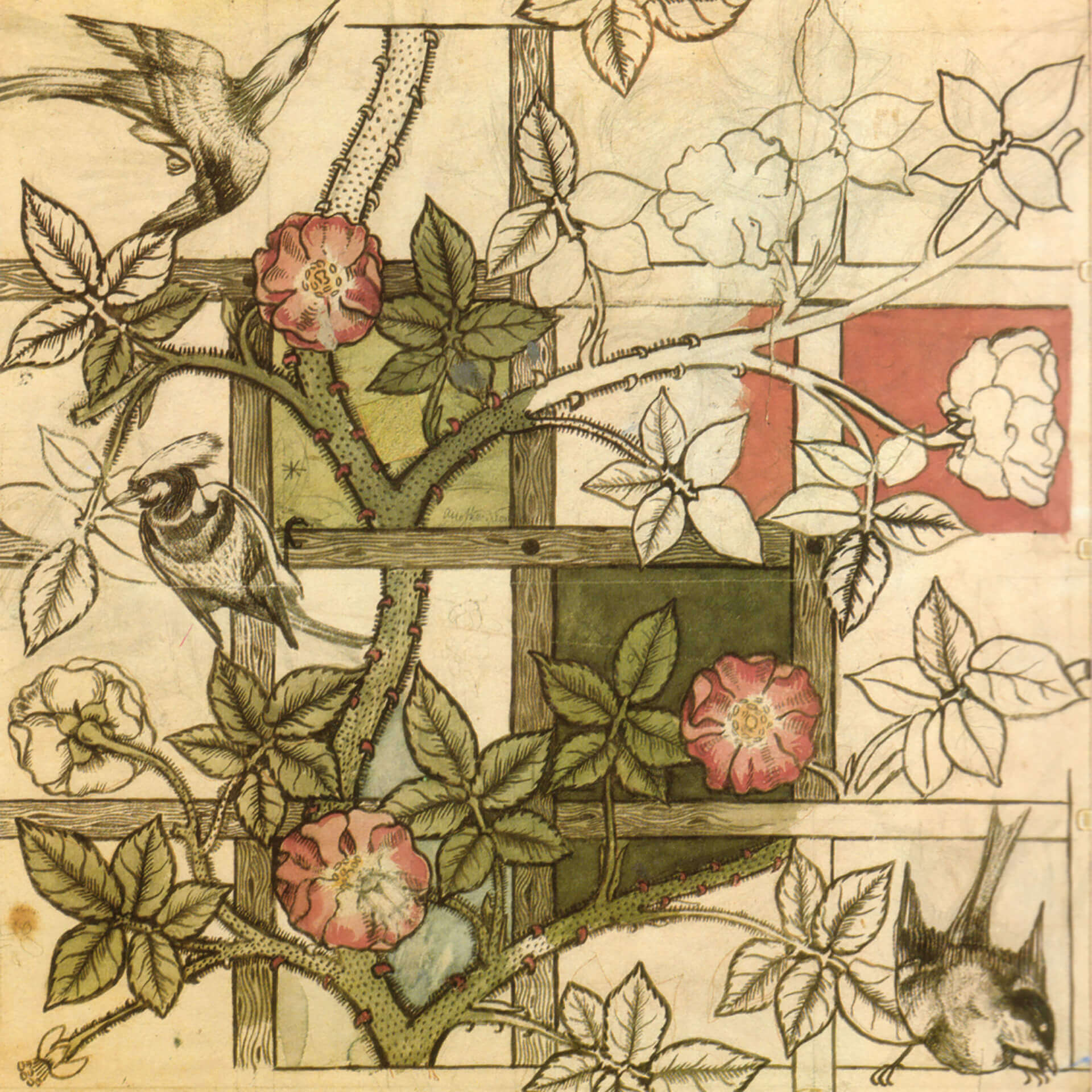
Before industrialization, things were made in small numbers, carrying the emotions and fingerprints of its creator as a result of...
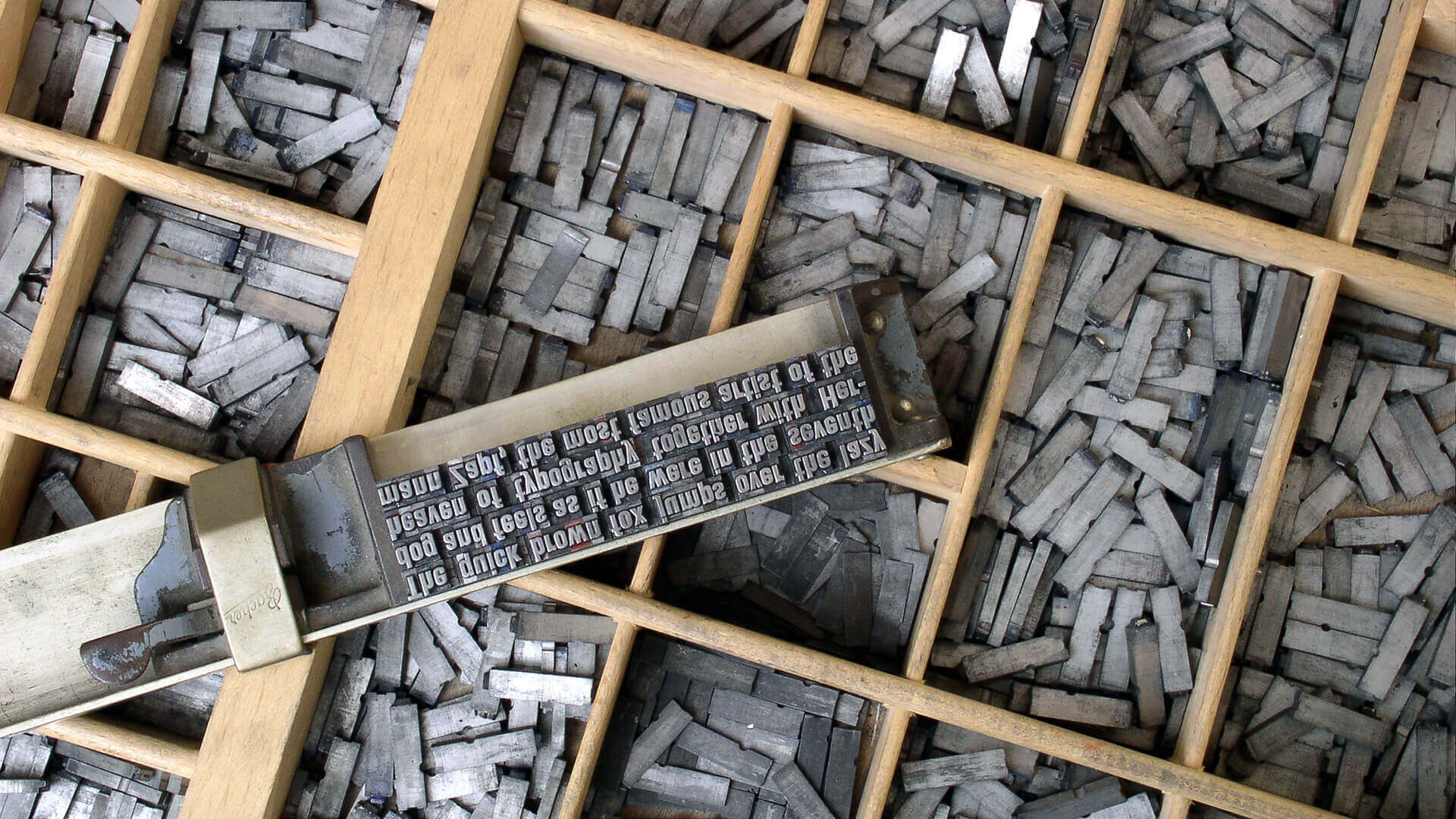
In 1400s AD, after several years of focused experiments, Johannes Gutenberg made the system scalable and led the way for...

The history of graphic design begins with the cave paintings. The prehistoric humans were marking their daily lives or the...

Starting from a simple stone ax, throughout the history we created a man-made environment, to survive and control the world...