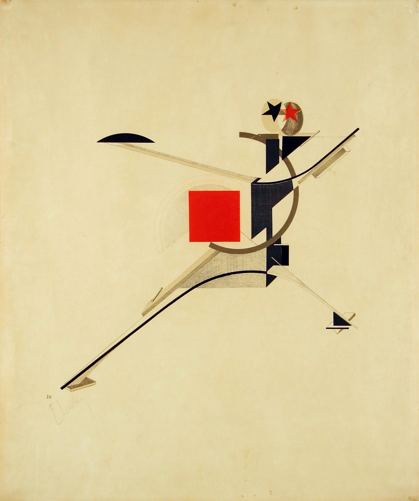
Russian Constructivism: Weaponizing the Grid
Rejecting the elite concept of "art for art's sake," the Russian avant-garde transformed abstract geometry into a tool for mass...
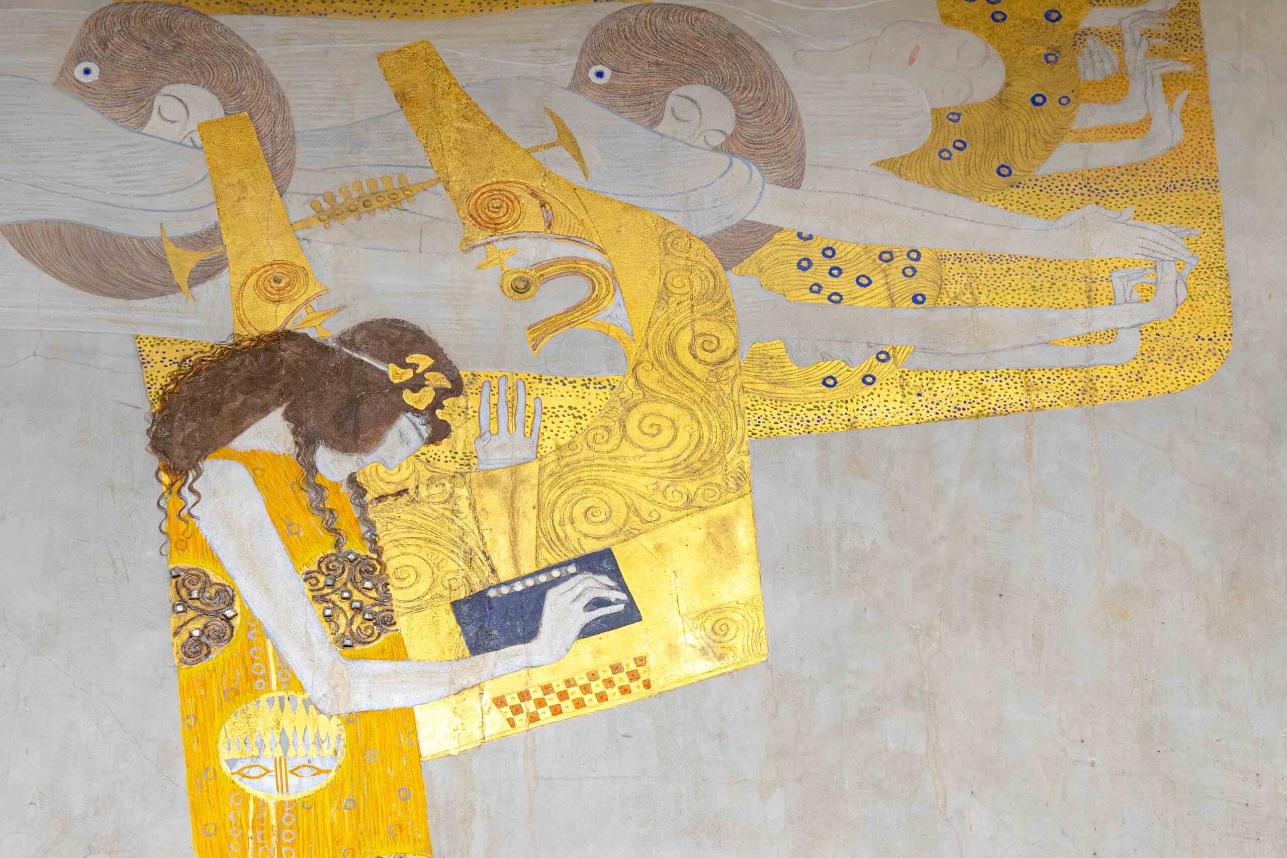
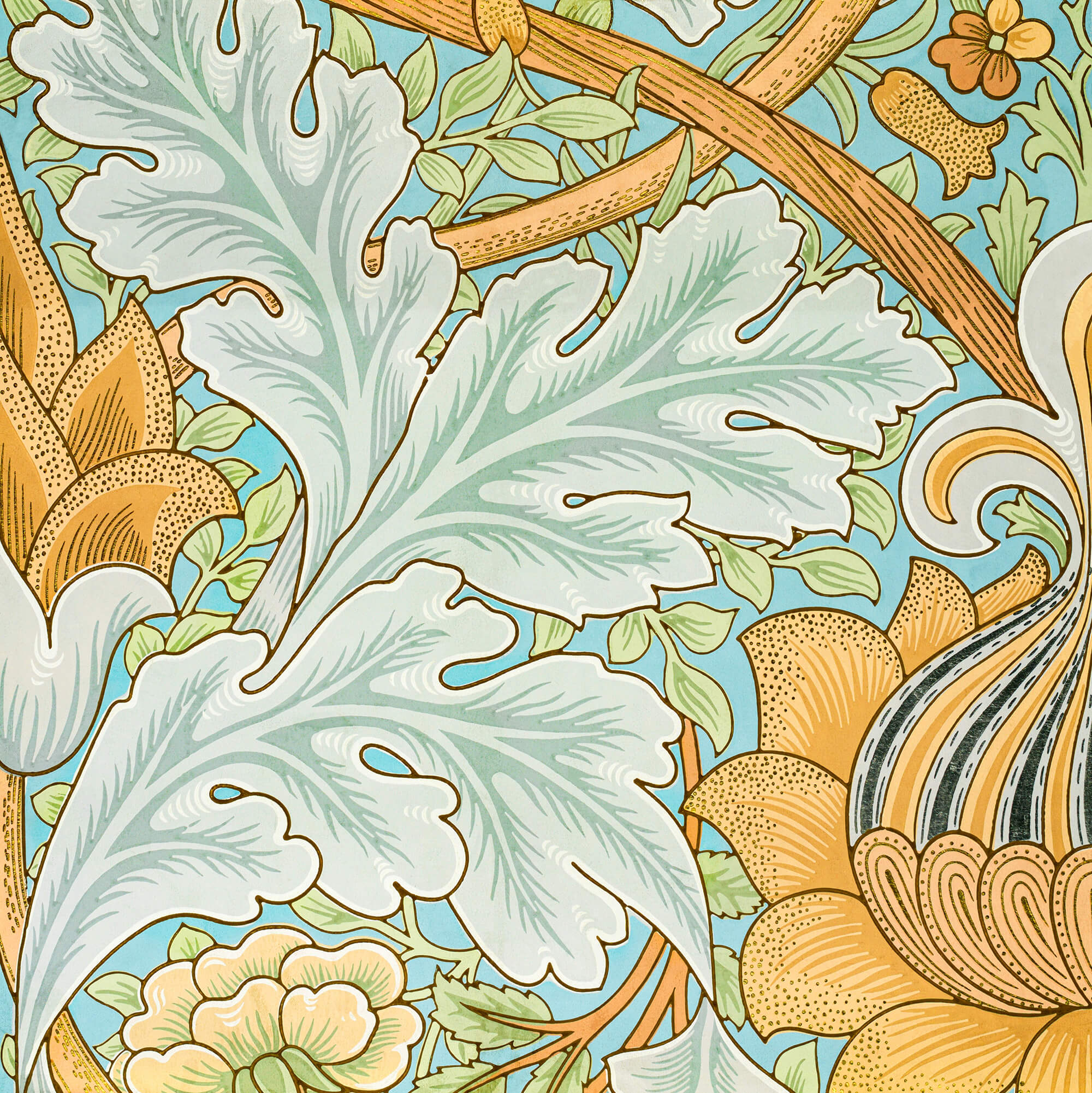
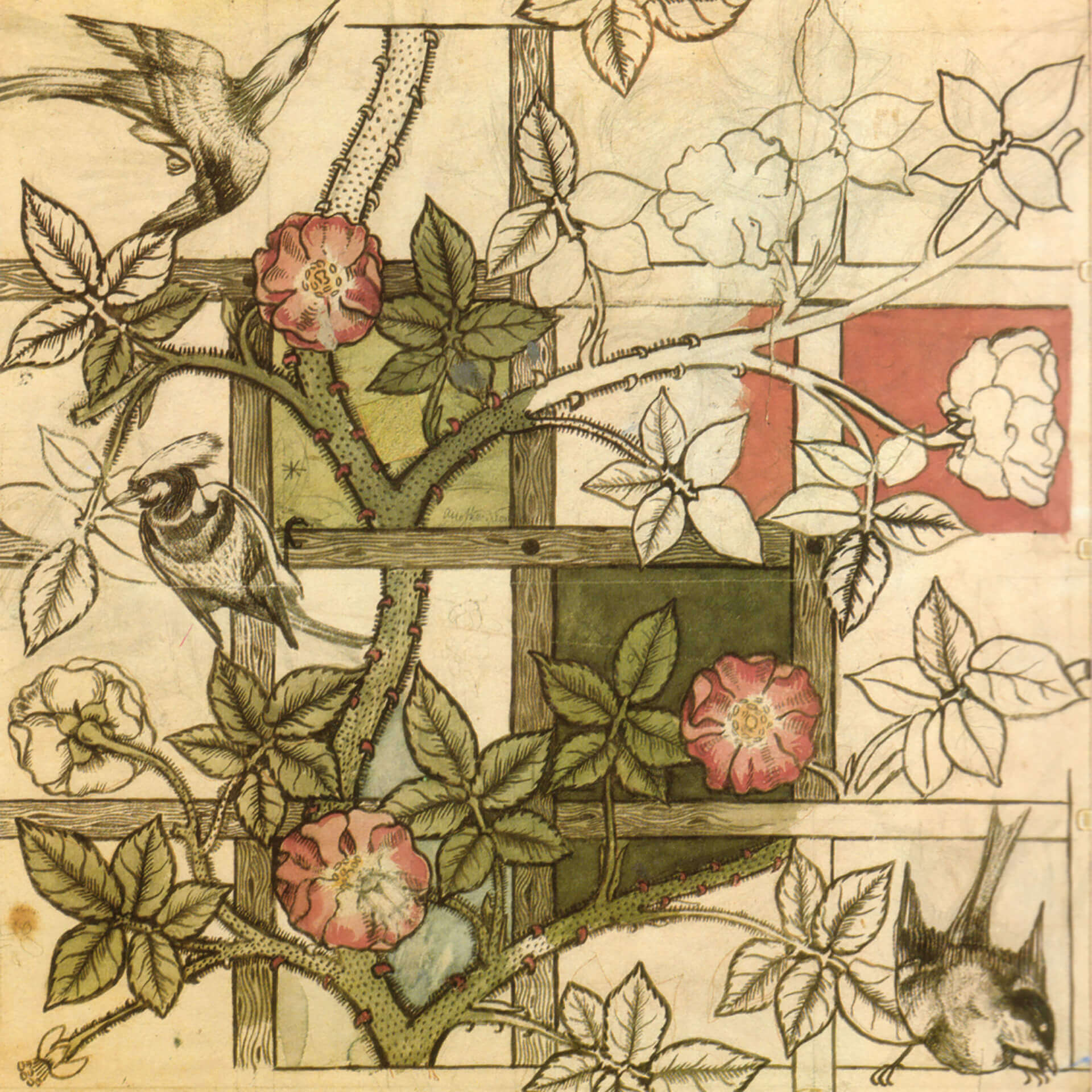
As the twentieth century unfolded, emerging artists sought inspiration beyond the intricate designs of the Victorian era, Art Nouveau, and Arts and Crafts movements. The dawning century ushered in a spirit of innovation and new perspectives. For these young artists, the medieval poetry and elaborate patterns of the past seemed out of place in this bold new world.
At the age of fifteen, Lucian Bernhard attended an exhibition in Munich that showcased art diverging from the dull tones and clutter of the Victorian era. Overwhelmed by the vibrant colors, he returned home and adorned his room’s walls and furniture with these bold hues. Despite being expelled by his father, Bernhard embraced the notion that design could be clear and minimalistic.
The colors employed were typically simple, flat, and distinctive—captivating to the eye. Bernhard’s revelation about minimalistic and clear design came to fruition during an exhibit in Munich at the age of 15, where he felt “drunk with colors”. This realization led him to strip down his poster for Priester’s matches to its essence, discarding elements until only the matchbox and matchsticks remained. This marked a departure from Victorian-style complexity, as the poster adopted a straightforward, minimalist approach using shapes and objects rather than elaborate illustrations.

This approach laid the foundation for modern graphic design, emphasizing symbols and shapes over literal illustrations to convey ideas. Known as Plakatstil (“poster style” in German) or Sachplakat (“object-poster” in German), this style was purposeful, aiming to captivate and entice audiences into desiring and purchasing the products depicted in the posters.
Plakatstil was characterized by implied form, effective use of negative space, and a purposeful engagement of the viewer’s mind. Handcrafted typography became an integral part of the illustration, conveying the most basic message. The German poster movement was distinguished by strong, vivid colors, abstract and flat patterns, and a rejection of decorative elements.
The posters, with bold lettering, basic objects, and vibrant colors, stood in stark contrast to the intricate and lengthy Art Nouveau posters. Bernhard’s work, lacking borders, communicated through simple, direct statements that quickly captured viewers’ attention. This departure from symbolic communication in favor of clear, direct messages made Bernhard and Plakatstil famous, marking the beginning of modern logo design.
Today’s concept of a logo, a simple icon coupled with a name, can be traced back to the original Priester poster. The influence of the German poster period persists in modern identity design, minimalistic posters, and the fundamental principle that less is more.
The outbreak of World War I in 1914 abruptly concluded the era of Plakatstil, as the conflict significantly disrupted both business and the economy. In response, poster artists redirected their efforts towards cultivating patriotism, adapting to the wartime atmosphere. Post-war, new artistic approaches, notably Art Deco, emerged.
Regrettably, the influence of Plakatstil remained confined to Europe, given its brief existence. Despite its fleeting duration, the impact of Plakatstil is discernible in the presentation of representative posters, especially those crafted by German Plakatstil designers and other noteworthy European Sachplakat artists. The posters’ pronounced focus on product advertising continues to provide valuable insights. The use of isolated images or symbolic values in Plakatstil/Sachplakat served as a precursor to the “less is more” strategy prevalent in contemporary graphic design. Even after a century, the precise and impactful nature of Plakatstil posters resonates strongly, underscoring their enduring relevance in the design landscape.
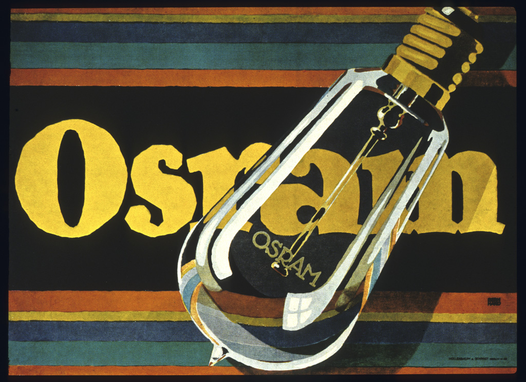
Lucian Bernhard, born Emil Kahn in Stuttgart, Germany, left an indelible mark on the development of modern design, advertising, and culture during the early 20th century. His significant contribution is encapsulated in the iconic poster he designed for the Priester match company in 1906. This creation emerged from a poster competition sponsored by Priester Match, where Bernhard faced the challenge of limited time but relied on instinctual design choices to promote matches.

In this pivotal work, he shifted away from complex illustrations, focusing on symbols and forms to convey the essence of the product. The bold, straight purple typography prominently featured the brand name Priester, while the central element—the matches—was emphasized against a simplified backdrop of flat black.
While this poster marked the beginning of his career, it was merely a prelude to the extensive influence Bernhard would exert in the realms of design, advertising, and beyond. His versatility extended to designing posters, typefaces, packaging, textiles, interiors, and trademarks for numerous companies. Bernhard’s impact reached both the United States and Europe, as he made the significant move from Berlin to America in 1923.

In an era when graphic design and advertising theories were evolving, Bernhard distinguished himself by working predominantly on instinct, declaring, “You see with your eyes, not your brain”. Despite his preference for classic book typefaces in setting text, he created several display typefaces, often bearing his namesake. Among them are notable fonts such as Bernhard Gothic, Bernhard Fashion, Lucian, Bernhard Tango, and Bernhard Brushscript. This amalgamation of innate design sensibilities and a prolific body of work solidifies Lucian Bernhard’s enduring legacy in the history of modern design.
Ludwig Hohlwein, born in Wiesbaden, Germany, in 1874, left an indelible mark on the graphic design landscape, playing a pivotal role in shaping visual arts during the early to mid-20th century. As a self-taught poster artist, Hohlwein cultivated a unique style, drawing inspiration from the collage techniques pioneered by the British Beggarstaff Brothers. His distinctive method involved layering colors, allowing them to dry at different intervals, resulting in compositions where subjects were distilled into colored surfaces and points, forming an intricate network of interlocking shapes within a vibrant and sophisticated color palette.

Hohlwein’s compositions were characterized by a purposeful play with minimal elements—juxtaposing light and dark, foreground and background. Despite the apparent simplicity, the interplay of light and shade hinted at a photographic influence. Throughout his career, Hohlwein masterfully balanced dominant visual elements with typography, utilizing serif, sans-serif, and gothic typefaces thoughtfully matched to the subject at hand. His typography, consistently legible, often formed compact groupings in a square format.
As Hohlwein’s renown and prosperity burgeoned, his artistic pursuits expanded beyond conventional product promotion. He contributed his expertise to various causes, participating in billboard campaigns for the war effort and accepting commissions from the Nazi regime. This period witnessed his design of posters for the NSDAP, the Nazi People’s Welfare, the Winter Relief Fund, air raid campaigns, and the 1936 Olympic Games. Despite the complexities of his affiliations during World War II, Hohlwein’s legacy endures as a versatile artist who adeptly navigated evolving design trends, leaving an enduring imprint on the history of graphic design and visual communication.

In the nascent stages of his career, Hohlwein forged a unique and refined style that remained remarkably consistent over four decades. His compositions, marked by their power, ingenuity, and precision, were intrinsically linked with Munich and Bavaria in southern Germany, showcasing a soft and elegant color palette. Employing the interplay of light and shade to define photographic-quality compositions, Hohlwein demonstrated a profound and intuitive grasp of graphical and architectural principles.
The period spanning 1912 to 1925 represented a zenith in Hohlwein’s career, characterized by the creation of his most notable posters and a distinctive phase in his artistic evolution. Defined by sharply delineated forms, vibrant colors, and an optimistic outlook, this era solidified his standing as the preeminent German commercial artist of his time. By 1925, Hohlwein had already conceived an impressive 3000 different advertisements, leaving a lasting legacy that continues to resonate within the realm of graphic design.
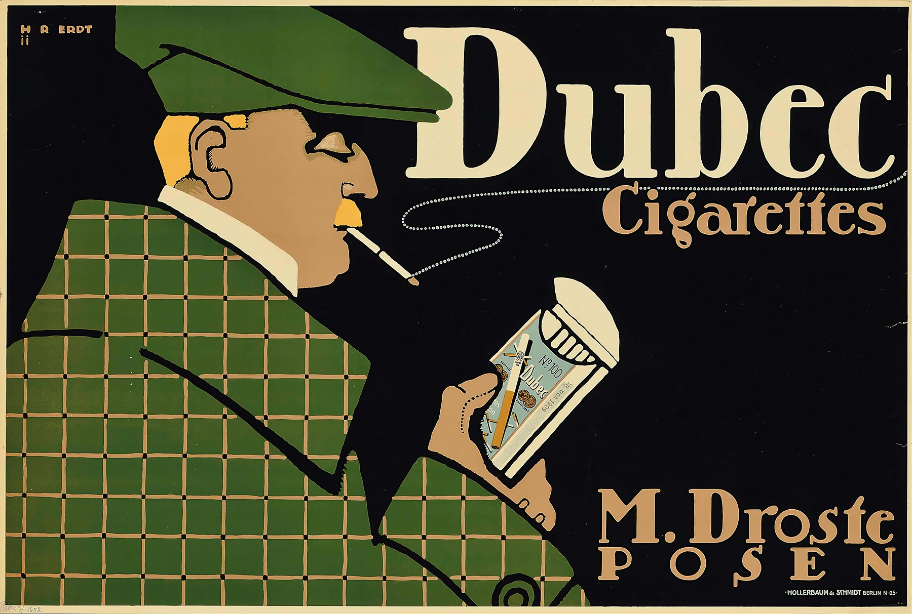
Hans Rudi Erdt (1883–1918), a prominent figure in German graphic design, lithography, and commercial art, left an enduring mark on the Plakatstil movement. His notable contributions during the years between 1906 and 1918, particularly through his association with the esteemed Hollerbaum und Schmidt art printing company, position him as one of the key representatives of German poster art. Erdt, born in Benediktbeuern, Bavaria, initially trained as a lithographer and studied under Maximilian Dasio at the Munich School of Applied Arts. Around 1908, he joined Hollerbaum und Schmidt, becoming a vital part of the influential “Berlin School“.

Erdt’s innovative use of typography in posters set him apart, and he played a crucial role in shaping Plakatstil. His minimalist approach to design, reminiscent of Lucian Bernhard’s style, emphasized flat colors, basic forms, and bold typography. While Erdt shared similarities with Bernhard’s approach, his designs tended to be less literal, focusing less on the specific products being marketed.
He used text as a means to seamlessly introduce a brand name, positioning it as an integral component of the layout that is both boldly striking and aesthetically pleasing. His compositions exhibit a sense of balance and monumentality. In 1912, he crafted the inaugural advertisement for Nivea and conceived the poster titled “Silhouette of Woman“. He belonged to a generation of graphic designers who, for the first time, embraced specialization in commercial art during the late 19th and early 20th centuries.
A standout example of Erdt’s enduring influence on Plakatstil is evident in his advertisement for the nascent racing division of the Opel car manufacturer. Unlike traditional automotive ads, Erdt’s design did not depict the vehicles themselves. Instead, it featured a man wearing driving goggles and a hat, with the brand name positioned both above and below the image. This departure from literal representation showcased Erdt’s ability to communicate brand identity and evoke a sense of lifestyle through symbolic imagery.

Tragically, Hans Rudi Erdt’s promising career was cut short by his untimely death in 1918 during the Spanish flu pandemic. Nevertheless, his contributions to the Plakatstil movement and his innovative use of design elements, especially typography, solidify his place as a key figure in the history of German poster art.
The legacy of early 20th-century graphic design, spearheaded by innovators like Lucian Bernhard, Ludwig Hohlwein, and Hans Rudi Erdt, set a transformative course towards minimalism and clarity that resonates in today’s design ethos. Their pioneering work in Plakatstil introduced a “less is more” philosophy, advocating simplicity, functionality, and the expressive power of form and color. This foundation continues to influence contemporary design, underlining the timeless impact and enduring relevance of their contributions to the visual language and principles of modern graphic art.
Rejecting the elite concept of "art for art's sake," the Russian avant-garde transformed abstract geometry into a tool for mass...
Emerging from the psychological wreckage of World War I, the Dutch De Stijl movement sought to build a utopian society...
Traumatized by the senseless slaughter of World War I, a rebellious group of anti-war artists completely rejected the harmonious design...
By the 1890s, graphic design was lost in a tangled, organic forest of twisting vines and dense Victorian clutter. Discover...
If you open your font menu today, you are looking at centuries of design history. Discover how the raw, heavy...
Long before Gutenberg developed the printing press, the foundations of the modern page were being masterfully engineered in the East....
In the tumultuous early 20th century, marked by a whirlwind of new inventions and a shift from agrarian to urban...
As the twentieth century unfolded, emerging artists sought inspiration beyond the intricate designs of the Victorian era, Art Nouveau, and...
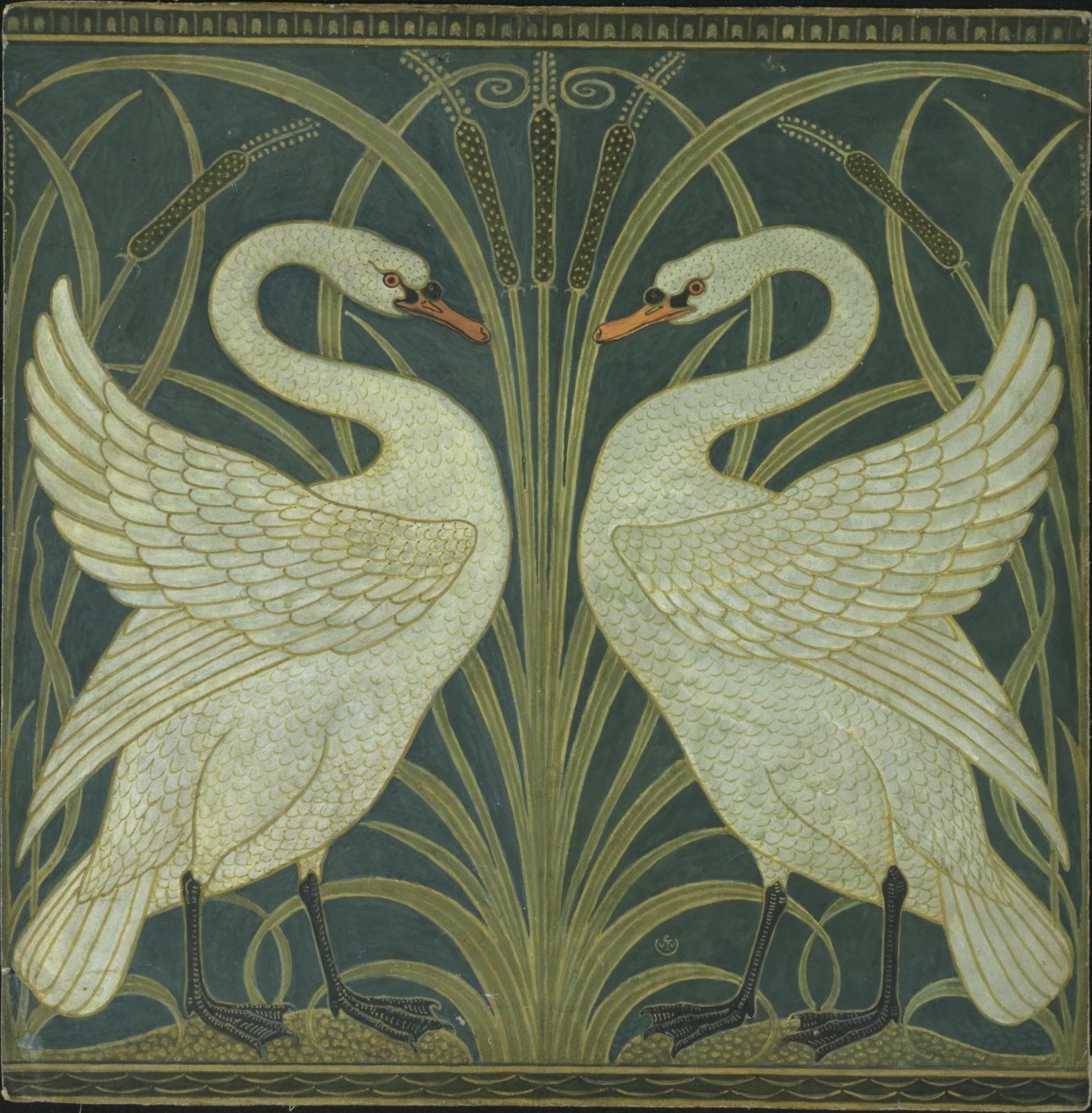
The Art Nouveau movement, which flourished in the late 19th and early 20th centuries, was characterized by its ornamental and...
As the 19th century unfolded, the city of Paris became a hotbed of optimism and creativity, fueled by a confluence...
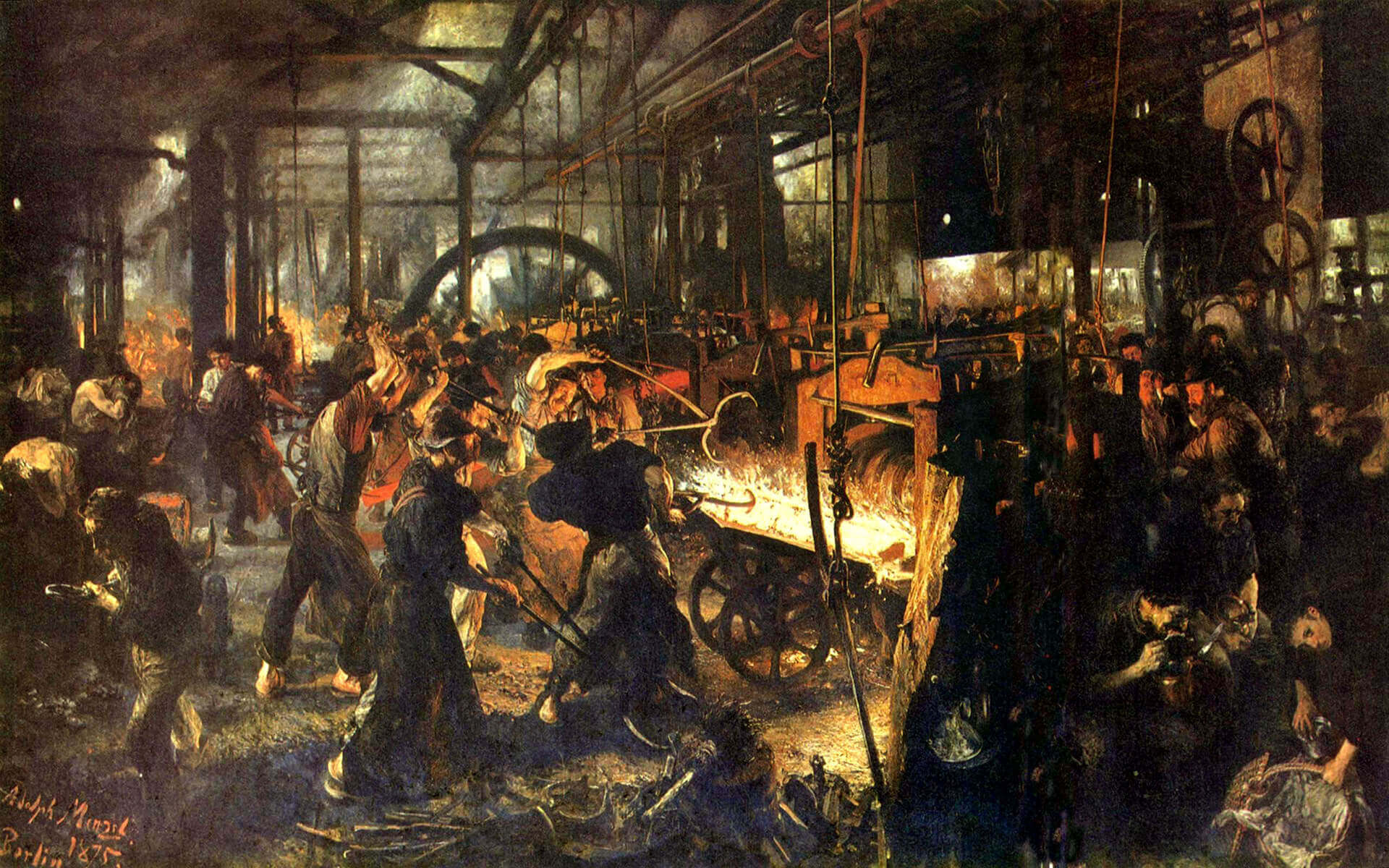
In the mid to late 19th century, the technological change was a big driving force, just like today. The new...
While these developments were happening, the deskilling of the craftsman and manufacturing of mass-produced items, expansion of factories and even...
Before industrialization, things were made in small numbers, carrying the emotions and fingerprints of its creator as a result of...
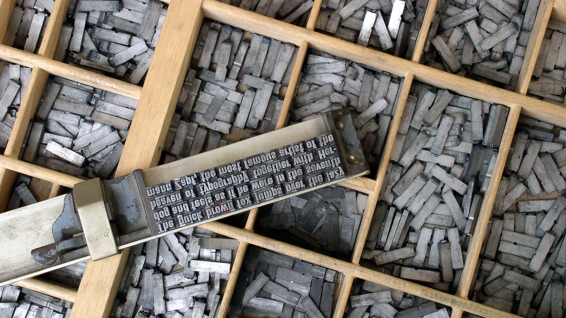
In 1400s AD, after several years of focused experiments, Johannes Gutenberg made the system scalable and led the way for...

The history of graphic design begins with the cave paintings. The prehistoric humans were marking their daily lives or the...

Starting from a simple stone ax, throughout the history we created a man-made environment, to survive and control the world...