American Modernism · Corporate Identity · Graphic Design History
Designing the Corporation: American Modernism and the Rise of Visual Systems
Following World War II, the American economy entered a period of rapid and sustained expansion. The sprawling industrial complexes that had spent years churning out tanks, munitions, and wartime supplies pivoted with astonishing speed to the mass production of consumer goods. In this booming post-war landscape, businesses were no longer local storefronts or even strictly national entities; they were rapidly evolving into massive, multinational corporations.
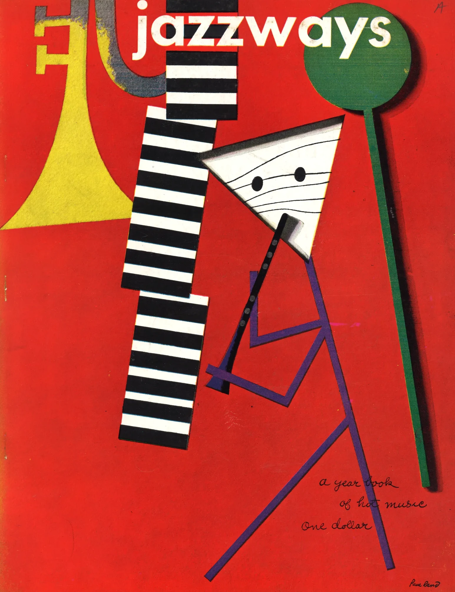
However, as these corporations grew in scale and reach, a critical problem emerged. The old methods of visual communication—disconnected illustrative posters, localized newspaper advertisements, and overly complex, decorative trademarks—were completely insufficient to govern these sprawling behemoths. Divisions within the same company often created their own versions of logos, resulting in a disconnected visual landscape that required systemic order. Rooted in American Modernism, a new generation of designers recognized a shifting reality: graphic design was no longer just commercial art; it was a core function of corporate management. The rallying cry of this new era became a simple but powerful mantra: “Good design is good business“.
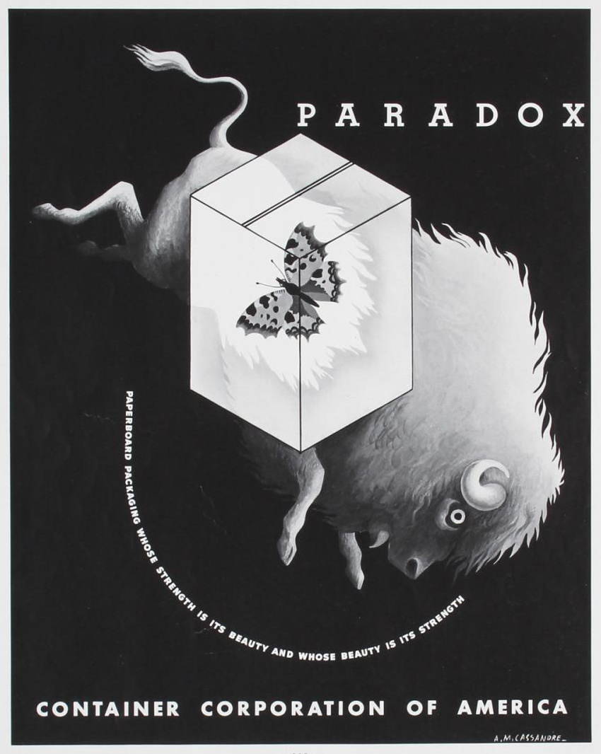
This realization did not happen in a vacuum. The foundations had been laid decades earlier by visionary corporate patrons like Walter Paepcke, a Chicago industrialist who founded the Container Corporation of America (CCA) in 1926. Paepcke was an early advocate who bridged the gap between European modernist ideals and American industrial capitalism. Recognizing that design could serve a pragmatic business purpose while becoming a major cultural thrust, Paepcke provided crucial support to avant-garde artists and designers.
Through brilliant, cohesive advertising campaigns, the CCA demonstrated that research, experience, and talent could be focused into a near-hypnotic visual impact. Paepcke proved that an enlightened corporation could use design not just to sell cardboard boxes, but to project an aura of advanced intelligence and progressive management.
The “Big Idea” and the Television Age
As the post-war economy surged and the television age dawned, the need for a unified, instantly recognizable corporate image became paramount. The catalyst for this transformation was the realization that a mark must endure the fleeting glance of a distracted public, whether speeding by on a highway billboard or flashing across a glowing television screen. The era of the American “Big Idea” was born, characterized by witty, conceptual, and highly simplified marks that stripped away the superfluous in favor of instant recognition.
William Golden’s groundbreaking work for the Columbia Broadcasting System (CBS) stands as the quintessential example of this shift. By designing the iconic CBS “Eye” logo in 1951, Golden created an exemplary, unified image that could represent the entire broadcasting corporation across a myriad of platforms. Inspired by hex symbols painted on Pennsylvania Dutch barns, the “Eye” was not just a drawing; it was an identity—a symbol that projected CBS’s vision and authority directly into the living rooms of millions. Often superimposed over a cloud-filled sky, it symbolized the awesome power of projected video images.

Concurrently, industrial designers like Raymond Loewy were proving that simplified marks possessed an enduring, almost architectural power. Loewy’s redesigns for brands like Lucky Strike, Shell, and Exxon demonstrated that a brand’s essence could be distilled into pure, graphic impact. In 1939, Loewy simplified the cluttered Lucky Strike package by placing the bold, target-like logo on both sides, ensuring its recognition from any angle.
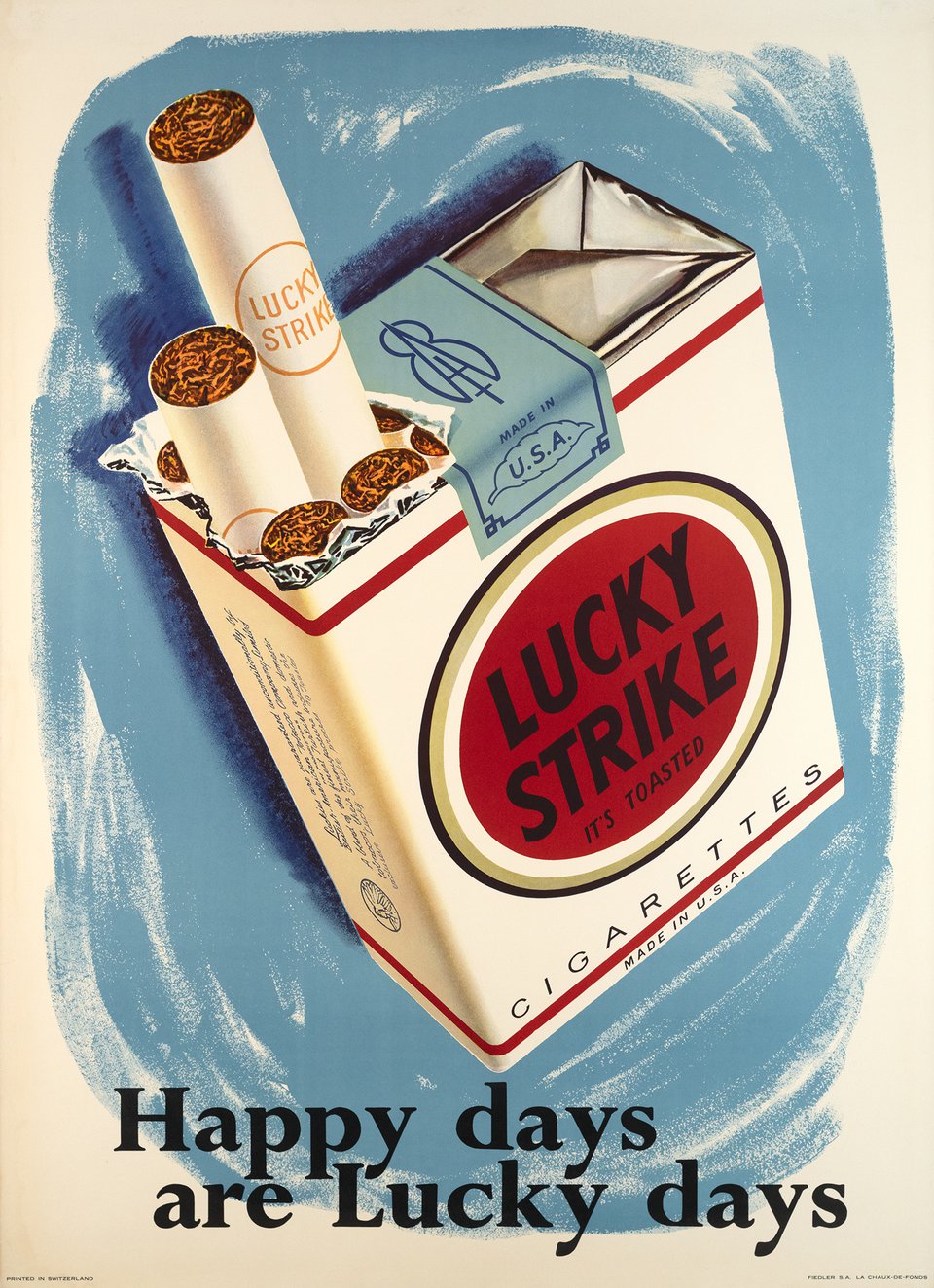
Loewy initiated a study of his audience to define their needs, developing his MAYA (“Most Advanced Yet Acceptable”) credo. He understood that a successful corporate mark required a very high index of visual retention. These designers proved that less was indeed more, and that the modern corporation required a streamlined face that could endure the rigorous test of time.
Paul Rand and the “True Gestalt”
While Golden and Loewy helped initiate this shift, it was Paul Rand who synthesized it into a comprehensive methodology. Rand masterfully synthesized the avant-garde principles of European modernism—from De Stijl’s geometric purity to Constructivism’s structural rigor—and forged them into a distinctly American language of capitalism. His monumental overhauls of corporate giants like IBM, Westinghouse, and ABC redefined the very nature of corporate identity.
Rand believed that a trademark must be memorable, highly legible, and, above all, a “true gestalt”. In his own words, a symbol must be designed so that it can be used in many sizes and situations without losing its core identity. “There is no part of a symbol that can be eliminated without destroying the image it creates,” Rand argued. “It is a true gestalt, in which the psychological effect of the total image is greater than the sum of its parts would indicate“.
His evolution of the IBM logo perfectly illustrates this concept. Moving from a heavy, geometric slab-serif typeface called City Medium, Rand transformed the letters into a powerful and unique alphabet image. In the 1970s, he updated the logo by introducing his famous scan-line stripes to unify the three letterforms and evoke the rhythm of video terminals. But Rand’s genius lay in his ability to make the abstract playful and engaging. His famous 1981 “Eye Bee M” poster proved that he was prepared to divert from the rigid original logo when a design concept called for conceptual wit, translating a massive corporate monolith into an approachable, delightful riddle.

Rand’s touch extended far beyond IBM. For the American Broadcasting Company (ABC), Rand reduced the information to its absolute essence: a lowercase, geometrically pure sans-serif typeface encased in a simple black circle, a mark so enduring it has remained largely unchanged for decades.

For Westinghouse, he created a mark based on a dynamic arrangement of lines and circles that looked as though it could be constructed in an animated film sequence.

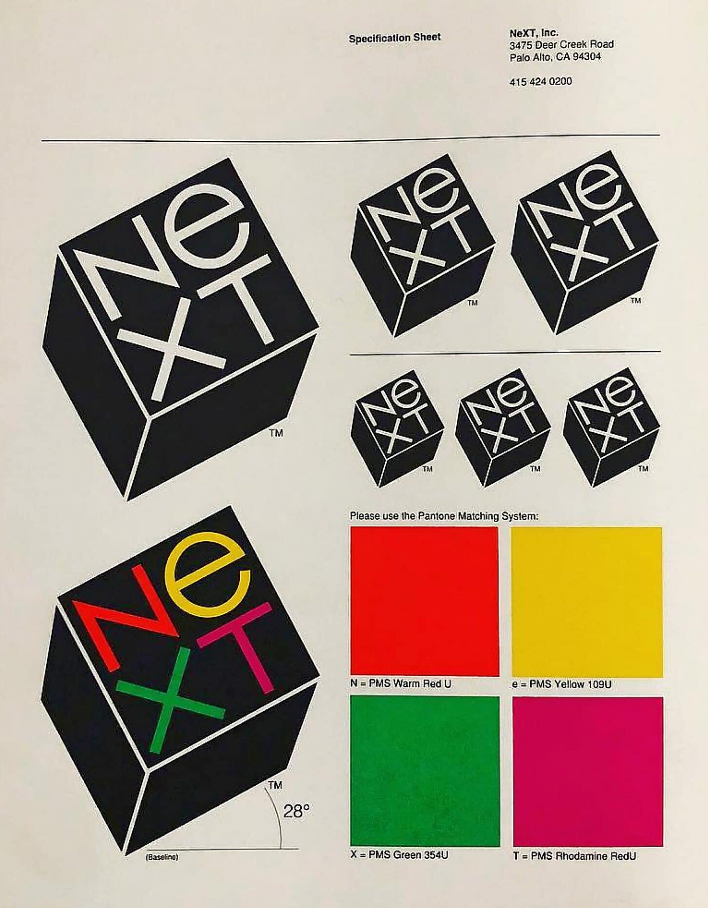
And later, for Steve Jobs’s NeXT computer, he tilted a black box at a twenty-eight-degree angle, separating a common four-letter word into two lines to startle the viewer with an uncommon image. Rand proved that a corporate mark could be mathematically structured, yet brimming with conceptual brilliance.
The Invention of the Corporate Rulebook
Yet, designing a brilliant mark was only the first step. As these corporations expanded globally, designers realized that a logo left unprotected would soon be mangled by varying printers, rogue local managers, and wildly diverse material applications. A great mark isn’t enough; you need strict rules to protect it. This necessity led to the invention of the corporate design manual.
When Lester Beall, alongside Richard Rogers, designed the identity for the International Paper Company in 1960, he created a mark of fundamental simplicity. By combining the company’s initials with an upward arrow and a stylized tree, he forged a triangle within a circle—a mark of timeless harmony engineered specifically to survive crude stenciling onto heavy forest products.
But Beall’s most lasting contribution to the design world was the pioneering corporate design manual that accompanied it. Beall’s manuals meticulously prescribed the permissible uses and the strictly forbidden abuses of the trademark. If a plant manager in a small, distant town retained a local sign painter to recreate the logo, the corporate design manual explicitly specified the exact proportions and placement, ensuring absolute uniformity across the globe. Designers had stopped simply drawing logos; they were now writing comprehensive visual systems.

This systematic, highly regulated approach was further validated in 1960 by the firm Chermayeff & Geismar when they designed the corporate identity program for Chase Manhattan Bank. They proved that a completely abstract, geometric form could achieve massive, worldwide public recognition. Their new logo was composed of four geometric wedges rotating around a central square to form an external octagon, completely free from alphabetic or literal pictorial reference. By relentlessly applying the mark with strict consistency across every conceivable surface, they built recognition value through systematic “visual redundancy”. The abstract octagon became an additional character in the visual inventory of the public mind. The foundation of the corporate visual rulebook had been firmly established, fundamentally changing how global institutions communicate.

The Need for Absolute Objectivity
The American Modernism had successfully tamed the wild frontier of mid-century commerce with witty, conceptual visual systems and rigorous corporate manuals. Through the genius of designers like Paul Rand, Lester Beall, and William Golden, they had proven that good design could effectively organize the chaos of the post-war economic boom, elevating the corporate mark into a highly regulated true gestalt.
However, as international trade expanded further and information systems grew even more complex, the clever subjectivity of the American “Big Idea” was no longer enough. The globalizing world demanded a rigorous objectivity that transcended cultural nuances and personal artistic expression. While American designers were conquering the boardroom with conceptual wit, a group of designers in Switzerland was quietly developing a purely mathematical, emotionless grid system. This relentless pursuit of structural purity would soon cross the ocean, becoming the ultimate, universal standard for multinational corporations everywhere.
More writing
The Architecture of Information: Swiss Design and the Grid
After World War II, a rapidly globalizing world needed a universal visual language that could cross borders without cultural misunderstandings. Explore how the pioneers of Swiss Design stripped…
Art Directing America: The Golden Age of Editorial Design
In the post-war era, American art directors broke free from traditional grids to turn the printed page into a cinematic, cultural experience. Explore how the visionary minds of…

Art Deco: Streamlined Glamour
Following the strict, functional rules established by the Bauhaus, the Roaring Twenties demanded a visual language that was fast, luxurious, and aerodynamic. Discover how Art Deco designers repackaged…