Selling the War: How Graphic Design Mobilized Nations
During the global conflicts of the 20th century, graphic design was mobilized as a powerful weapon of mass communication. Explore...
In 1914, the outbreak of the First World War forced the world’s great powers—Britain, France, Russia, Germany, and Austria-Hungary—into a massive communication crisis. Almost overnight, governments urgently needed to recruit millions of volunteers, raise staggering sums of money to finance the war machine, and convince the public that the impending bloodshed was a righteous and winnable cause.
At the dawn of the conflict, widespread radio, television, and the internet did not exist. Instead, the military leadership relied on the rapidly advancing technological landscape of the printing industry. Thanks to leaps in color lithography achieved during the Belle Époque, cost-efficient mass printing was readily available to blanket the cities of the world.
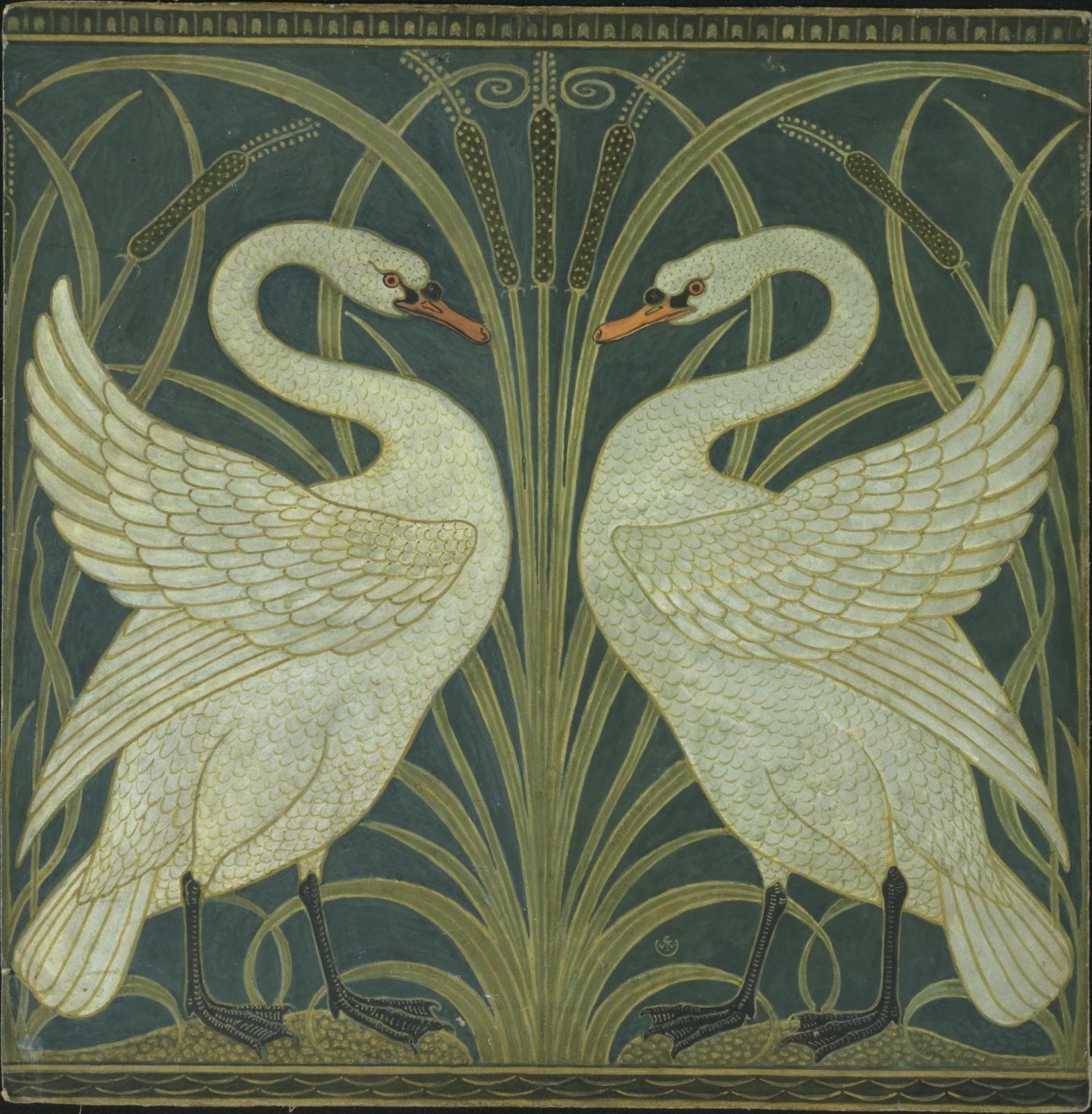
The printed poster and using it for Propaganda became the undisputed king of mass communication. Functioning as the radio, television, and internet combined, graphic design was deployed to the front lines. The aesthetic explorations of Art Nouveau and the Arts and Crafts movements were abruptly set aside, and the poster was mobilized to alter public psychology on a global scale.
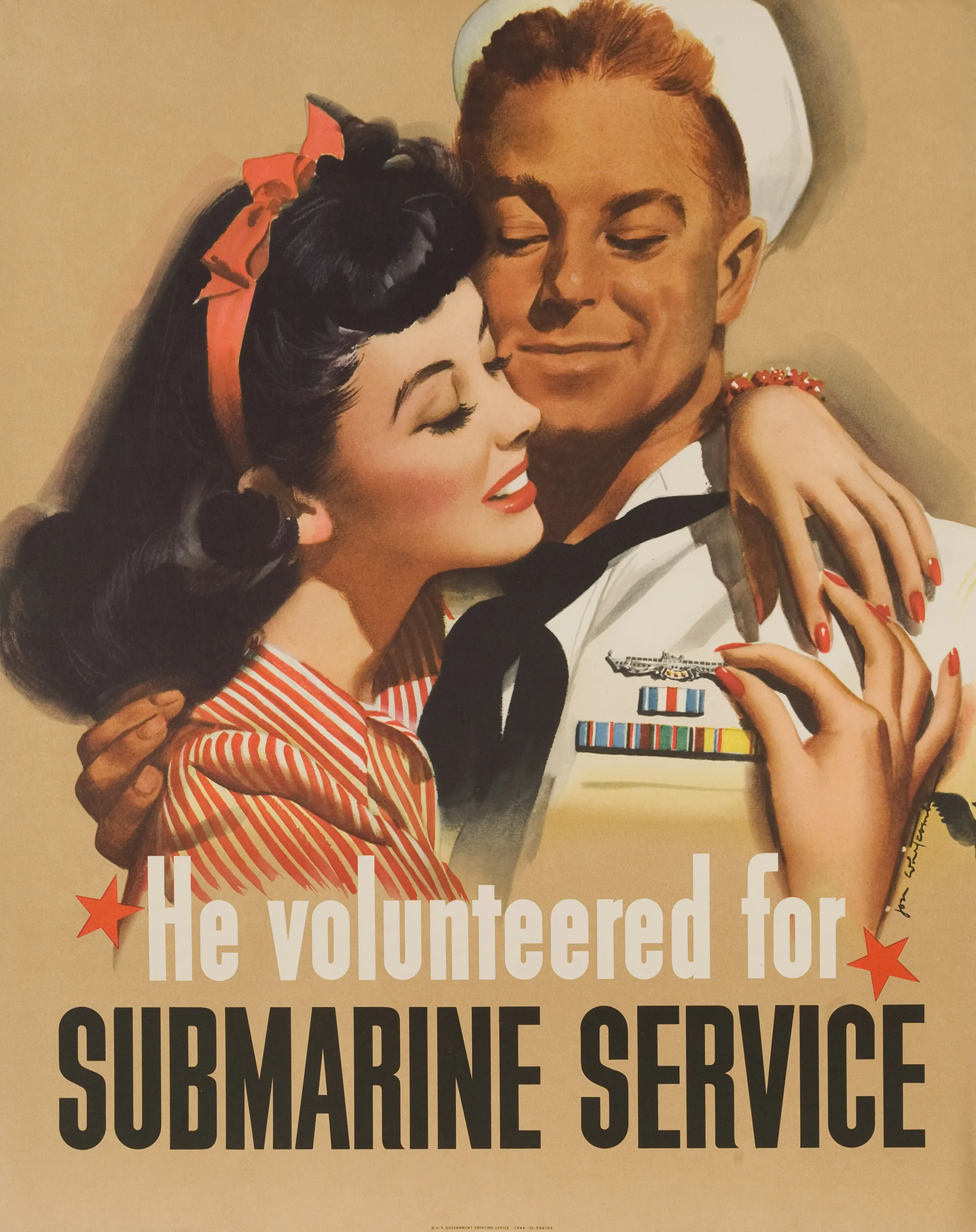
The Allied forces, particularly Great Britain and the United States, approached this unprecedented communication challenge through the lens of traditional, narrative realism. Instead of pushing aesthetic boundaries, the British, French, and American governments favored literal illustrations that appealed directly to emotion, patriotism, and traditional societal roles.

British posters frequently relied on messages of home, family, and masculinity, effectively utilizing guilt as a psychological tool. Consider Savile Lumley‘s famous 1914 poster, “Daddy, what did YOU do in the Great War?“. It depicts a comfortable father sitting in an armchair after the war, staring blankly as his children ask him about his military service. This was calculated emotional blackmail, directly questioning a man’s honor and masculinity if he chose to stay safely at home rather than enlist.

The Allies also perfected the confrontational gaze. Alfred Leete‘s iconic 1914 design featuring Lord Kitchener, the British Secretary of War, pointing a stern, oversized finger directly at the viewer above the text “Wants YOU“, set a formidable new standard for mass persuasion.

When America entered the conflict, the illustrator James Montgomery Flagg adapted this exact pointing-finger composition for an American audience. His 1917 poster, “I Want You for U.S. Army“, featured a self-portrait of Flagg dressed as a commanding Uncle Sam. Unlike the British designs, the American posters were stark, direct, and straightforward. Uncle Sam looks directly into the eyes of the public and commands them to act. Over four to five million copies were printed and distributed across the country, making it one of the most widely reproduced posters in human history.
These literal designs lacked avant-garde sophistication, but they proved the raw, undeniable power of direct psychological manipulation.
Across the trenches, the Central Powers took a radically different aesthetic path. Instead of the sentimental, illustrative realism of the Allies, German and Austro-Hungarian designers relied on the reductive simplicity of Plakatstil (the poster style). Continuing the structured traditions of the Vienna Secession, this approach integrated words and images into simplified, powerful shapes. Pioneered by figures like Lucian Bernhard and Hans Rudi Erdt, Plakatstil utilized flat areas of color, bold typography, and stark pictographic symbols.

Bernhard’s 1915 poster for the Seventh War Loan campaign is a masterpiece of this cold, calculated philosophy. In an almost primeval expression of ancient Germanic spirit, he depicted a clenched fist enclosed in medieval armor, thrusting outward against a stark background of bold, Gothic typography.

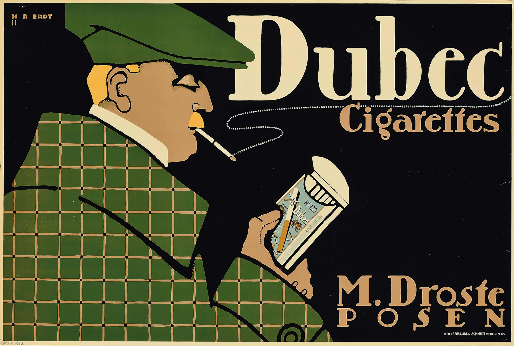
Similarly, Hans Rudi Erdt’s poster U-Boats Out! (c. 1916) used the massive, structural shape of a sans-serif “U” to frame an abstract, stylized submarine commander, integrating the image and hand-drawn text into one unified message.

Designer Julius Klinger employed flat symbols to express complex ideas, such as using eight arrows piercing a wounded dragon to represent the nation’s eighth bond drive. The German approach demonstrated that complex political ideas could be distilled into bold, abstract visual signs. They were aesthetically brilliant, tightly composed, and visually striking. Yet, despite their formal perfection, this abstraction lacked realism and ultimately failed to carry the deep, visceral emotional impact of the Allies’ pointing fingers and weeping children.
By the time the Second World War erupted, the global aesthetic battle lines had shifted dramatically. In Nazi Germany, the propaganda machine controlled by Joseph Goebbels deliberately rejected the avant-garde modernism of the 1920s. Seeking to project a narrative of Aryan supremacy and vilify enemies, Hitler preferred traditional, idealized, heroic realism.
The Allies, conversely, embraced the very European modernism that the fascist regimes had attempted to crush. As visionary designers fled the chaos of Europe for the United States, they brought with them the advanced visual languages of cubism, constructivism, and the Bauhaus. During the war, the U.S. Office of War Information recognized the communicative power of these movements and commissioned artists to create intense, modernist graphic statements.

The French immigrant Jean Carlu designed one of the era’s most powerful pieces: America’s Answer! Production (1942). Carlu interlocked a massive steel wrench and a stylized, geometric hand into a single, undeniable symbol of industrial labor and urgency.

The social realist Ben Shahn created the haunting “This is Nazi brutality” (1943). By placing a rough, agonizing sketch of a shackled figure against a stark backdrop resembling an urgent telegram, Shahn bypassed traditional sentimental illustration. Instead, he relied on a documentary-like visual harshness to deliver a chilling, immediate punch to the American public.

Other designers, like E. McKnight Kauffer, combined classical symbols—such as Hermes, the Greek messenger of the Gods, or ancient Spartan warriors—with the American flag to create potent graphic symbols of Allied unity.
The Allies had learned that modernism wasn’t just an intellectual exercise for avant-garde galleries; it was an incredibly powerful tool for democratic defense, prioritizing intense visual forms and raw urgency over the sentimental illustration of the previous war.
The two global conflicts of the early twentieth century functioned as a massive, tragic proving ground for graphic design. Over three decades, governments had successfully manipulated mass psychology on an unprecedented scale, rallying millions of troops, managing food conservation, and raising billions of dollars using nothing but ink, paper, and targeted visual strategy.
Once peacetime returned, this raw persuasive capacity did not simply vanish. Instead, the designers, the mass-printing technologies, and the psychological tactics were demobilized and handed directly to commerce. The consumer boom of the post-war era inherited a mature, highly effective communication machine. To harness this immense power in a modern, industrial world—and to cure the psychological hangover of global conflict—designers realized they needed a new, objective system of order. They needed universal rules for visual harmony to rebuild society from the ashes of war.
That search for absolute, rational structure leads us directly to 1919 and the ultimate laboratory of modern design: The Bauhaus.
During the global conflicts of the 20th century, graphic design was mobilized as a powerful weapon of mass communication. Explore...
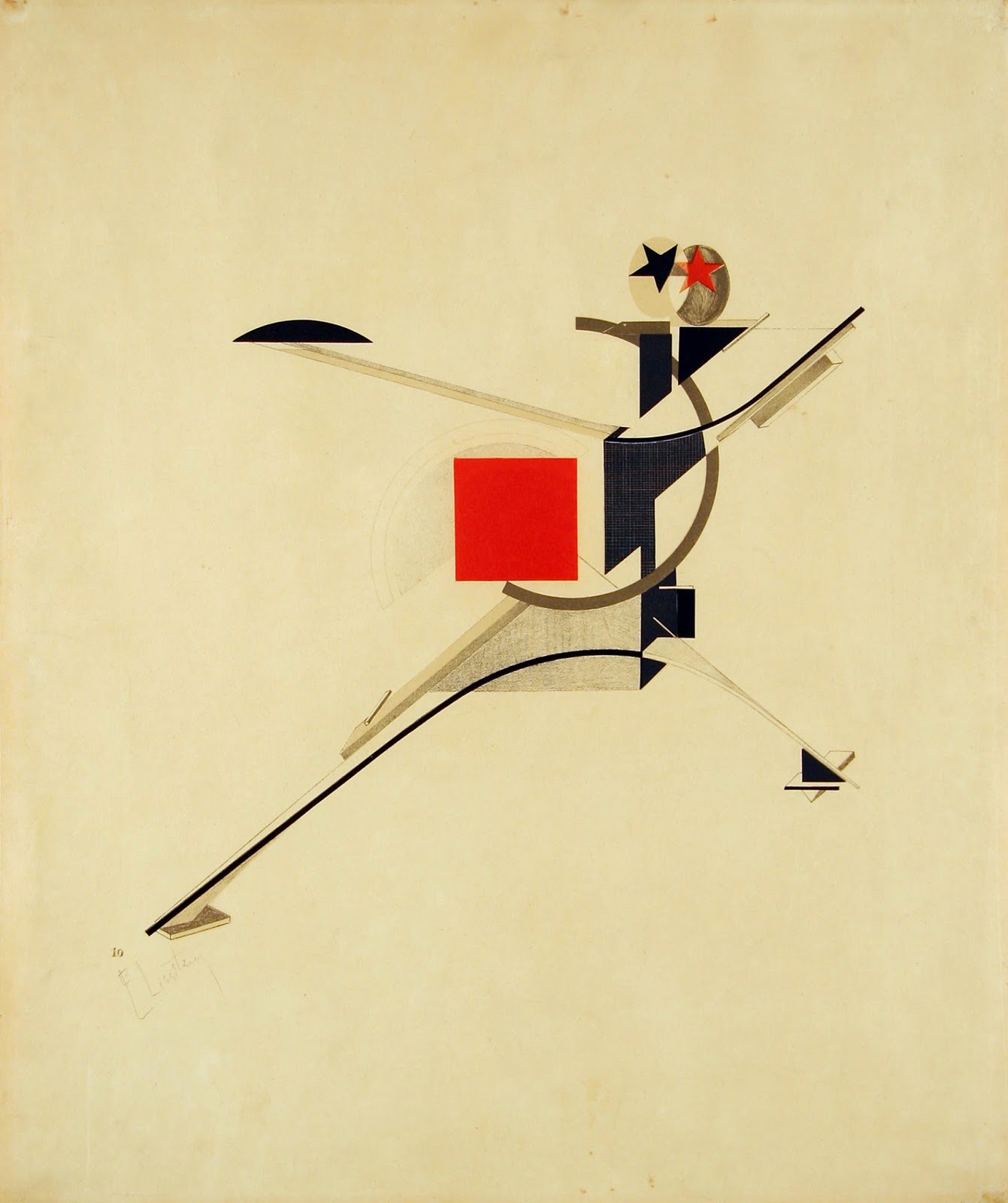
Rejecting the elite concept of "art for art's sake," the Russian avant-garde transformed abstract geometry into a tool for mass...
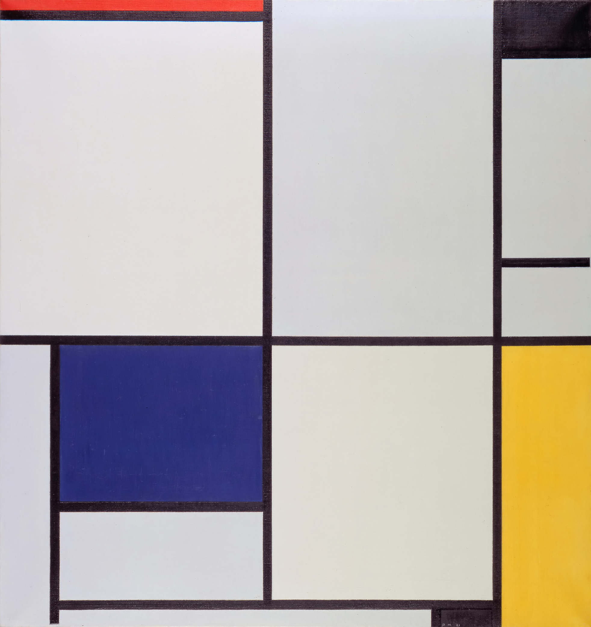
Emerging from the psychological wreckage of World War I, the Dutch De Stijl movement sought to build a utopian society...
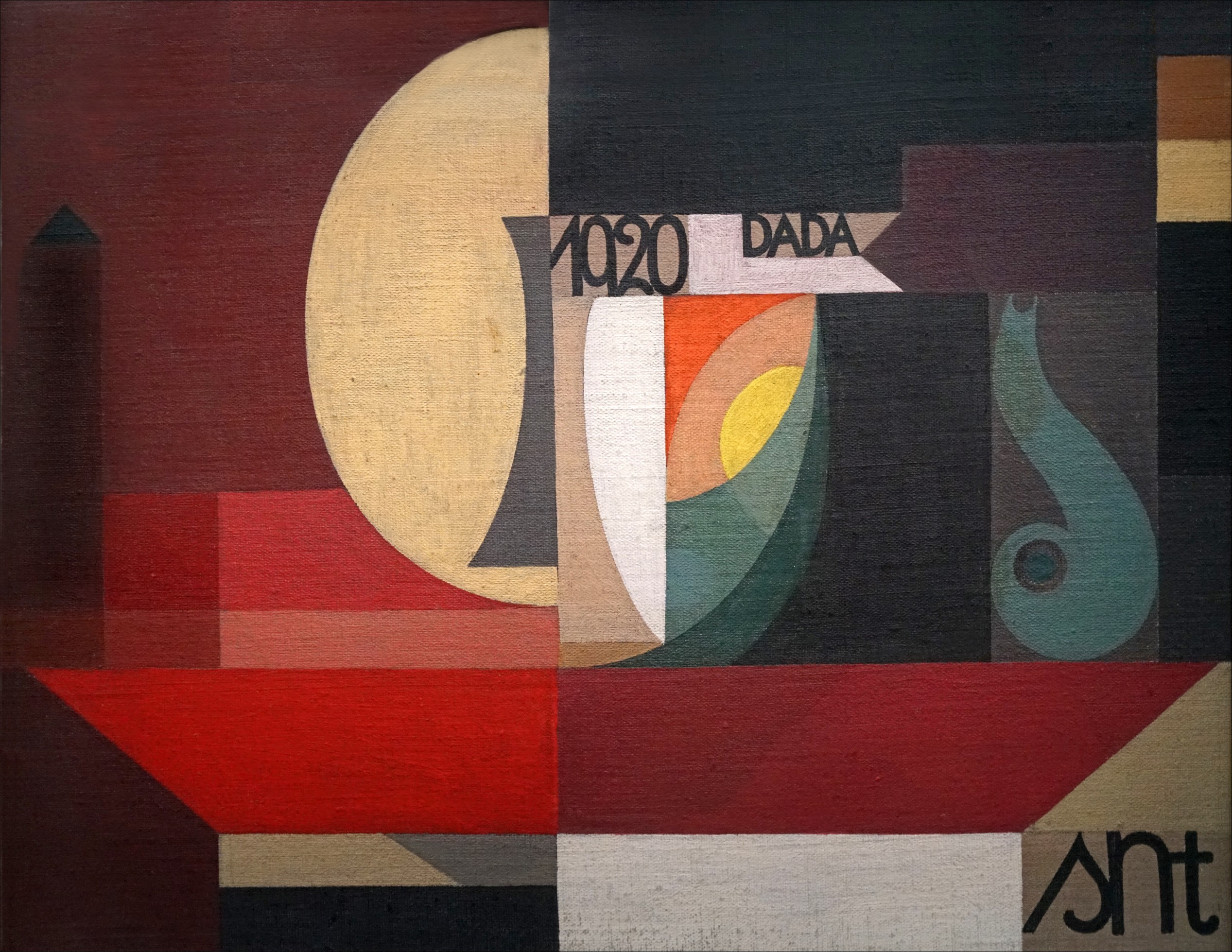
Traumatized by the senseless slaughter of World War I, a rebellious group of anti-war artists completely rejected the harmonious design...
By the 1890s, graphic design was lost in a tangled, organic forest of twisting vines and dense Victorian clutter. Discover...
If you open your font menu today, you are looking at centuries of design history. Discover how the raw, heavy...

Long before Gutenberg developed the printing press, the foundations of the modern page were being masterfully engineered in the East....
In the tumultuous early 20th century, marked by a whirlwind of new inventions and a shift from agrarian to urban...
As the twentieth century unfolded, emerging artists sought inspiration beyond the intricate designs of the Victorian era, Art Nouveau, and...
The Art Nouveau movement, which flourished in the late 19th and early 20th centuries, was characterized by its ornamental and...
As the 19th century unfolded, the city of Paris became a hotbed of optimism and creativity, fueled by a confluence...
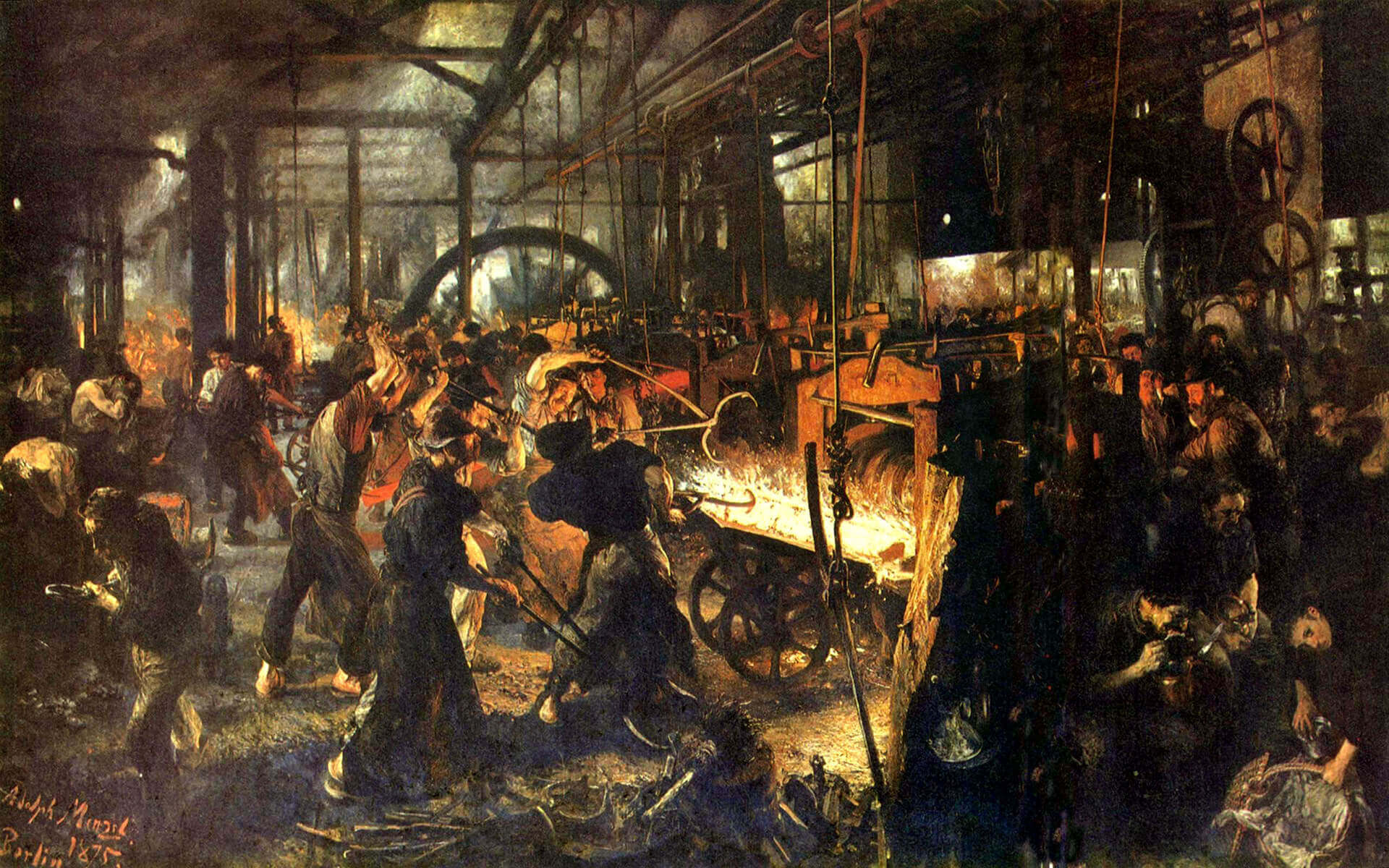
In the mid to late 19th century, the technological change was a big driving force, just like today. The new...
While these developments were happening, the deskilling of the craftsman and manufacturing of mass-produced items, expansion of factories and even...
Before industrialization, things were made in small numbers, carrying the emotions and fingerprints of its creator as a result of...
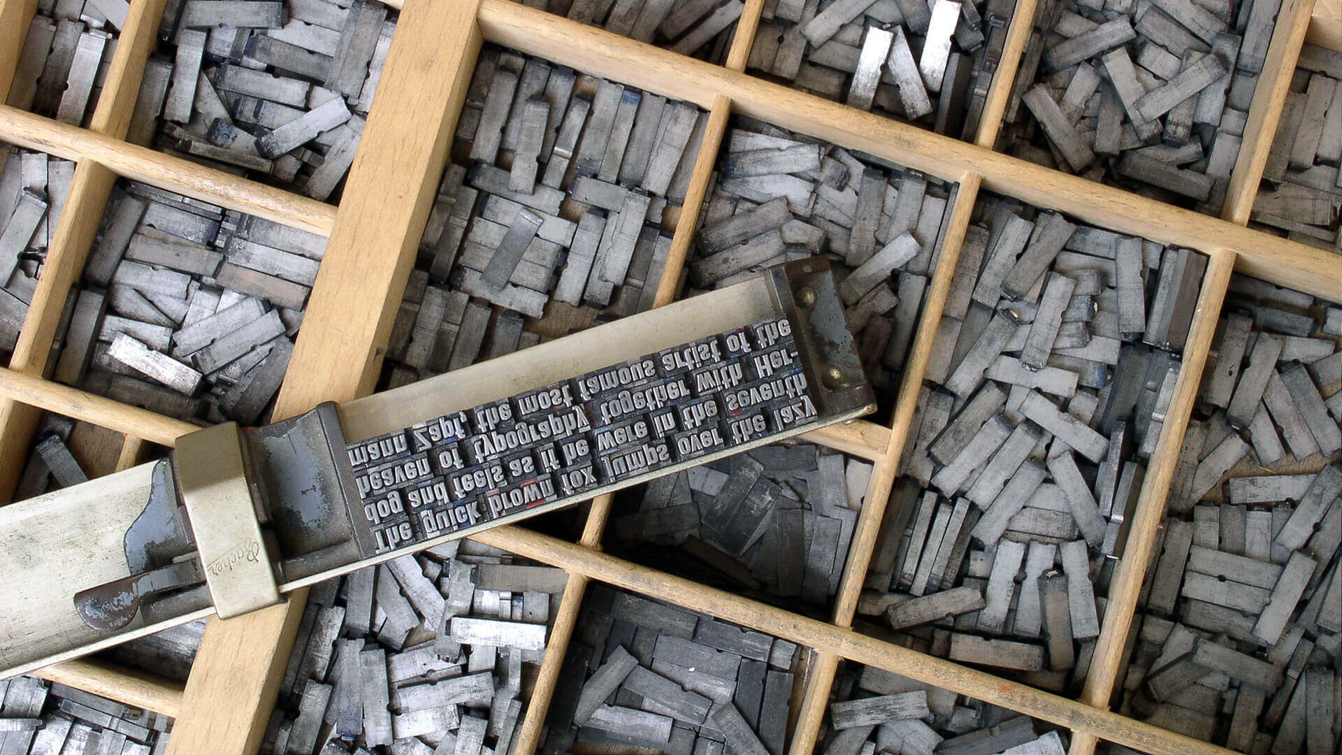
In 1400s AD, after several years of focused experiments, Johannes Gutenberg made the system scalable and led the way for...

The history of graphic design begins with the cave paintings. The prehistoric humans were marking their daily lives or the...

Starting from a simple stone ax, throughout the history we created a man-made environment, to survive and control the world...