Designing the Corporation: American Modernism and the Rise of Visual Systems
In the post-war era, American businesses rapidly evolved into massive multinational corporations that demanded rigorous visual order. Explore how modernist...
By the 1890s, graphic design was lost in a tangled, organic forest of twisting vines and dense Victorian clutter. Discover how a rebellious group of Scottish students and Austrian artists completely rejected nature’s chaotic curves to invent the modern design grid, the square page format, and the world’s very first unified lifestyle brand.
Reacting against the chaotic, organic curves of Art Nouveau, visionary designers in Scotland and Austria pioneered a new visual language of geometric precision, modular grids, and unified branding that laid the foundation for modern graphic design.
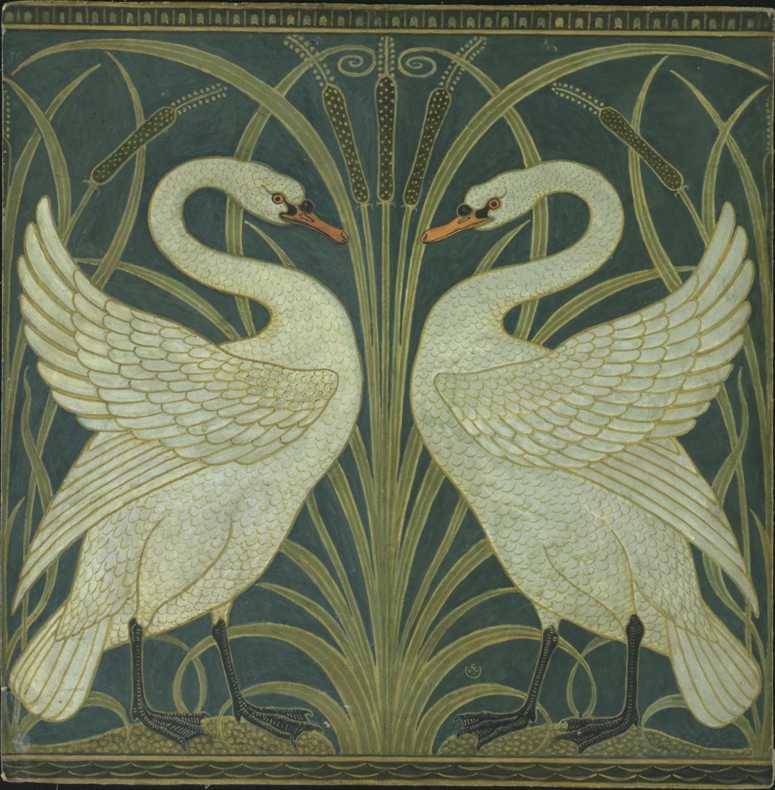
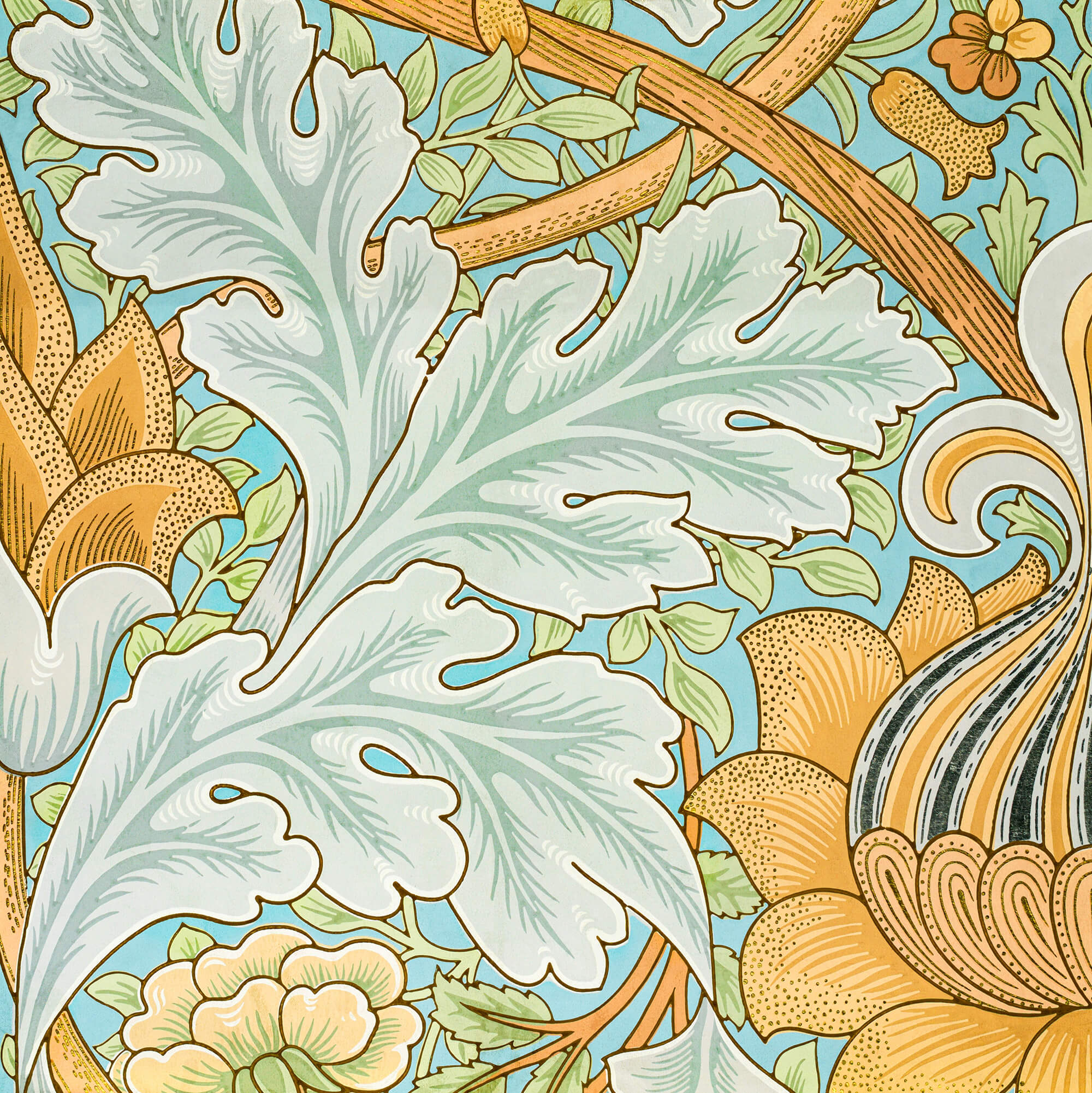
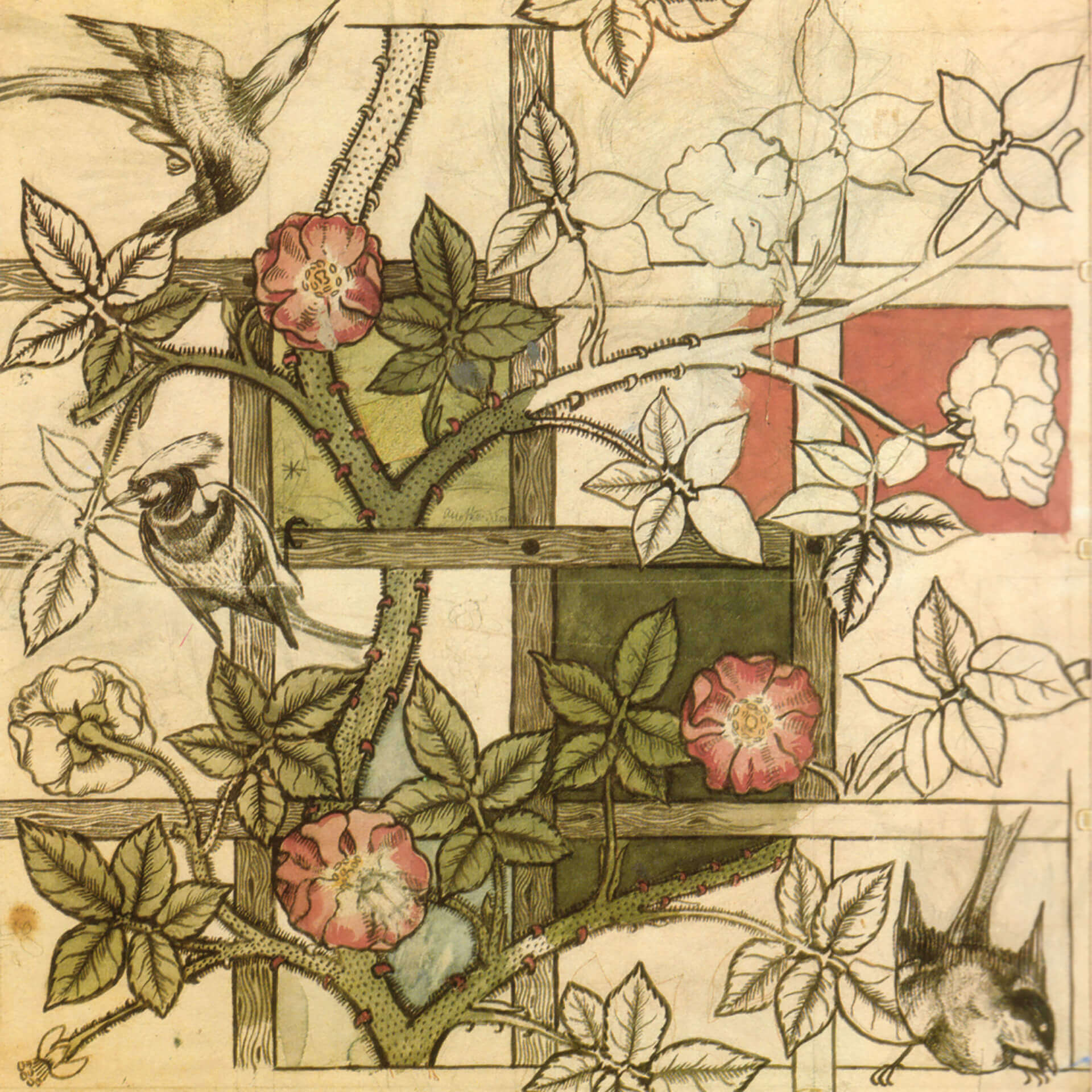
As the 19th century drew to a close, the design world was a tangled, organic forest. In England, the Arts and Crafts movement led by William Morris was covering every available surface with dense, intertwining floral patterns. In Paris, the Art Nouveau movement was celebrating the “whiplash” curve, creating posters filled with flowing hair, twisting vines, and asymmetrical chaos.
But as the 20th century rapidly approached, the modern, industrialized world demanded a new visual order. The heavy, romantic clutter of the Victorian era and the serpentine vines of Art Nouveau no longer reflected the realities of an increasingly mechanized society. A new generation of designers realized that the future of visual communication required structure, empty space, and mathematical precision.
Here is how a rebellious group of Scottish students and Austrian artists rejected nature’s curves to invent the modern design grid, the square format, and the world’s first unified lifestyle brand.
To understand the sheer shock of the modern grid, you have to look at what it replaced. By the 1890s, the dominant graphic styles in Europe were entirely based on historical mimicry or organic, plant-like lines. Printers and illustrators treated the page as a canvas to be filled completely, twisting and bending typography to fit inside complex borders.

But a fundamental shift was occurring in the minds of young artists. The approaching 20th century was the era of the machine, of speed, and of new, towering architecture. They began to question why graphic design and typography should look like a medieval garden. They sought a new visual language that could organize information rather than just decorate it. A profound aesthetic shift was brewing. The shift from the fluid, organic curve to the clean, straight line did not happen overnight, but its first major breakthrough occurred in a surprisingly gloomy, rain-swept city in the north.
In the early 1890s, four students at the Glasgow School of Art struck up a friendship that would permanently alter the trajectory of modern design. This group—architect Charles Rennie Mackintosh, designer J. Herbert McNair, and the artist sisters Margaret and Frances Macdonald—became widely known as The Four.
To the traditional British art establishment, their work was so haunting, elongated, and highly stylized that critics dismissively dubbed them the “Spook School”. But the critics were missing the point entirely. The Four were actively tempering the wild, flowing curves of Art Nouveau with a strong, imposing rectilinear structure.

Their hallmark aesthetic was an extreme, rising verticality. In Mackintosh’s towering 1896 poster for The Scottish Musical Review—which stands a massive 2.5 meters tall—complex overlapping planes are unified by flat colors and strict vertical lines. The human figure is abstracted into a geometric symbol rather than a realistic illustration. Furthermore, The Four completely reimagined the use of negative space. Rather than viewing white space as empty background to be filled with decoration, they used it as an active structural element to direct the viewer’s eye and create visual hierarchy.

Nowhere was their synthesis of nature and geometry more obvious than in the iconic “Mackintosh Rose”. By taking the fluid, organic shape of a blooming rose and reducing it to a series of stylized, geometric arcs and circles, they created a powerful visual metaphor. They were capturing the essence of the natural world but forcing it into a modern, structured grid.

While The Four were celebrated on the European continent, their work was often ignored back home in Britain. However, their geometric experiments found a wildly receptive audience in Austria.
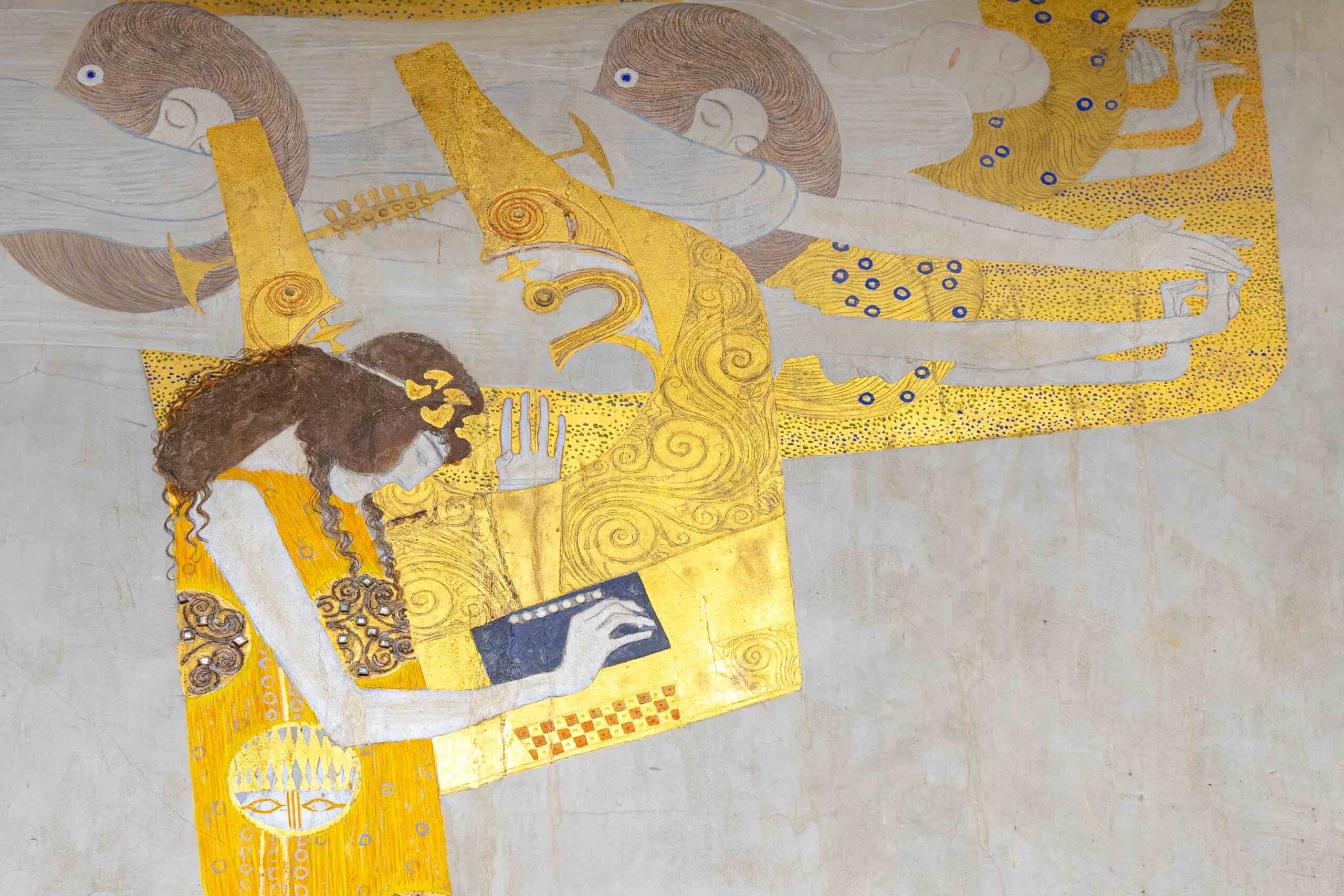
In April 1897, a group of young, visionary artists led a dramatic walkout from the traditional Viennese Creative Artists’ Association. Disgusted by the suffocating historical styles of the academy, painters like Gustav Klimt and Koloman Moser, along with architect Josef Hoffmann, resigned to form their own avant-garde movement: the Vienna Secession. Their battle cry was clear: “To every age its art, to every art its freedom.”
The Secessionists traded the organic, floral curves of French Art Nouveau for the mathematical purity of flat shapes, circles, and, most importantly, the square. For these Austrian designers, the geometric grid became a rebellious manifesto against the establishment.

You can see this immediate shift in Gustav Klimt’s poster for the First Secession Exhibition in 1898. To symbolize the rebellion, Klimt drew the Greek goddess Athena watching Theseus deliver the deathblow to the Minotaur. But the true revolution was in the layout. Klimt used a massive, unprecedented block of open negative space in the center of the poster, pushing the typography into a strict architectural column at the bottom. The grid had officially arrived in Central Europe.
To spread their revolutionary aesthetic, the Secessionists launched an official magazine in 1898 called Ver Sacrum (Sacred Spring). It quickly became the ultimate laboratory for modern editorial design.
Ver Sacrum was completely unprecedented, starting with its physical shape. Instead of a traditional vertical rectangle, the magazine was designed in a striking square format (originally 29.5 by 28.2 centimeters). This square page allowed the Secessionist designers, particularly Koloman Moser and Alfred Roller, to experiment with modular grids and flawless mathematical proportions.

The magazine featured breathtaking production values. It included original etchings, lithographs, bold geometric rules, and experimental typography printed in metallic gold, muted browns, and vibrant blues. More importantly, the designer of each issue controlled the total page environment. Text, illustration, and negative space were no longer treated as separate elements haphazardly pasted together by a printer; they were harmonized into a single, cohesive architectural structure. Ver Sacrum effectively invented the modern editorial layout.
As the new century dawned, Koloman Moser and Josef Hoffmann realized that their geometric design principles did not have to be restricted to gallery walls or magazine pages. With backing from an industrialist named Fritz Wärndorfer, the two men founded the Wiener Werkstätte (Vienna Workshops) in 1903.
The Wiener Werkstätte’s goal was to offer an alternative to poorly designed, mass-produced factory goods by applying the Secessionist grid to every single aspect of daily life. Hoffmann and Moser designed architecture, furniture, metalwork, jewelry, textiles, and printed matter. Everything they produced was unified by a strict adherence to harmonious proportion, clean lines, and geometric construction.
In doing so, they created the ultimate Gesamtkunstwerk (total work of art). But from a graphic design perspective, they accomplished something even more historic: they invented the modern corporate identity.

The Wiener Werkstätte registered a trademark featuring a beautiful, geometric “WW” monogram. This logo was stamped onto their products, printed on their stationery, and integrated into their highly structured advertising. Long before modern tech companies or fashion houses figured out how to brand an entire ecosystem of products, these Austrian designers built the blueprint for the unified corporate lifestyle brand.
By the end of the first decade of the 20th century, the designers in Glasgow and Vienna had successfully re-engineered the visual world. They had bridged the gap between the messy clutter of the Victorian era and the clean, rational functionalism of modernism. Through their pioneering use of the modular grid, structural negative space, and unified visual identity, they mapped out a beautiful, mathematically perfect design universe.
But this era of golden perfection was about to be abruptly shattered.
As the calendar turned toward 1914, the technological machines that these designers had hoped would build a harmonious new society were instead turned toward mass slaughter. World War I shattered the optimism of the European continent. The logical, orderly grid of the Vienna Secession could no longer explain a world that had seemingly gone mad.
In our next post, Dadaism: The Art of Chaos, we will explore how a new generation of traumatized, pacifist artists completely rejected this mathematical perfection, weaponizing scissors, glue, and visual nonsense to blow the grid to pieces.
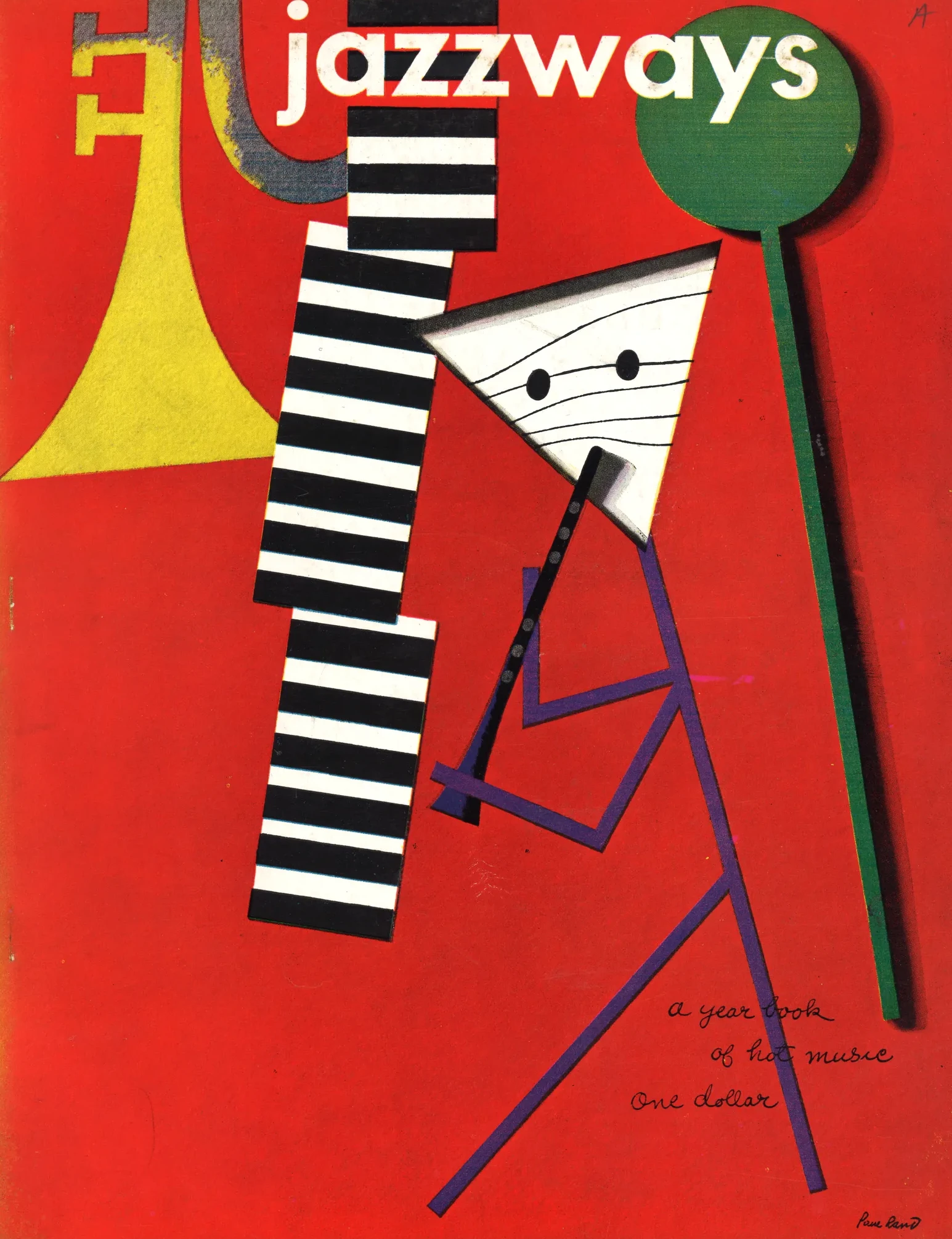
In the post-war era, American businesses rapidly evolved into massive multinational corporations that demanded rigorous visual order. Explore how modernist...
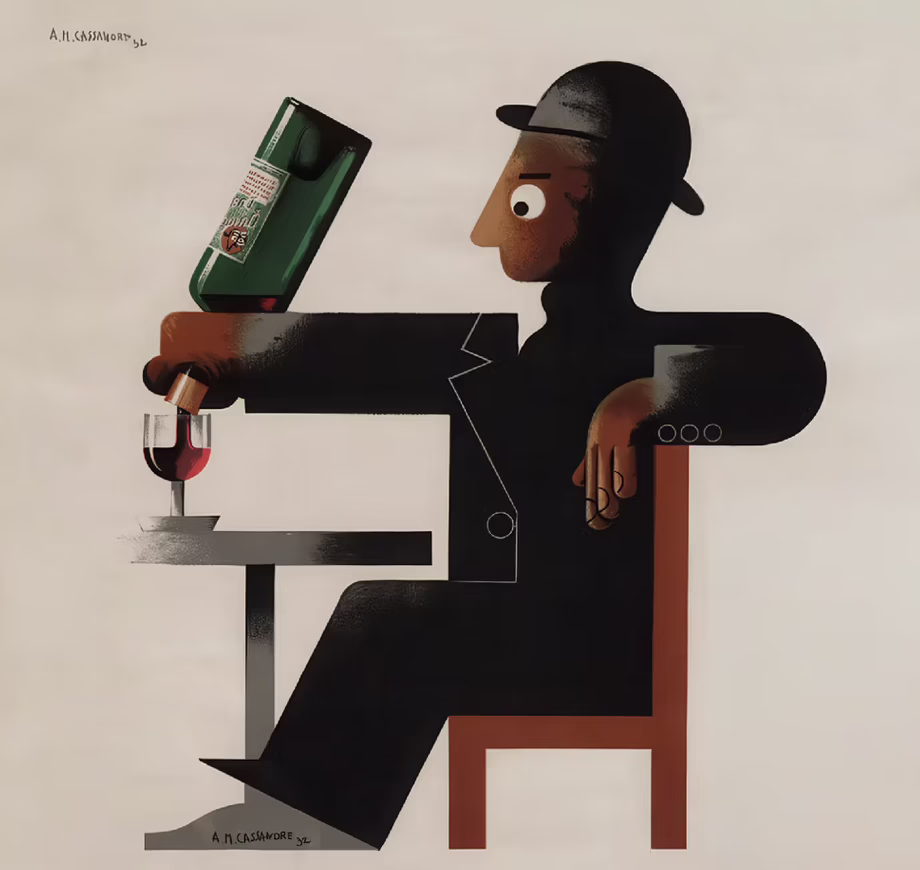
Following the strict, functional rules established by the Bauhaus, the Roaring Twenties demanded a visual language that was fast, luxurious,...

Following the chaos of World War I, Walter Gropius founded the Bauhaus to rebuild society through a unified approach to...

During the global conflicts of the 20th century, graphic design was mobilized as a powerful weapon of mass communication. Explore...
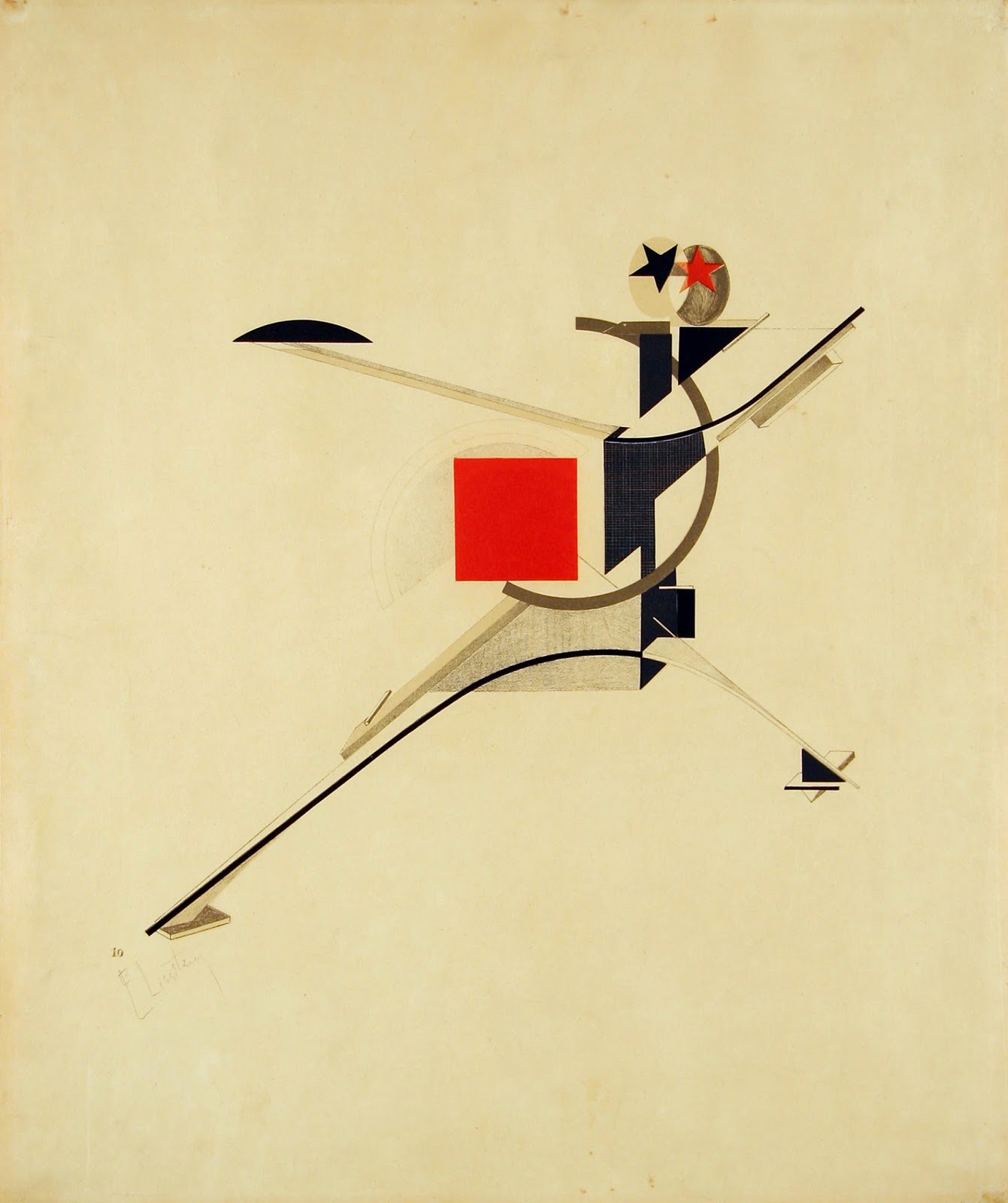
Rejecting the elite concept of "art for art's sake," the Russian avant-garde transformed abstract geometry into a tool for mass...
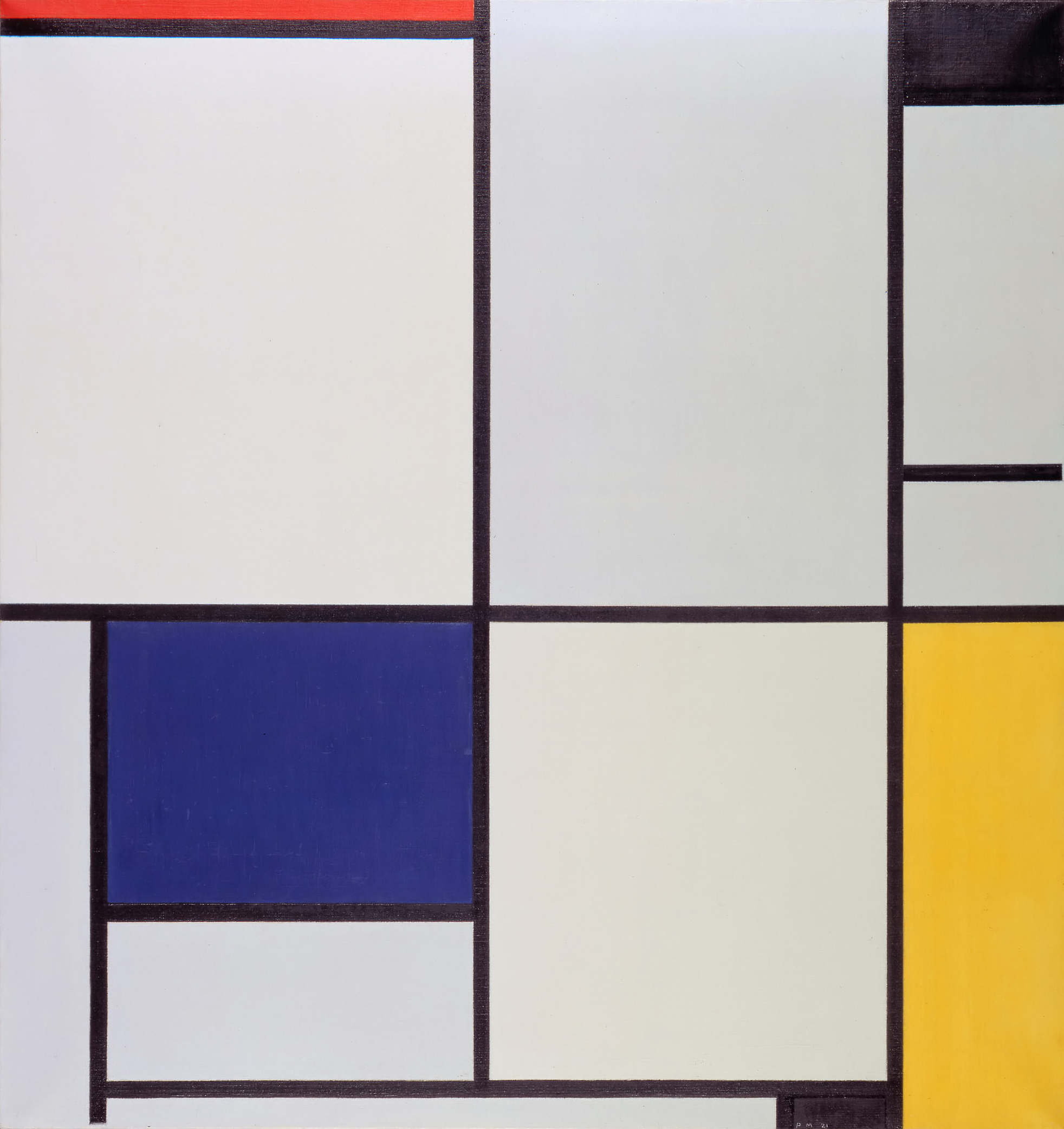
Emerging from the psychological wreckage of World War I, the Dutch De Stijl movement sought to build a utopian society...
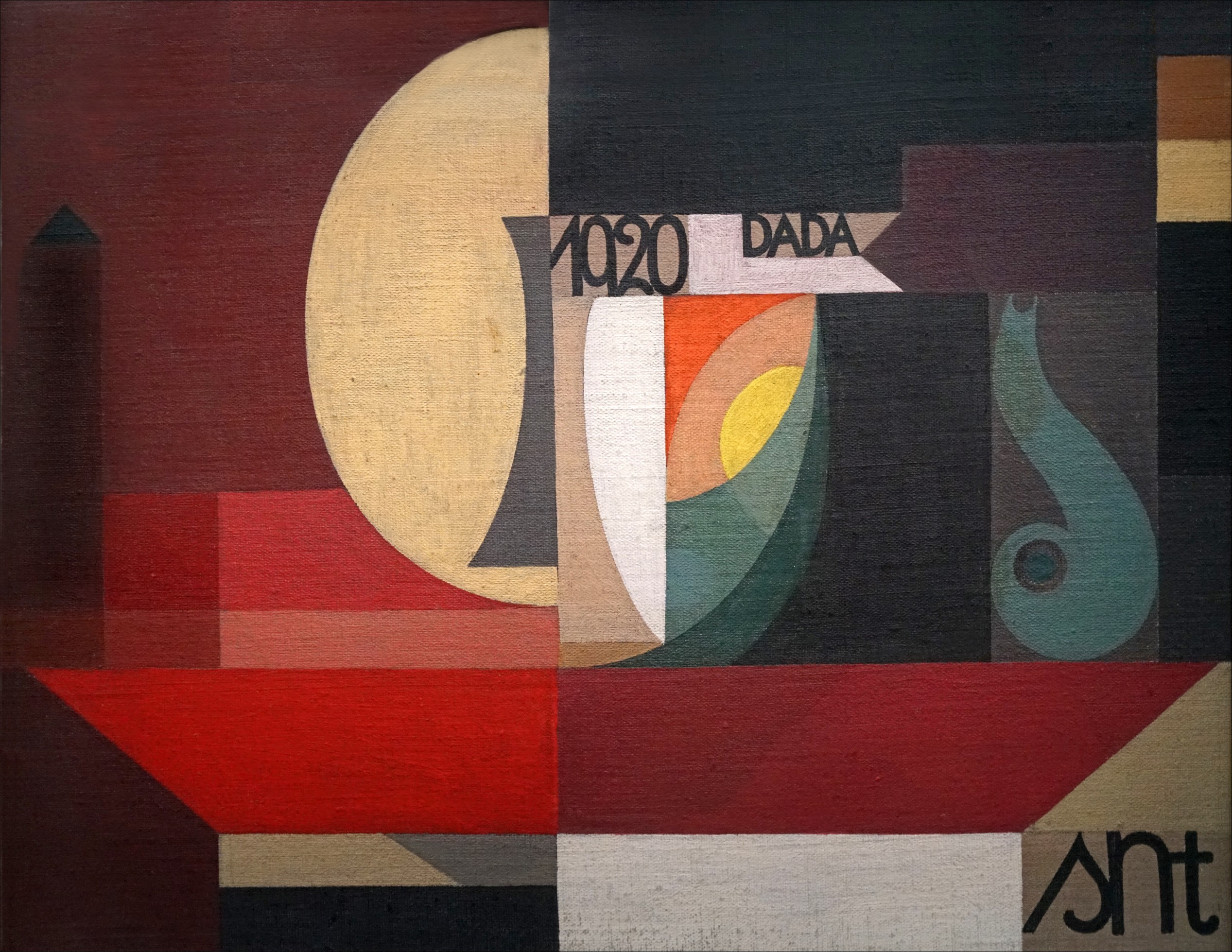
Traumatized by the senseless slaughter of World War I, a rebellious group of anti-war artists completely rejected the harmonious design...
By the 1890s, graphic design was lost in a tangled, organic forest of twisting vines and dense Victorian clutter. Discover...

If you open your font menu today, you are looking at centuries of design history. Discover how the raw, heavy...

Long before Gutenberg developed the printing press, the foundations of the modern page were being masterfully engineered in the East....
In the tumultuous early 20th century, marked by a whirlwind of new inventions and a shift from agrarian to urban...
As the twentieth century unfolded, emerging artists sought inspiration beyond the intricate designs of the Victorian era, Art Nouveau, and...
The Art Nouveau movement, which flourished in the late 19th and early 20th centuries, was characterized by its ornamental and...
As the 19th century unfolded, the city of Paris became a hotbed of optimism and creativity, fueled by a confluence...
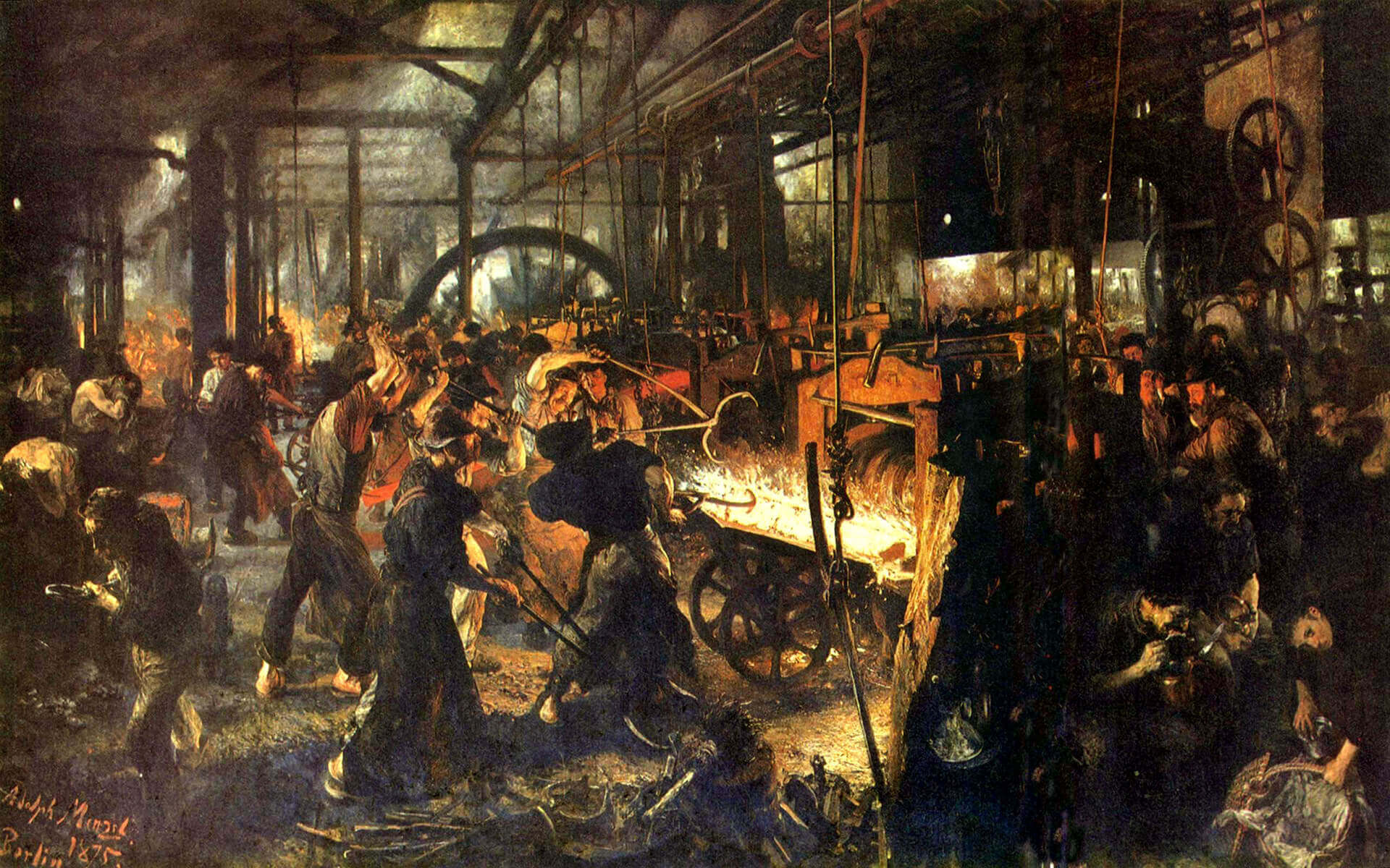
In the mid to late 19th century, the technological change was a big driving force, just like today. The new...
While these developments were happening, the deskilling of the craftsman and manufacturing of mass-produced items, expansion of factories and even...
Before industrialization, things were made in small numbers, carrying the emotions and fingerprints of its creator as a result of...
In 1400s AD, after several years of focused experiments, Johannes Gutenberg made the system scalable and led the way for...

The history of graphic design begins with the cave paintings. The prehistoric humans were marking their daily lives or the...

Starting from a simple stone ax, throughout the history we created a man-made environment, to survive and control the world...