
Art Directing America: The Golden Age of Editorial Design
In the post-war era, American art directors broke free from traditional grids to turn the printed page into a cinematic,...
In the immediate aftermath of World War II, the United States entered an era of rapid economic expansion. The factories that had spent the early 1940s building bombers and tanks were suddenly churning out cars, televisions, and consumer appliances for a rapidly expanding suburban middle class. To sell this massive influx of goods, the American advertising industry roared to life.
However, the advertising landscape of the 1940s and early 1950s was largely a visual cacophony. Magazines and newspapers were cluttered with hyperbolic copy, exclamation points, heavy-handed illustrations, and screaming headlines that treated the consumer as someone who needed to be yelled at to pay attention. The traditional agency model kept copywriters and art directors strictly separated; a writer would draft the text, and an artist would merely draw a picture to fill the remaining space.
This disconnected, noisy approach was completely upended by the emergence of the “new advertising“, a revolution pioneered by the New York agency Doyle Dane Bernbach (DDB). The new advertising and editorial design developed alongside the new journalism of the era. Just as writers like Tom Wolfe replaced dispassionate objectivity with subjective, participatory reportage, agencies like DDB replaced coarse, hard-sell advertising with methods that were honest, literate, and tasteful. DDB fundamentally restructured the creative process by placing the art director and the copywriter in the same room, demanding they work simultaneously. This resulted in a profound visual-verbal synergy where the image and the text were inextricably linked, each doing exactly half the work.
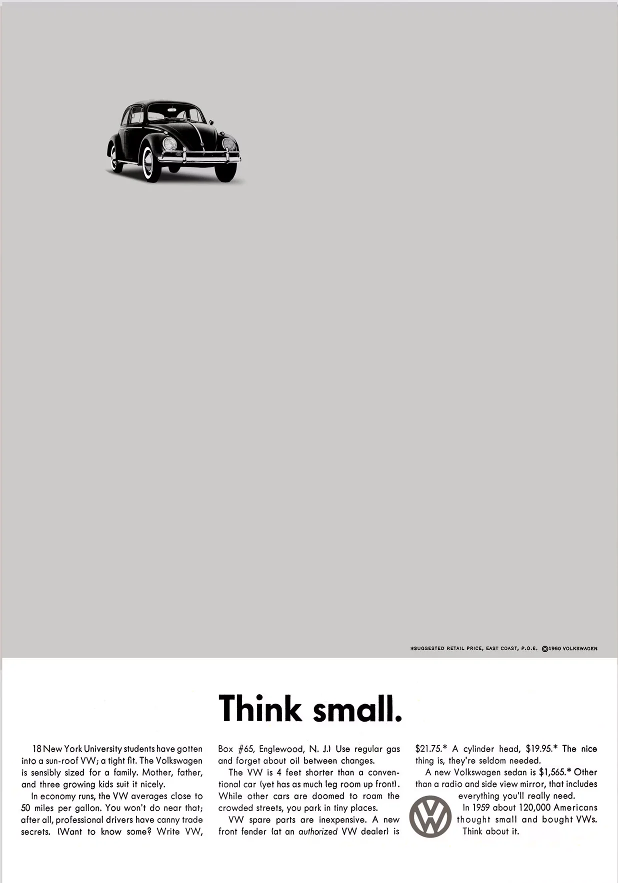
Nowhere was this conceptual wit more visible than in DDB’s legendary campaign for the Volkswagen Beetle. In a market dominated by massive, chrome-covered American muscle cars, DDB didn’t try to hide the Beetle’s small, unconventional shape. Instead, they famously used the headline “Think small“, floating a tiny photograph of the car in a massive, daring expanse of white space. By refusing to shout, DDB forced the reader to lean in and listen. They proved that honest, minimalist design and conceptual intelligence could cut through the commercial clutter far more effectively than hyperbolic noise.
As the advertising industry was learning to speak with conceptual sophistication, the American magazine was undergoing its own radical transformation. For decades, editorial design had been a rigid, uninspired affair. Text was locked into standard columns, and illustrations were neatly boxed into the remaining gaps. The catalyst for the dismantling of this static grid was Alexey Brodovitch, a Russian-born designer who became the art director of Harper’s Bazaar. Brodovitch did not view the magazine as a collection of individual, isolated pages; he viewed it as a flowing, cinematic environment. “Astonish me,” was Brodovitch’s unceasing request to his contributors.
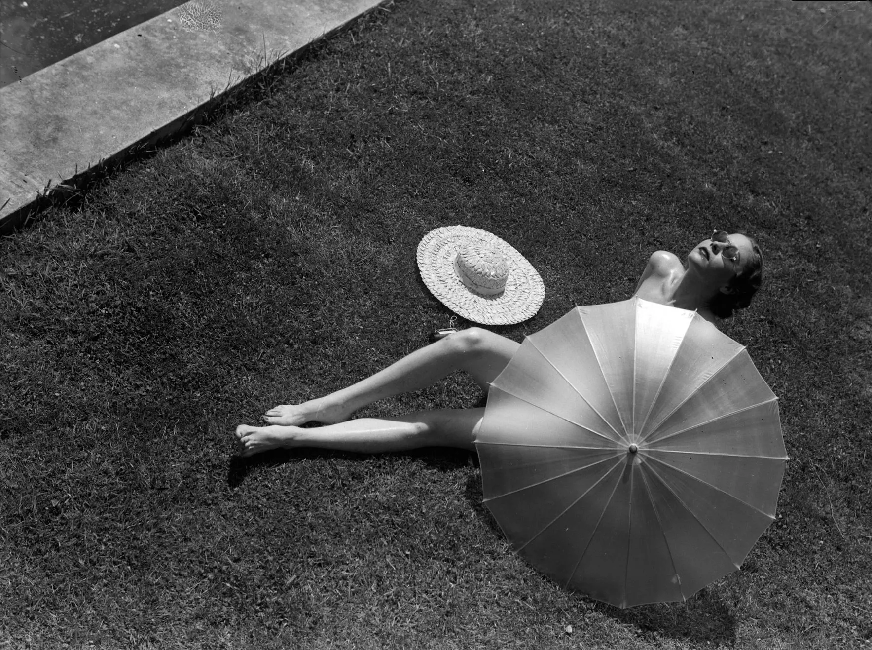
He cultivated a new breed of editorial and advertising photographers, such as Martin Munkacsi, who combined the visual dynamics learned from European avant-garde figures like László Moholy-Nagy and Man Ray with the fresh mobility of the 35mm Leica miniature camera. Munkacsi’s compositions brazenly defied the long-held conventions of editorial photography, capturing fashion in motion rather than in stiff, aristocratic poses.
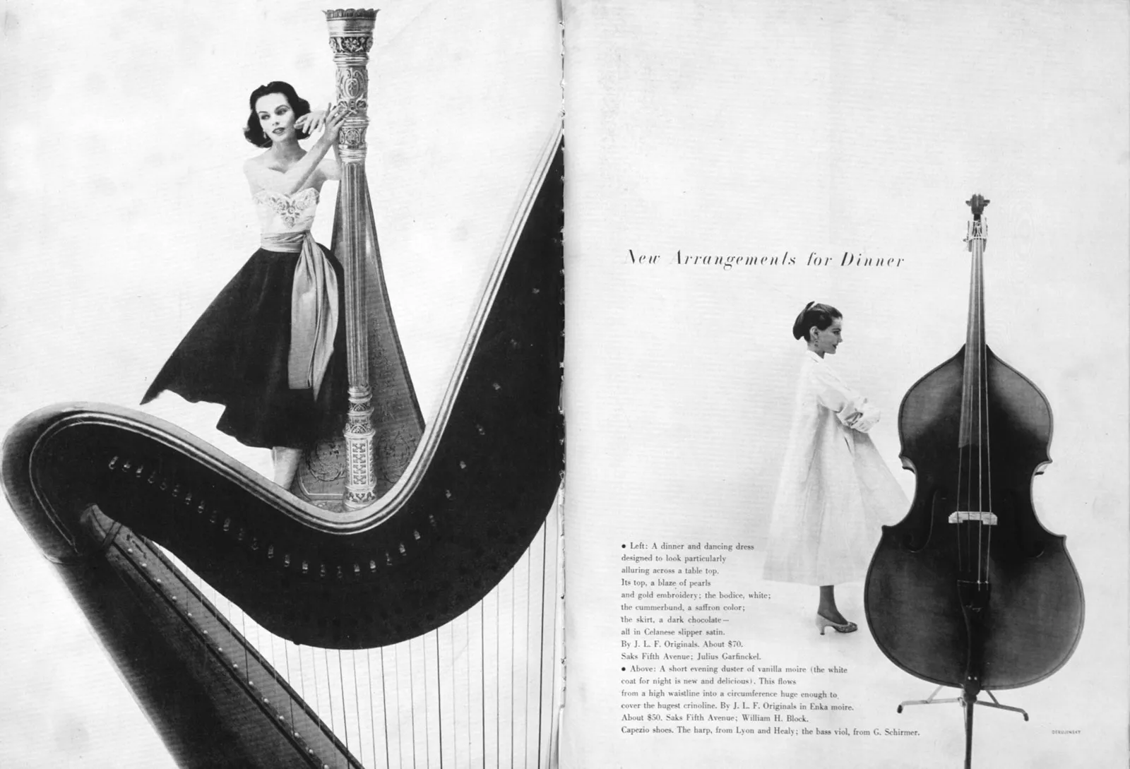
Brodovitch took these dynamic photographs and orchestrated them across the magazine’s spreads with the pacing of a musical score. He utilized extreme photographic cropping, dramatic shifts in scale, and vast pools of structural white space to create rhythm and tension. A model’s arm might slice across the gutter of the magazine, or a dress might bleed entirely off the edge of the page, pulling the reader’s eye relentlessly forward. Under Brodovitch’s command, the role of the “art director” evolved from a mere layout technician into a visionary mastermind who controlled the entire visual and emotional pacing of the publication.
The experimental energy of the New York School was not confined to glossy fashion photography; it also sparked a revolution in printing and typography. European modernists had traditionally viewed typography as a strict, mathematical science, but American designers began treating the printed page as a boundless experimental canvas. They broke the rules of the grid by diving deep into the mechanics of the print shop itself.
The undisputed master of this typographic playground was Bradbury Thompson. For years, Thompson designed Westvaco Inspirations, a promotional publication for the Westvaco paper corporation. Because the magazine existed purely to demonstrate the possibilities of printing on quality paper, Thompson was given absolute creative freedom. He used this platform to push the technological limits of the printing press, proving that a deep, technical knowledge of commercial printing could yield astonishing avant-garde graphic expression.
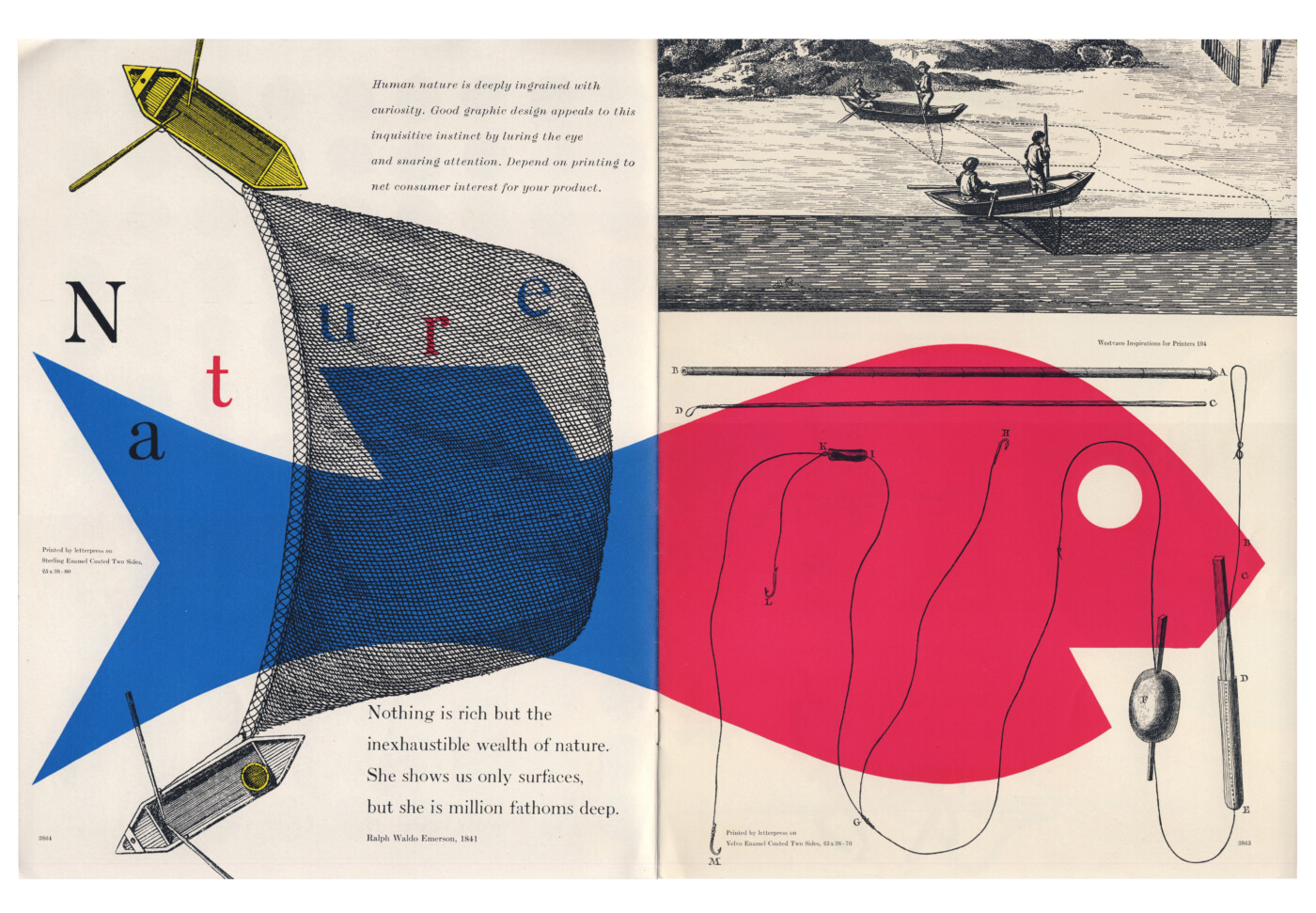
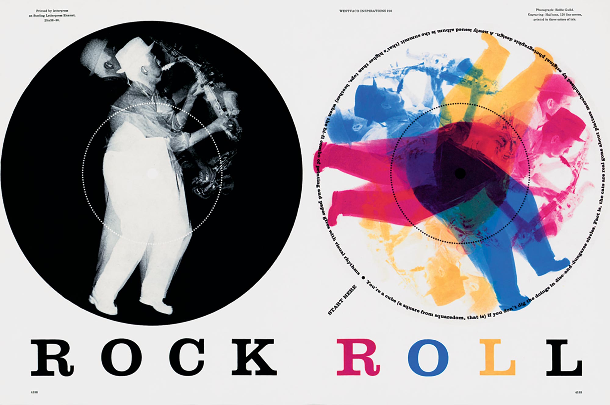
Thompson relentlessly explored the potential of CMYK color plates, historical typefaces, and complex photographic techniques. He famously repurposed 19th-century engravings, lifting them from the public domain and injecting them into a modern design vocabulary. In one iconic spread from Westvaco Inspirations 210 in 1958, Thompson took a multiple-exposure photograph of a saxophone player, reversed it out of a solid black circle on the left page, and then overprinted it in vibrant, shifting primary colors on the right.
He layered halftones, misaligned color separations on purpose to create optical vibrations, and scaled classic serif typefaces to massive, architectural proportions. Thompson proved that the machinery of industrial mass communication was not a limitation, but rather an instrument waiting to be played by a visionary artist.
As the 1960s approached, the New York School reached the absolute pinnacle of its conceptual wit, fueled by major technological shifts. For over five hundred years, typography had been bound by the physical limitations of metal type—rigid lead blocks that forced letters onto a strict, immovable baseline. But the commercial rise of photo-typography changed everything. Because type was now generated photographically rather than physically, letterforms could be scaled, distorted, and overlapped with unprecedented freedom.
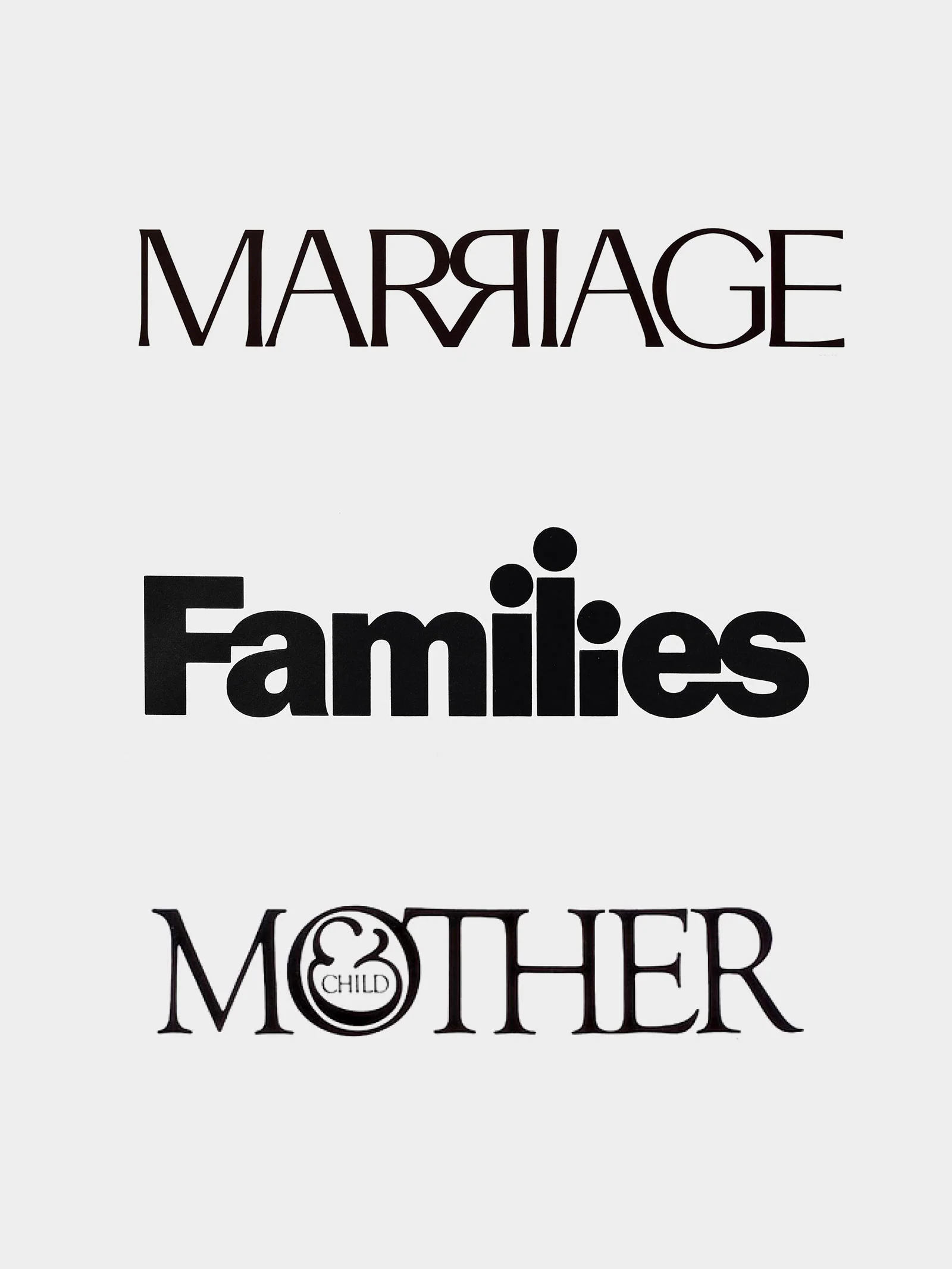
Herb Lubalin became a master of this photo-type revolution. Discontented with the rigid, invisible grids of European modernism, Lubalin rebelled by treating typography as an elastic, highly expressive image. He realized that letters no longer had to sit politely next to one another; they could be compressed, smashed together, and intertwined to create what he called “typograms“. A typogram was a brief, visual poem where the word itself visually enacted its own meaning.
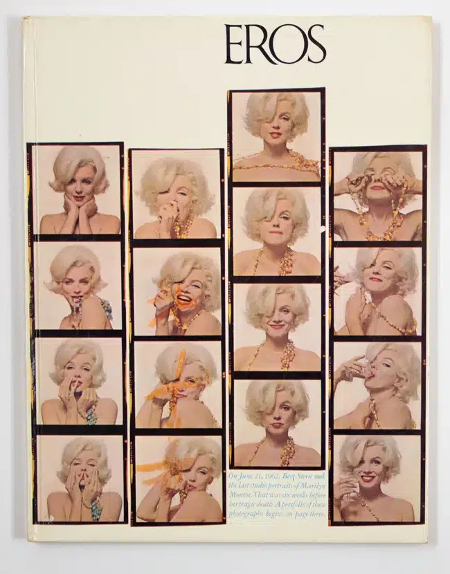
Lubalin’s masterful, cinematic layouts for magazines like Eros and Avant Garde transformed typography from a passive vehicle for reading into a dynamic, figurative object that demanded to be looked at. In one brilliant layout for Eros, he formed a grid from strips of photographic transparencies, violating the mathematical structure by shifting a single image upward to perfectly align with the logo and headline.
While Lubalin was revolutionizing the interior pages, the legendary art director George Lois was taking this conceptual revolution directly to the American newsstand. Lois stripped away the polite, painted illustrations and predictable celebrity portraits that had dominated magazine covers for decades. During his tenure at Esquire, he transformed the cover into a fierce, provocative canvas for the “Big Idea“. Lois utilized blatant symbolism and outrageous humor to craft covers that functioned as biting cultural commentary.
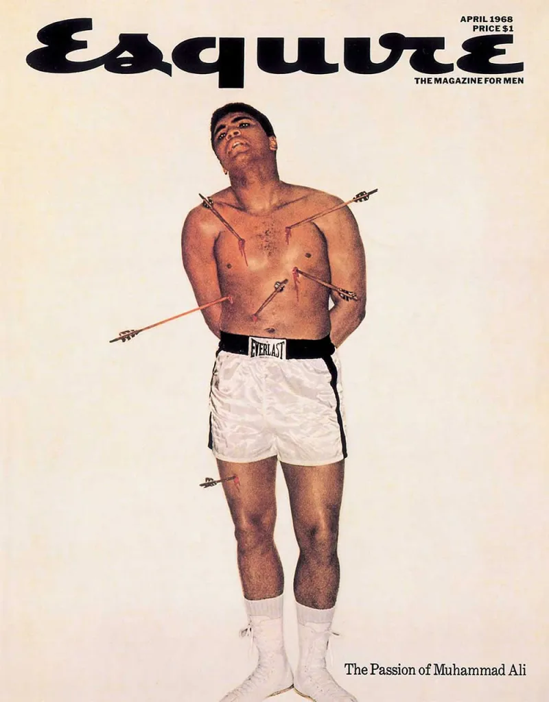
Whether he was depicting Muhammad Ali pierced by arrows like the martyred Saint Sebastian, or showing Richard Nixon having makeup applied for a television debate, Lois believed that visual and verbal elements were indivisible.
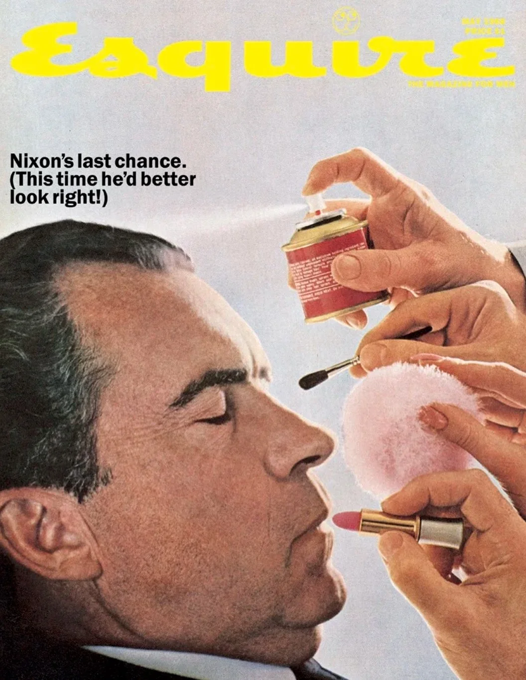
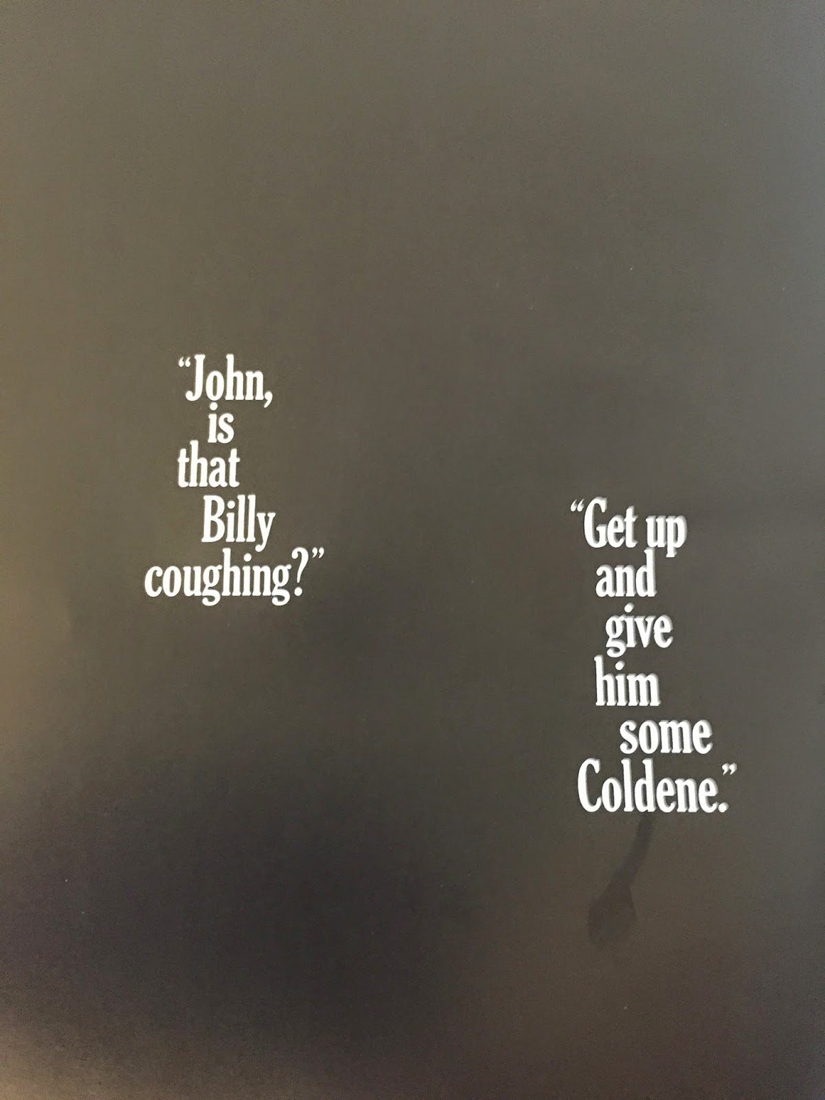
He designed covers that didn’t just summarize the magazine’s contents—they shocked the public, started national conversations, and proved that mass-market editorial design could wield immense political and cultural power. Unlike the coarse, hard-sell advertising of most medications, Lois even applied this minimalist brilliance to pharmaceutical ads, such as a 1961 Coldene advertisement featuring a stark black page and only twelve words to suggest a midnight exchange between concerned parents.
The cover, the advertisement, and the editorial spread had all become unified spaces for brilliant, subjective conceptualism.
The American art directors of the New York School had successfully broken the grid. Through the visual-verbal synergy of Doyle Dane Bernbach, the cinematic pacing of Alexey Brodovitch, the typographic playfulness of Bradbury Thompson, and the provocative conceptualism of George Lois, they proved that graphic design could be wildly intuitive, deeply personal, and brimming with subjective wit. They embraced the messy, brilliant human element, turning the commercial magazine into a cultural artifact.
However, as the post-war era matured, the global landscape began to shift. International trade was expanding at a dizzying rate, and the world was shrinking into a complex web of multinational commerce and global communication. The clever, highly subjective wit of the American “Big Idea” was distinctly cultural—it relied on shared humor, idioms, and local visual puns that did not always translate across borders. The globalizing world soon demanded a rigorous objectivity that transcended cultural nuances and personal artistic expression.
While the New York School was celebrating the triumph of intuition and personality, a radically different movement was quietly brewing in the valleys of Switzerland. This new school of designers sought to strip away all personal quirks, humor, and subjective illustration in favor of absolute, infallible mathematical clarity. The era of expressive rebellion was about to collide with the ultimate demand for universal order.
In the post-war era, American art directors broke free from traditional grids to turn the printed page into a cinematic,...
In the post-war era, American businesses rapidly evolved into massive multinational corporations that demanded rigorous visual order. Explore how modernist...
Following the strict, functional rules established by the Bauhaus, the Roaring Twenties demanded a visual language that was fast, luxurious,...
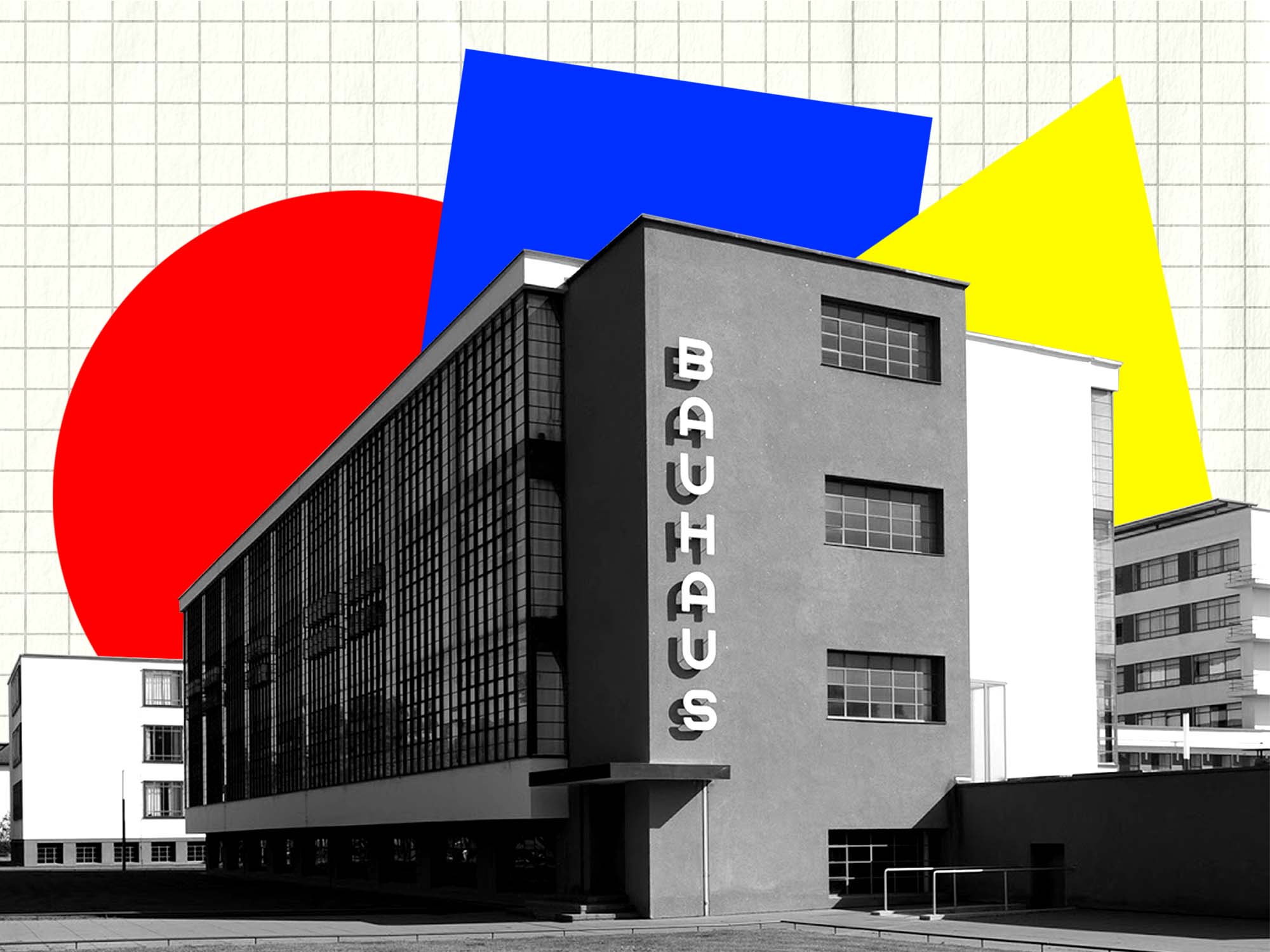
Following the chaos of World War I, Walter Gropius founded the Bauhaus to rebuild society through a unified approach to...
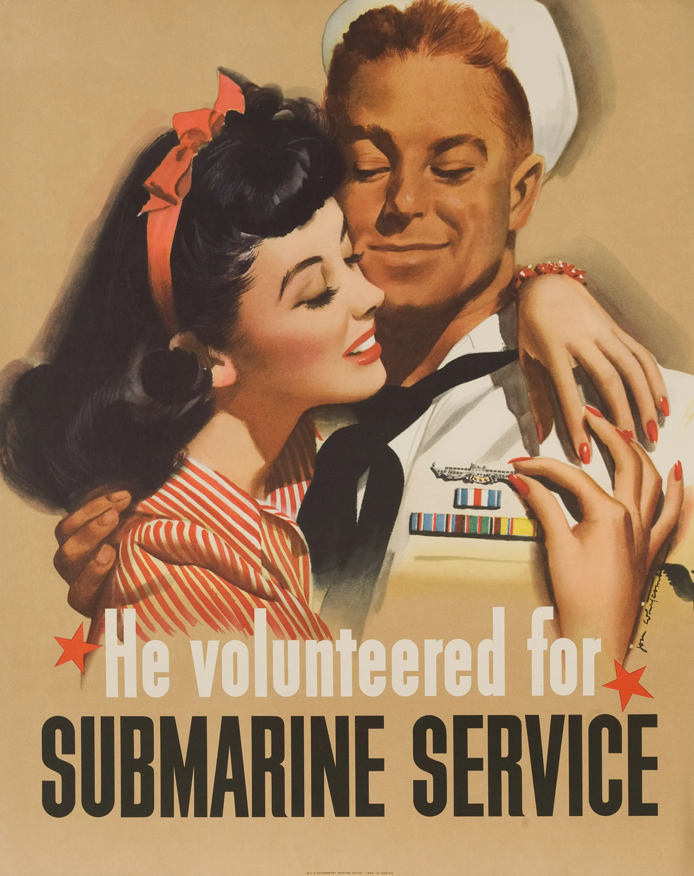
During the global conflicts of the 20th century, graphic design was mobilized as a powerful weapon of mass communication. Explore...
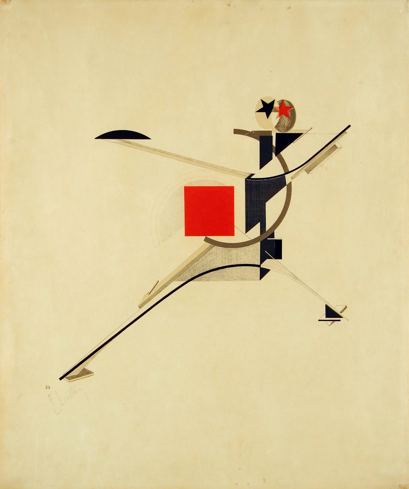
Rejecting the elite concept of "art for art's sake," the Russian avant-garde transformed abstract geometry into a tool for mass...
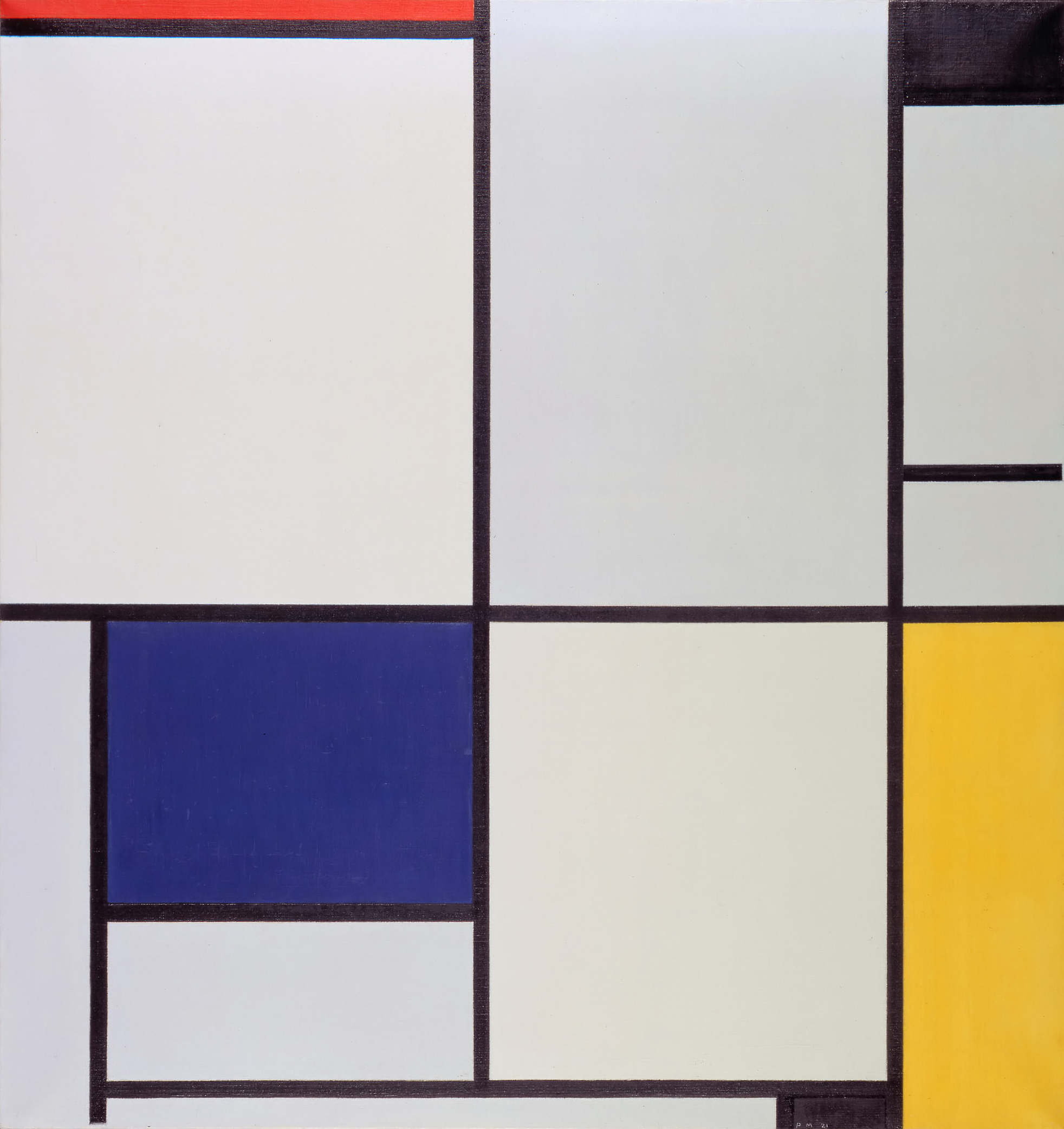
Emerging from the psychological wreckage of World War I, the Dutch De Stijl movement sought to build a utopian society...
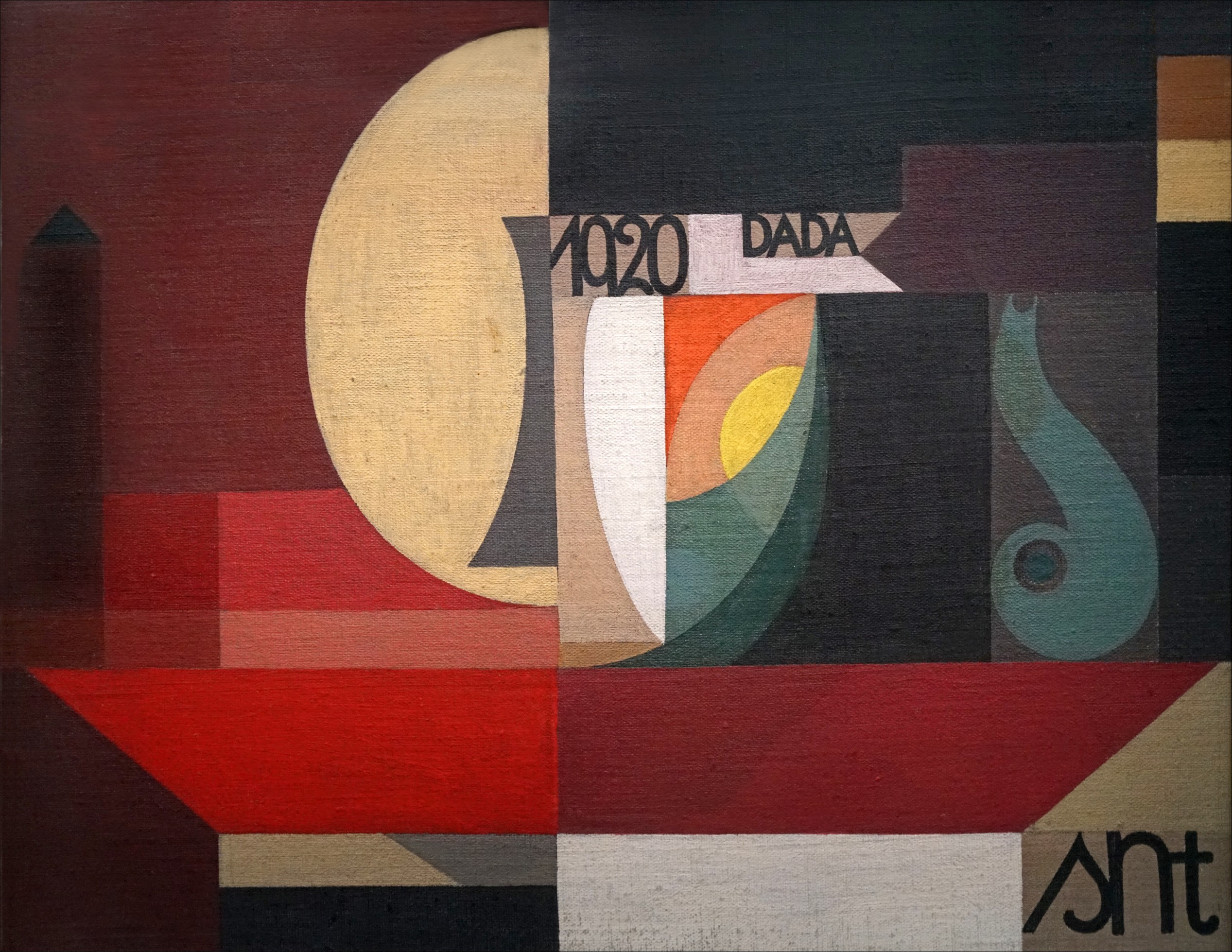
Traumatized by the senseless slaughter of World War I, a rebellious group of anti-war artists completely rejected the harmonious design...
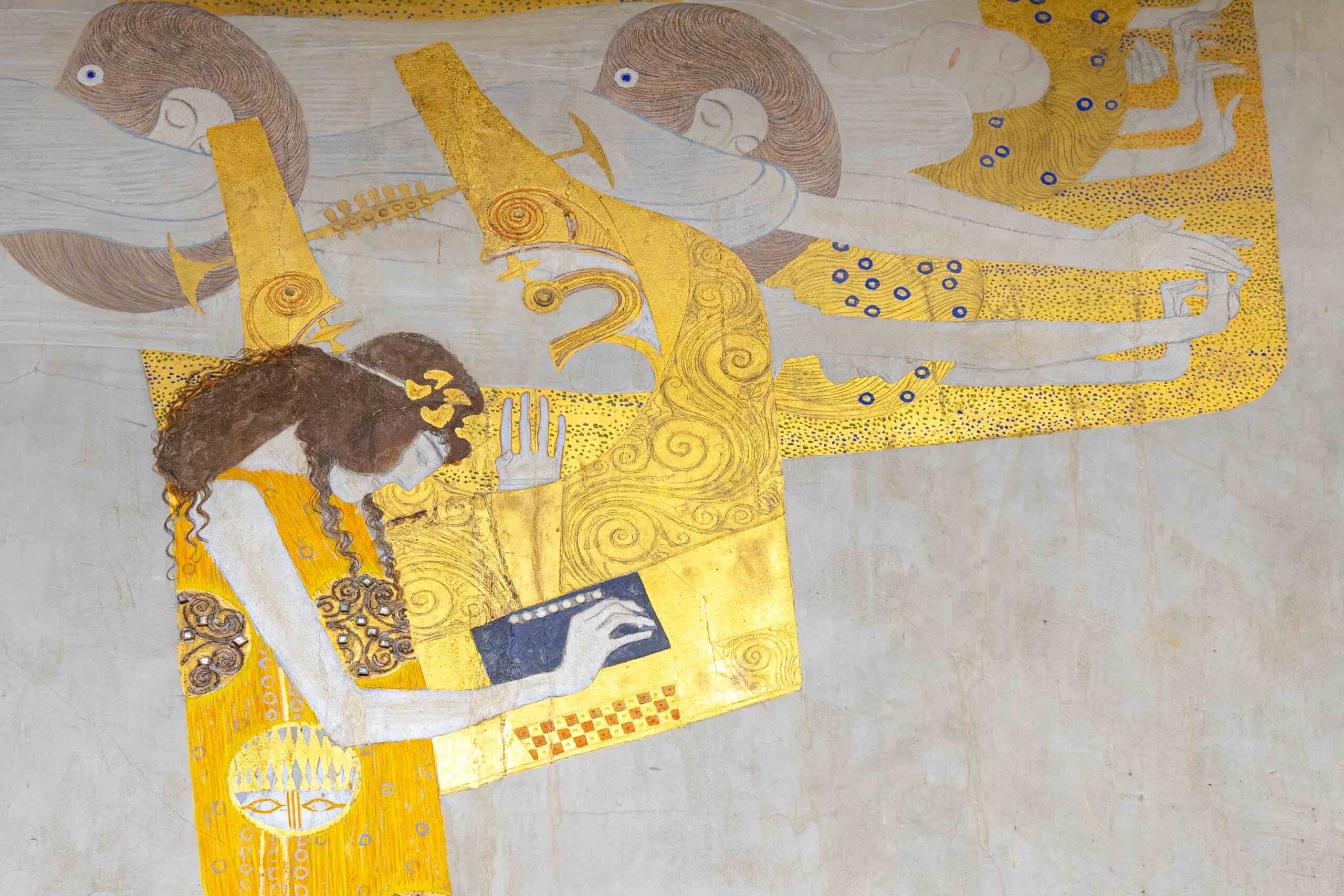
By the 1890s, graphic design was lost in a tangled, organic forest of twisting vines and dense Victorian clutter. Discover...
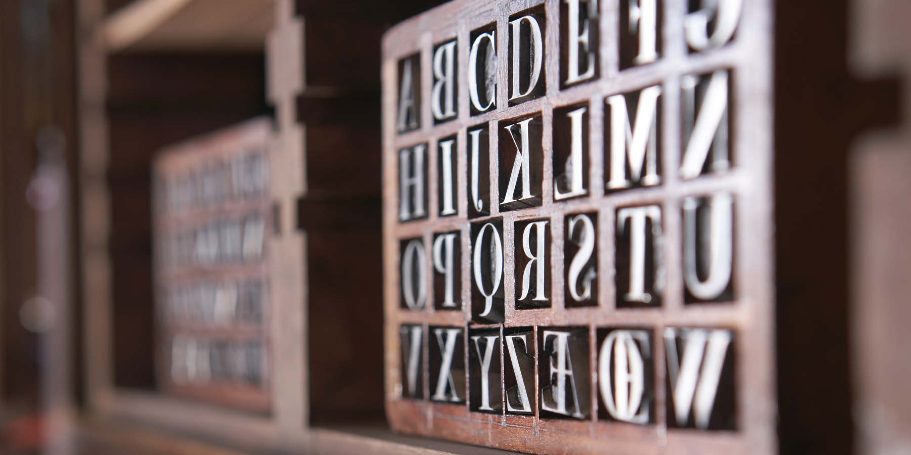
If you open your font menu today, you are looking at centuries of design history. Discover how the raw, heavy...

Long before Gutenberg developed the printing press, the foundations of the modern page were being masterfully engineered in the East....
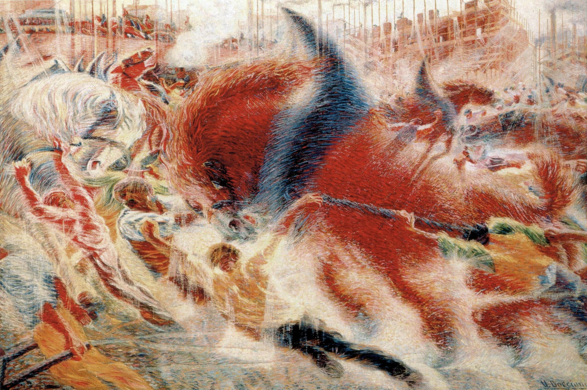
In the tumultuous early 20th century, marked by a whirlwind of new inventions and a shift from agrarian to urban...
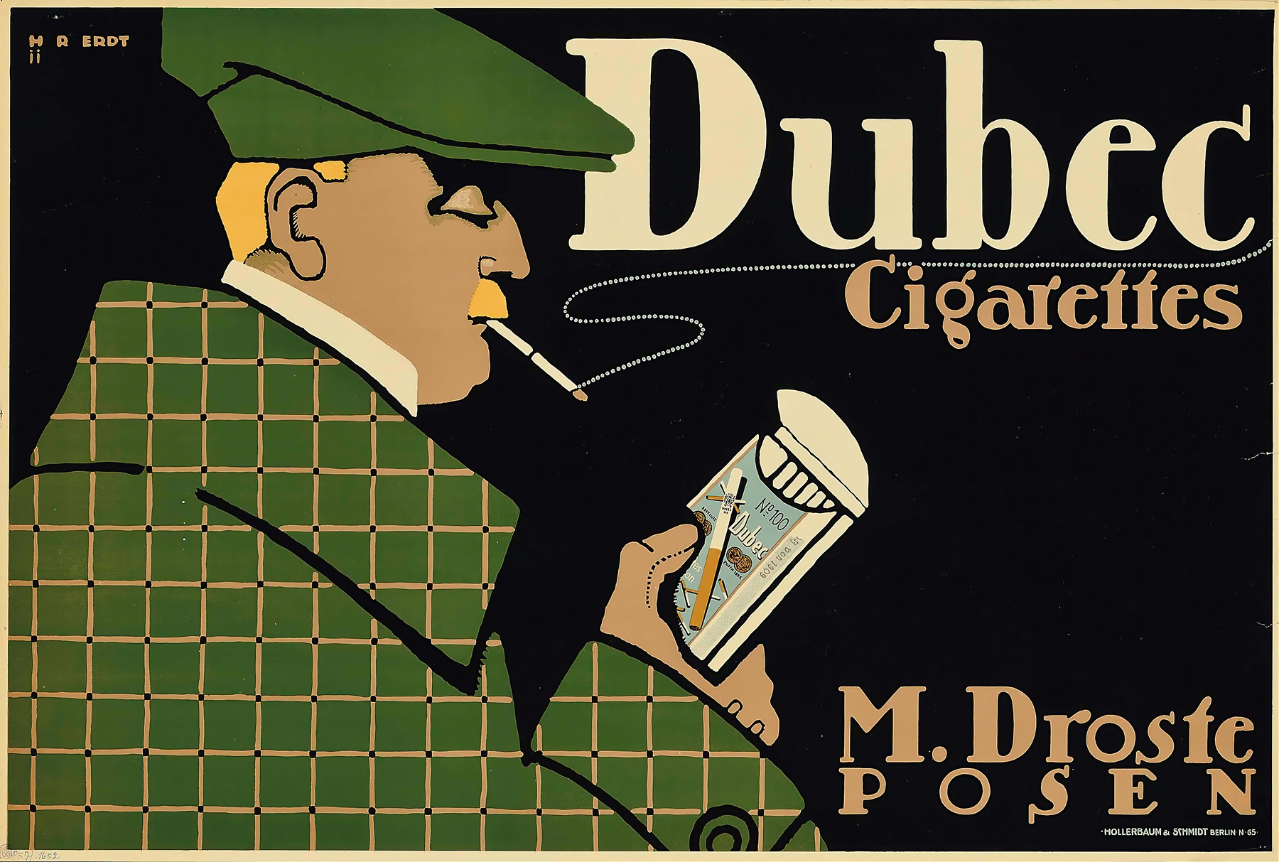
As the twentieth century unfolded, emerging artists sought inspiration beyond the intricate designs of the Victorian era, Art Nouveau, and...
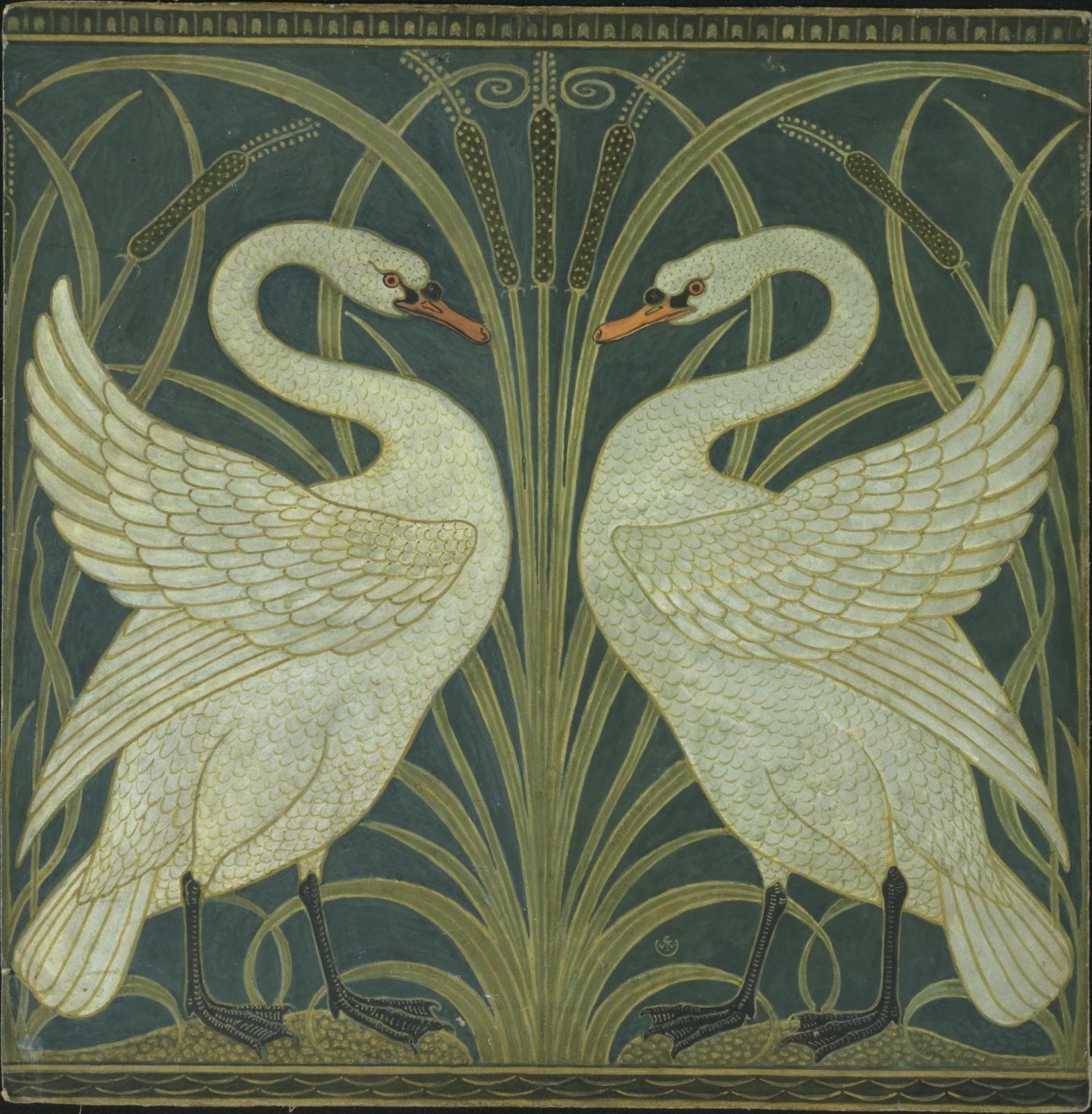
The Art Nouveau movement, which flourished in the late 19th and early 20th centuries, was characterized by its ornamental and...
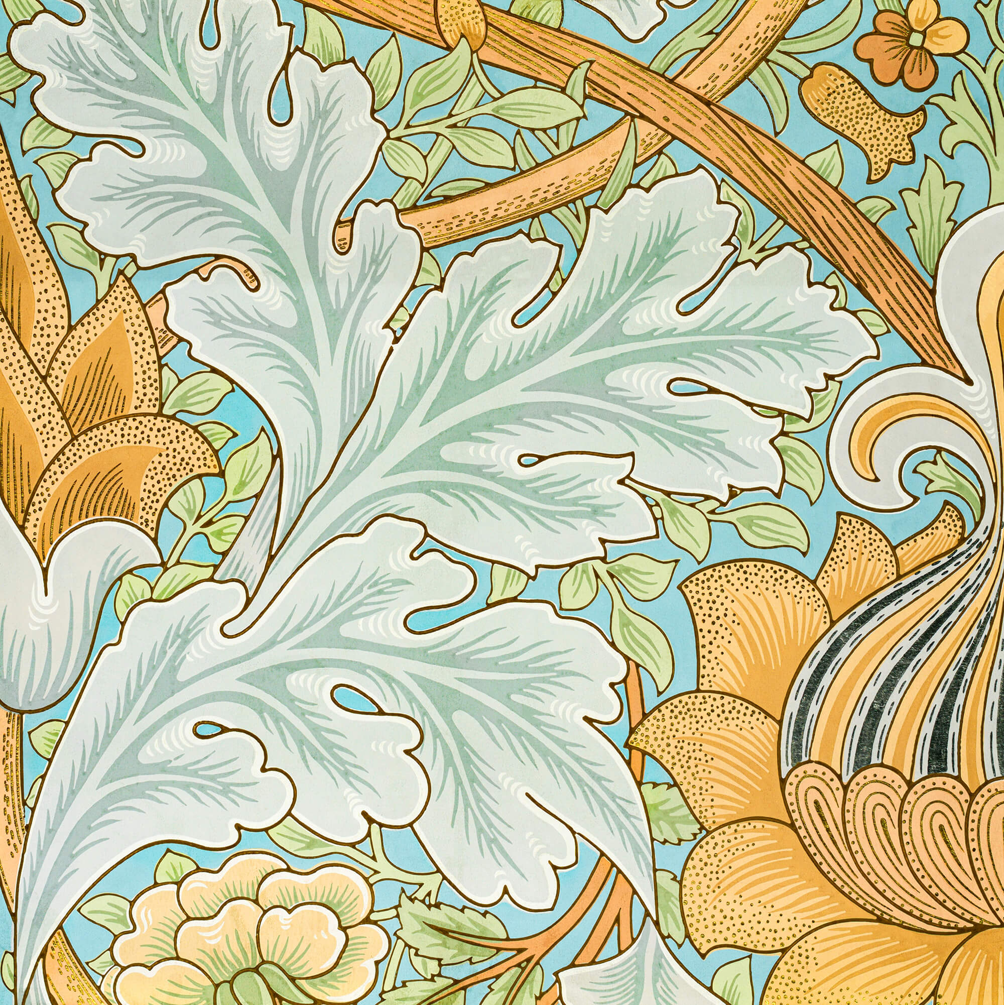
As the 19th century unfolded, the city of Paris became a hotbed of optimism and creativity, fueled by a confluence...
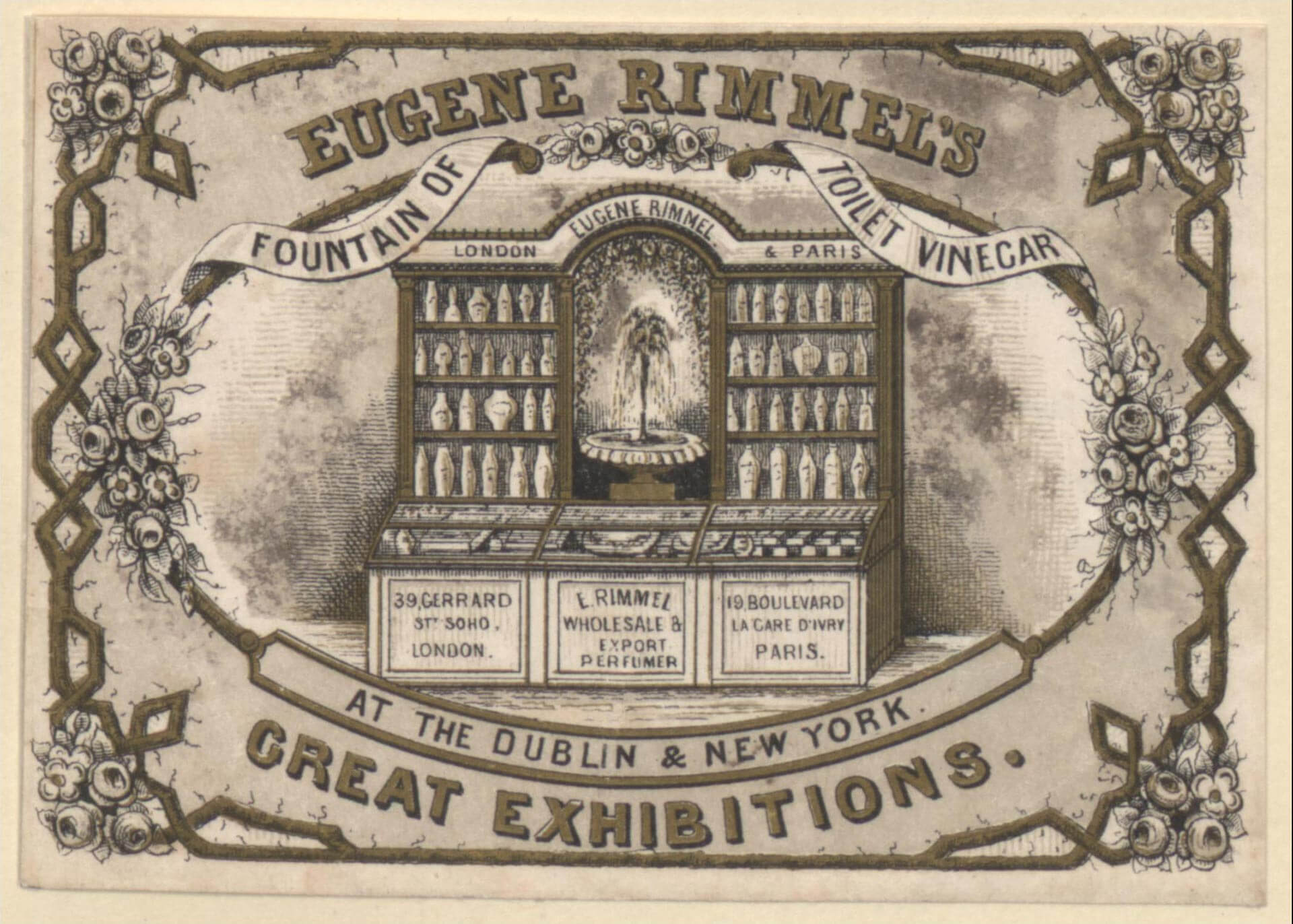
In the mid to late 19th century, the technological change was a big driving force, just like today. The new...
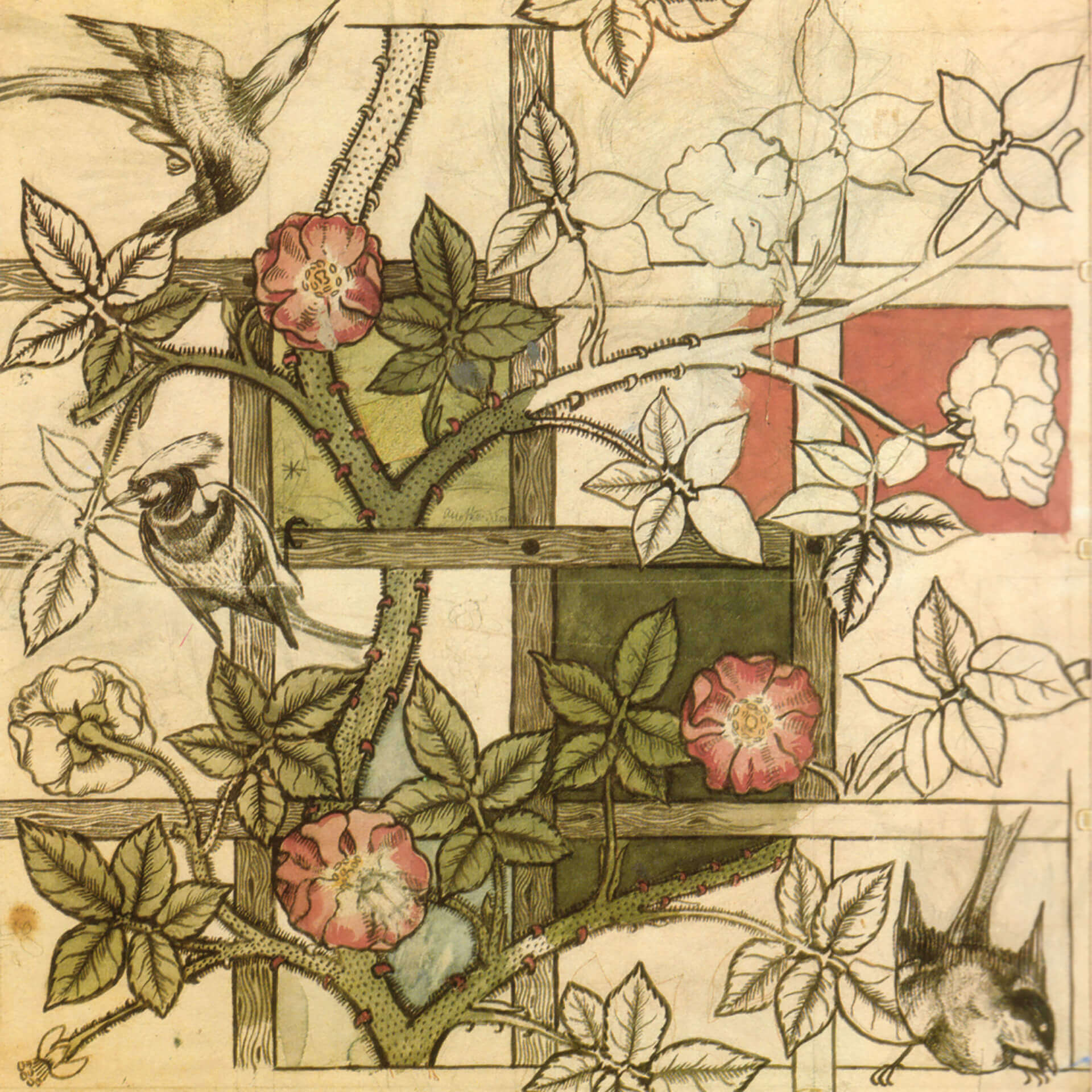
While these developments were happening, the deskilling of the craftsman and manufacturing of mass-produced items, expansion of factories and even...
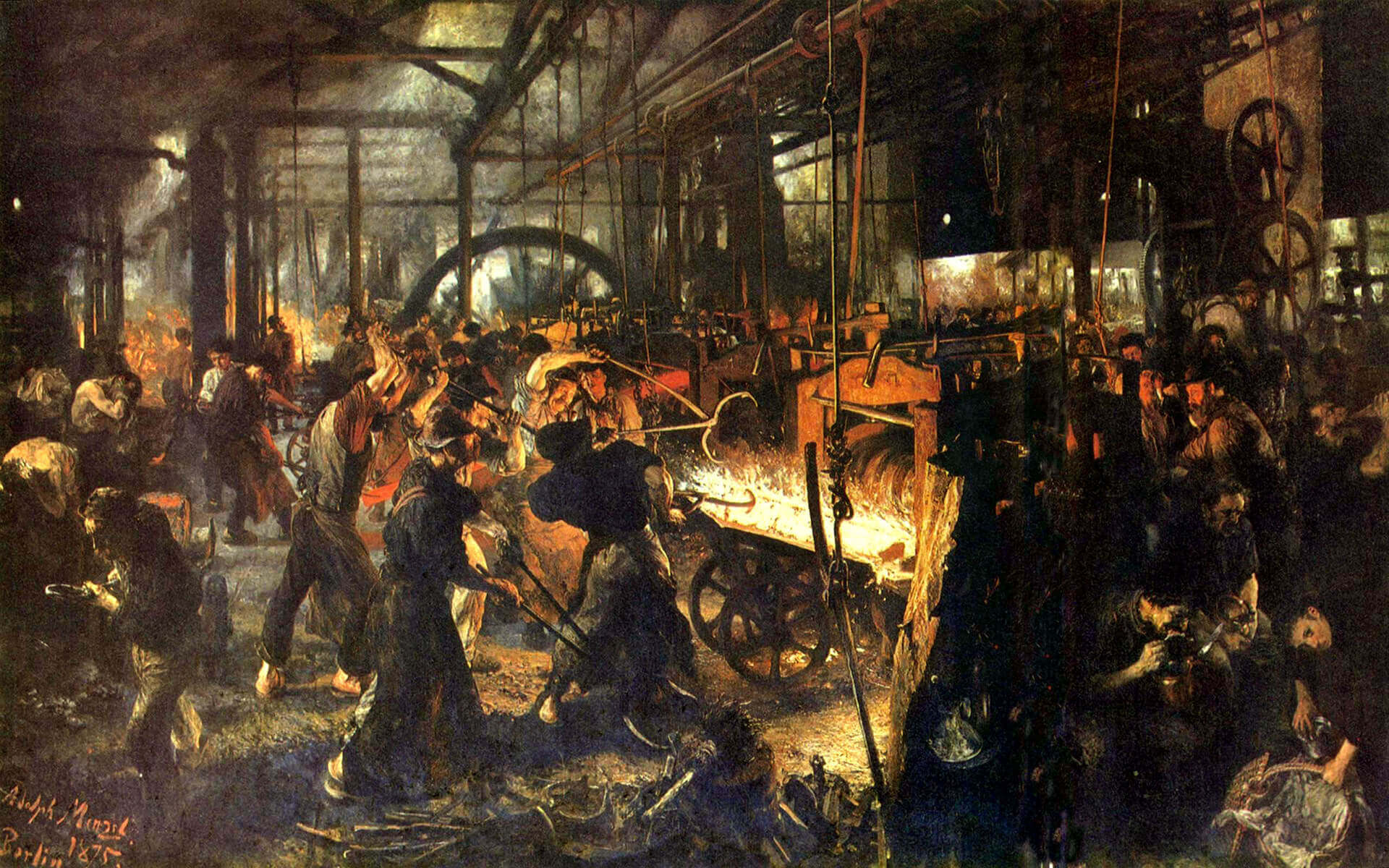
Before industrialization, things were made in small numbers, carrying the emotions and fingerprints of its creator as a result of...
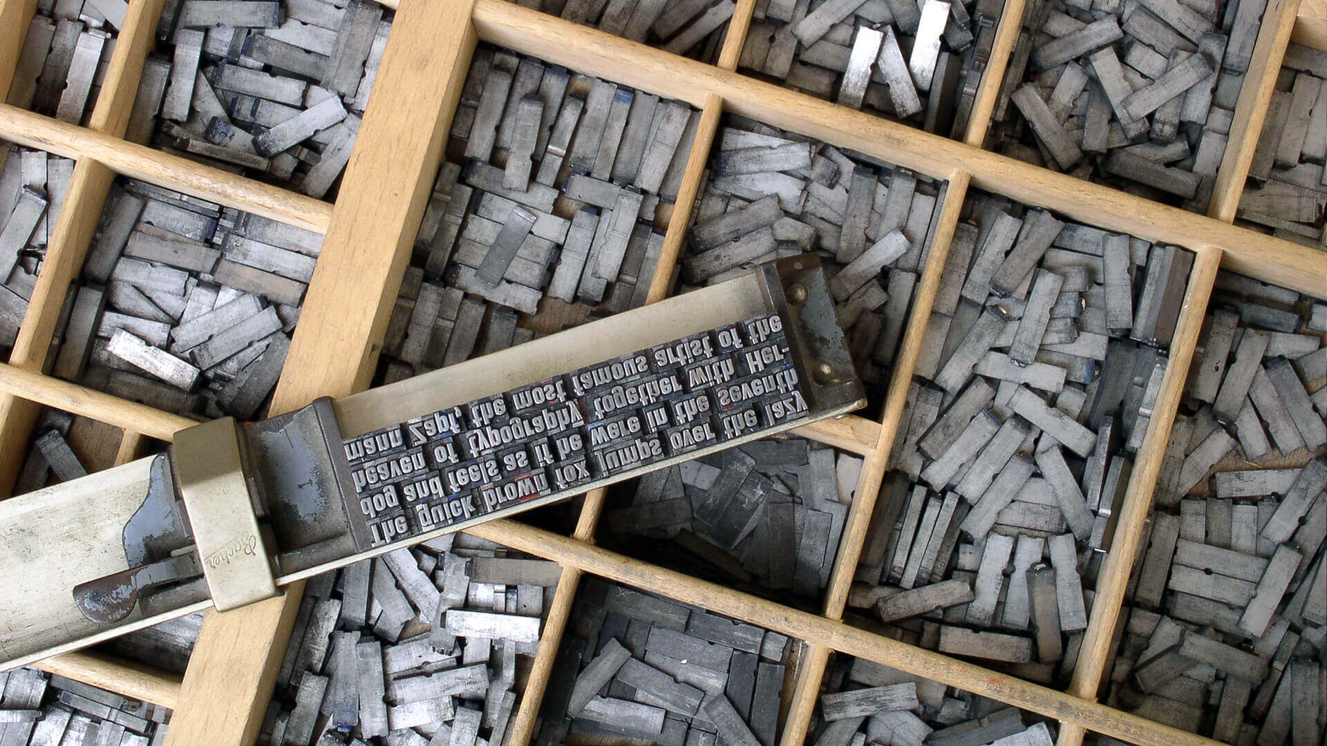
In 1400s AD, after several years of focused experiments, Johannes Gutenberg made the system scalable and led the way for...

The history of graphic design begins with the cave paintings. The prehistoric humans were marking their daily lives or the...

Starting from a simple stone ax, throughout the history we created a man-made environment, to survive and control the world...