De Stijl: The Purity of the Grid
Emerging from the psychological wreckage of World War I, the Dutch De Stijl movement sought to build a utopian society...
Emerging from the psychological wreckage of World War I, the Dutch De Stijl movement attempted to build a utopian society by reducing visual communication to its most pure, objective, and mathematical elements: the straight line and the primary color.
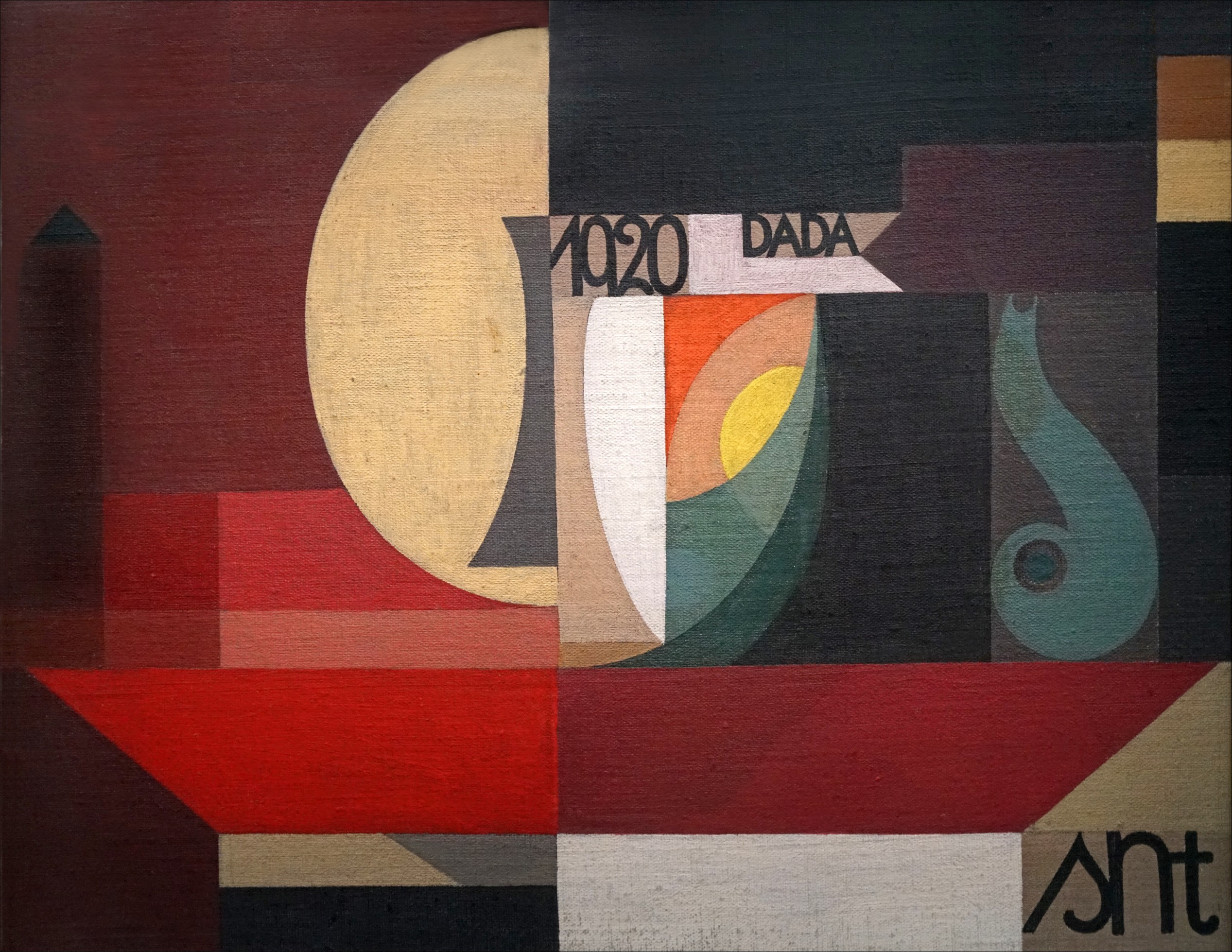
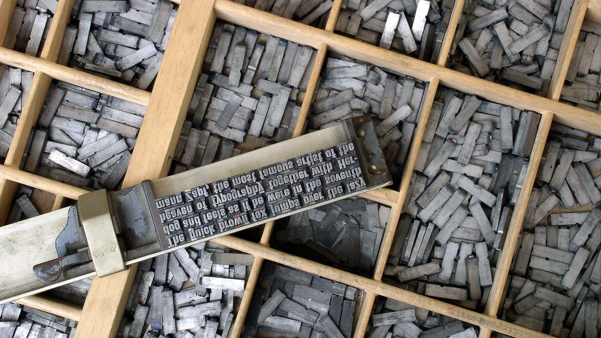
In our previous post, we explored how the traumatized, pacifist artists of the Dada movement weaponized “scissors, glue, and visual nonsense” to violently dismantle the design grids of the 19th century. They successfully dismantled the old world, proving to the establishment that the traditional rules of art and communication were dead.
But pure destruction is not a sustainable design system. Humanity cannot live in a state of perpetual visual chaos. Once the dust of the First World War settled, designers surveyed the cultural wreckage and realized they needed to rebuild the visual world from scratch. While much of Europe was still reeling from the bloodshed, a new spiritual quest for absolute, unshakable order began in the neutral nation of Holland.
Here is how a small group of Dutch visionaries responded to the trauma of World War I by inventing an absolute, mathematical design system that continues to dictate modern grid layouts and architecture today.
To understand the radical simplicity of De Stijl, you have to look at the psychological state of Europe in the late 1910s. The war had proven that human emotion, nationalism, and subjective individualism could lead to mass slaughter.
If society was going to survive the modern era, it needed a universal language—something completely objective, mathematical, and immune to the messy, destructive nature of human emotion.

For the designers attempting to rebuild visual communication, this meant rejecting the chaotic photomontages of Dadaism just as firmly as they rejected the organic, flowing vines of Art Nouveau.
They sought a cure for the trauma of the era. They believed that by creating a perfectly balanced, rational visual environment, they could engineer a perfectly balanced, rational society. The answer was not found in complex illustration or expressive typography, but in the absolute purity of the geometric grid.

In 1917, a small group of Dutch visionaries—including painter Piet Mondrian, designer and theorist Theo van Doesburg, and artist Bart van der Leck—launched a radical new movement called De Stijl (The Style).
To find their universal truth, the founders of De Stijl placed themselves on an incredibly strict visual diet: They systematically stripped away all subjective emotion, historical mimicry, and decorative elements from their work.
They established rigid, unbending rules for their new aesthetic: designers could only use primary colors (red, yellow, and blue), non-colors (black, white, and gray), and exclusively straight horizontal and vertical lines.

Curves were entirely forbidden. To these designers, a curve represented the unpredictable, organic flaws of nature; a straight, right-angled line represented the supreme triumph of human intellect and mathematical precision.
While this might sound creatively suffocating, this extreme limitation was actually incredibly liberating.
By removing the burden of illustration and decorative curves, it forced the designers to focus entirely on proportion, harmony, and spatial division.

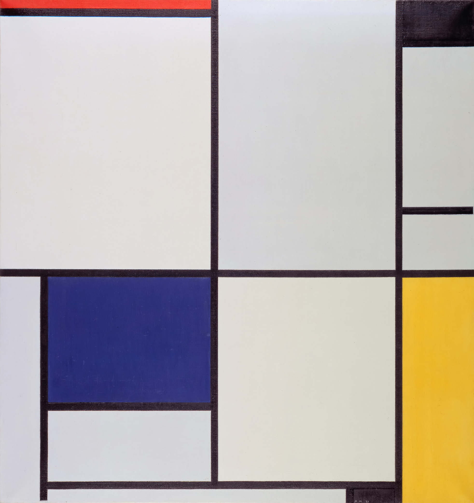
You can see this absolute purity in Piet Mondrian’s Composition with Red, Yellow, and Blue (1927).
By manipulating only the thickness of the black lines and the placement of primary colors, he proved that pure geometry could carry profound visual and spiritual weight.
To spread their gospel across Europe, Van Doesburg published and edited a journal, also named De Stijl.
This publication became the ultimate testing ground for translating the group’s abstract painting philosophies into functional graphic design.
Van Doesburg, alongside designers like Vilmos Huszár, applied their geometric painting rules directly to typography and editorial layout. They constructed blocky, square, sans-serif letterforms that looked as if they were built from industrial bricks.

More importantly, they revolutionized the structure of the page itself. Layouts utilized thick, heavy black horizontal and vertical rules to compartmentalize text and empty space into perfect mathematical rectangles.
Through this process, the designers of De Stijl rejected the traditional, centered symmetry that had dominated book design since the Renaissance. Instead, they pioneered asymmetrical balance.
They discovered that a small, dense block of black typography in the bottom corner of a page could perfectly balance a large, open area of white space at the top. This laid the vital foundation for the asymmetrical, modular grid—an underlying structure that modern UI/UX designers, web developers, and editorial art directors rely on today.
For the adherents of De Stijl, the grid was not just a tool for arranging ink on paper; it was a blueprint for living. They firmly believed that their visual logic could, and should, scale up to organize the entire built environment.

In 1925, the Dutch architect J.J.P. Oud provided the ultimate demonstration of this concept when he designed the Café de Unie in Rotterdam. Oud successfully translated the 2D typographic grid of the De Stijl magazine directly into a 3D architectural facade. The building’s exterior, its signage, and its typography were completely indistinguishable from one another.
The name of the café was integrated as a massive, structural typographic block, interacting seamlessly with the asymmetrical, brightly colored rectangular windows and flat stucco planes. Architectural and graphic forms of contrasting color and scale were ordered into a flawless, harmonious balance.

By erasing the boundary between the printed page and the physical street, they achieved the ultimate integration of graphic design and environmental architecture.
The rules of De Stijl were so incredibly strict and philosophically rigid that the movement was eventually destined to fracture under its own weight. In fact, Piet Mondrian famously quit the group entirely when Theo van Doesburg committed the ultimate heresy: he wanted to introduce the diagonal line into their compositions.

But despite its relatively short lifespan and intense internal debates, De Stijl’s DNA permanently altered the graphic landscape. They proved the undeniable, structural power of the mathematical grid, providing the foundational logic for modern corporate identity and digital interfaces.
While the Dutch were using this pure, objective geometry to seek spiritual peace and universal harmony in a neutral nation, across the continent, another group of designers had a very different agenda. They were about to take the exact same mathematical lines, shapes, and primary colors and use them to wage a violent political revolution.
In our next post, Russian Constructivism, we will explore what happens when the purity of the grid is weaponized by the state.
Emerging from the psychological wreckage of World War I, the Dutch De Stijl movement sought to build a utopian society...
Traumatized by the senseless slaughter of World War I, a rebellious group of anti-war artists completely rejected the harmonious design...
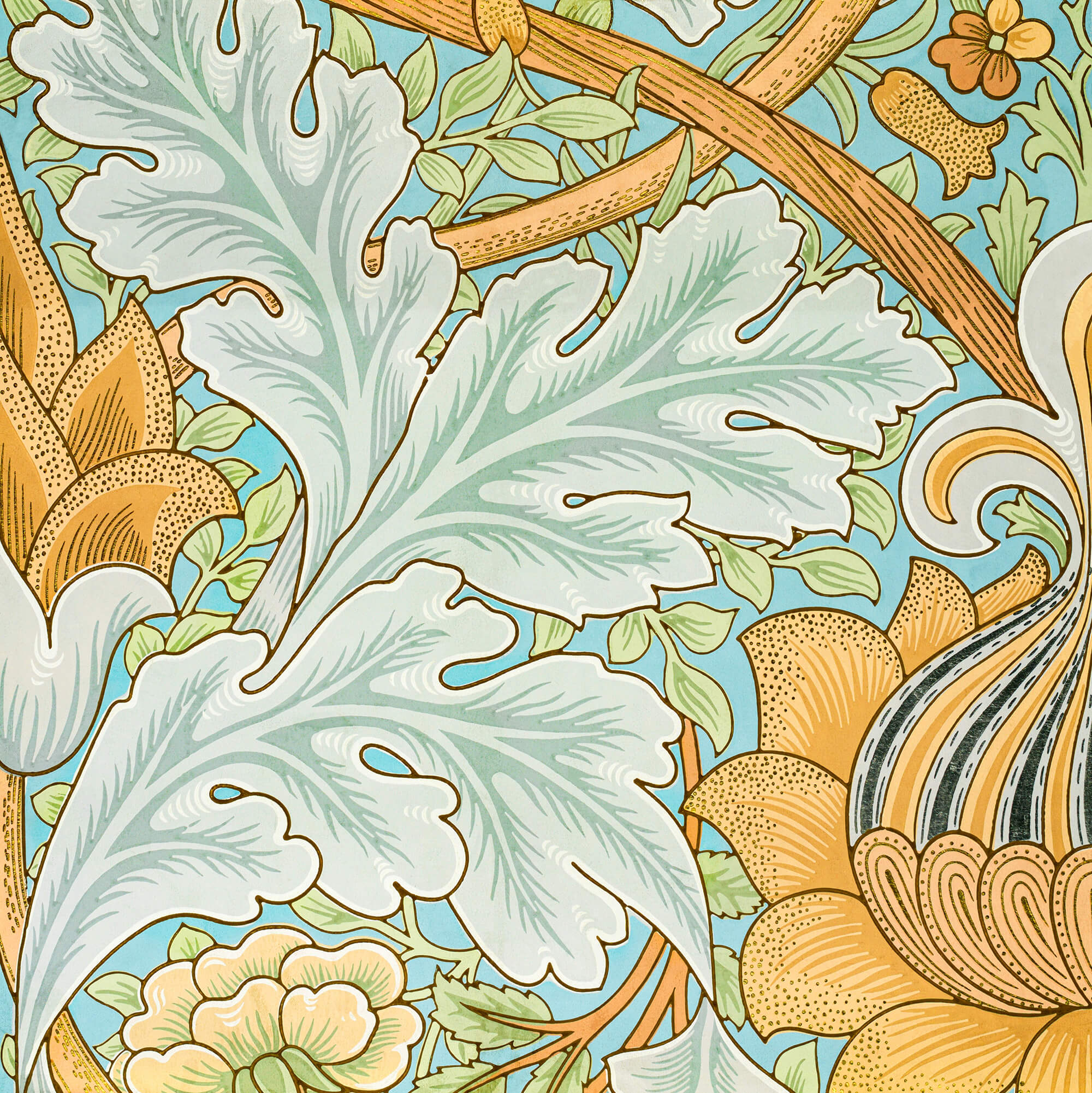
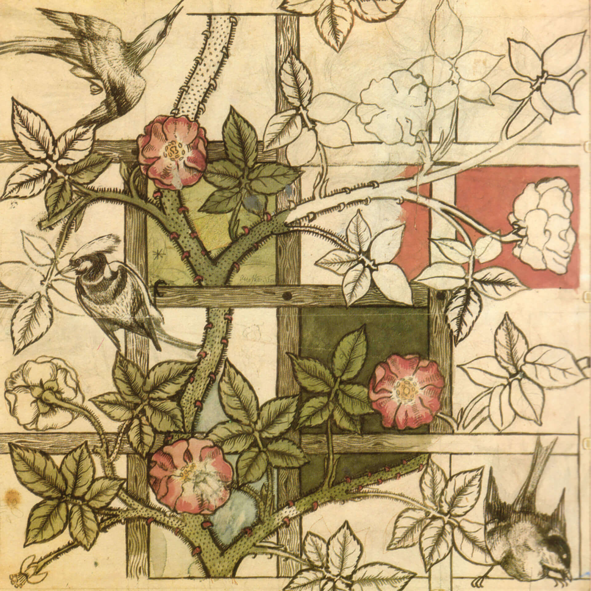
By the 1890s, graphic design was lost in a tangled, organic forest of twisting vines and dense Victorian clutter. Discover...
If you open your font menu today, you are looking at centuries of design history. Discover how the raw, heavy...
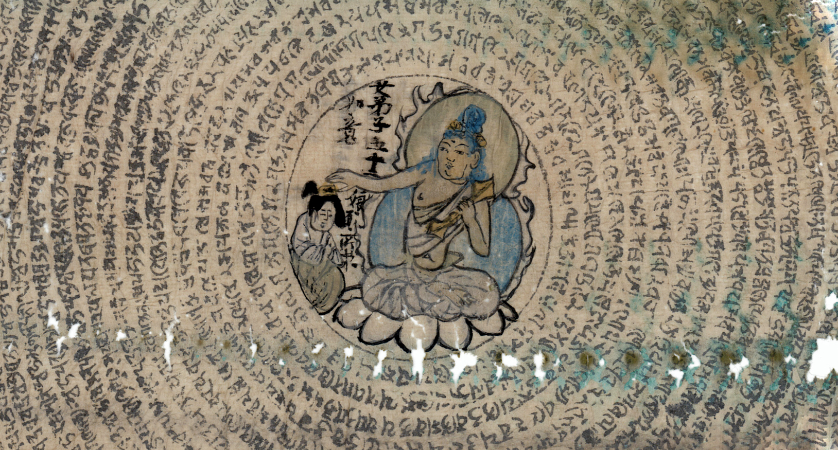
Long before Gutenberg developed the printing press, the foundations of the modern page were being masterfully engineered in the East....
In the tumultuous early 20th century, marked by a whirlwind of new inventions and a shift from agrarian to urban...
As the twentieth century unfolded, emerging artists sought inspiration beyond the intricate designs of the Victorian era, Art Nouveau, and...
The Art Nouveau movement, which flourished in the late 19th and early 20th centuries, was characterized by its ornamental and...
As the 19th century unfolded, the city of Paris became a hotbed of optimism and creativity, fueled by a confluence...
In the mid to late 19th century, the technological change was a big driving force, just like today. The new...
While these developments were happening, the deskilling of the craftsman and manufacturing of mass-produced items, expansion of factories and even...
Before industrialization, things were made in small numbers, carrying the emotions and fingerprints of its creator as a result of...
In 1400s AD, after several years of focused experiments, Johannes Gutenberg made the system scalable and led the way for...

The history of graphic design begins with the cave paintings. The prehistoric humans were marking their daily lives or the...

Starting from a simple stone ax, throughout the history we created a man-made environment, to survive and control the world...