Russian Constructivism: Weaponizing the Grid
Rejecting the elite concept of "art for art's sake," the Russian avant-garde transformed abstract geometry into a tool for mass...
Rejecting the elite concept of “art for art’s sake,” the Russian Constructivists weaponized the mathematical grid, turning geometric abstraction and photomontage into utilitarian tools to organize information and drive a mass political revolution.
In our previous post, we explored how the Dutch designers of the De Stijl movement used the mathematical grid to seek absolute purity and universal harmony. They believed that by restricting visual communication to strict horizontal lines and primary colors, they could cure the psychological trauma of World War I and engineer a peaceful, balanced society.
But geometric forms are not inherently neutral. Their meaning depends entirely on who wields them. While Piet Mondrian used these tools to seek spiritual peace, the Russian avant-garde took the exact same shapes and weaponized them.

Here is how visionary designers transformed the quiet grids of abstract art into loud, revolutionary agitprop that forever changed the course of visual communication.
To understand Russian Constructivism, you must first recognize the dramatic shift in how art and design were valued.
Geometry was no longer a philosophical meditation; it was a tool of action. The Russian avant-garde turned the perfectly balanced grids of abstract painting into piercing, aggressive visual weapons used to fuel a violent political uprising.
For these designers, an angle was not just an aesthetic choice—it was an expression of kinetic energy and societal tension. A thick black rule was not just a spatial divider; it was a structural beam holding the communication together. The transition of the grid from a philosophical cure into a political weapon marks one of the most drastic ideological pivots in graphic design history.
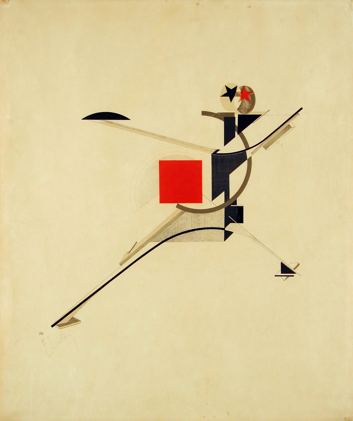
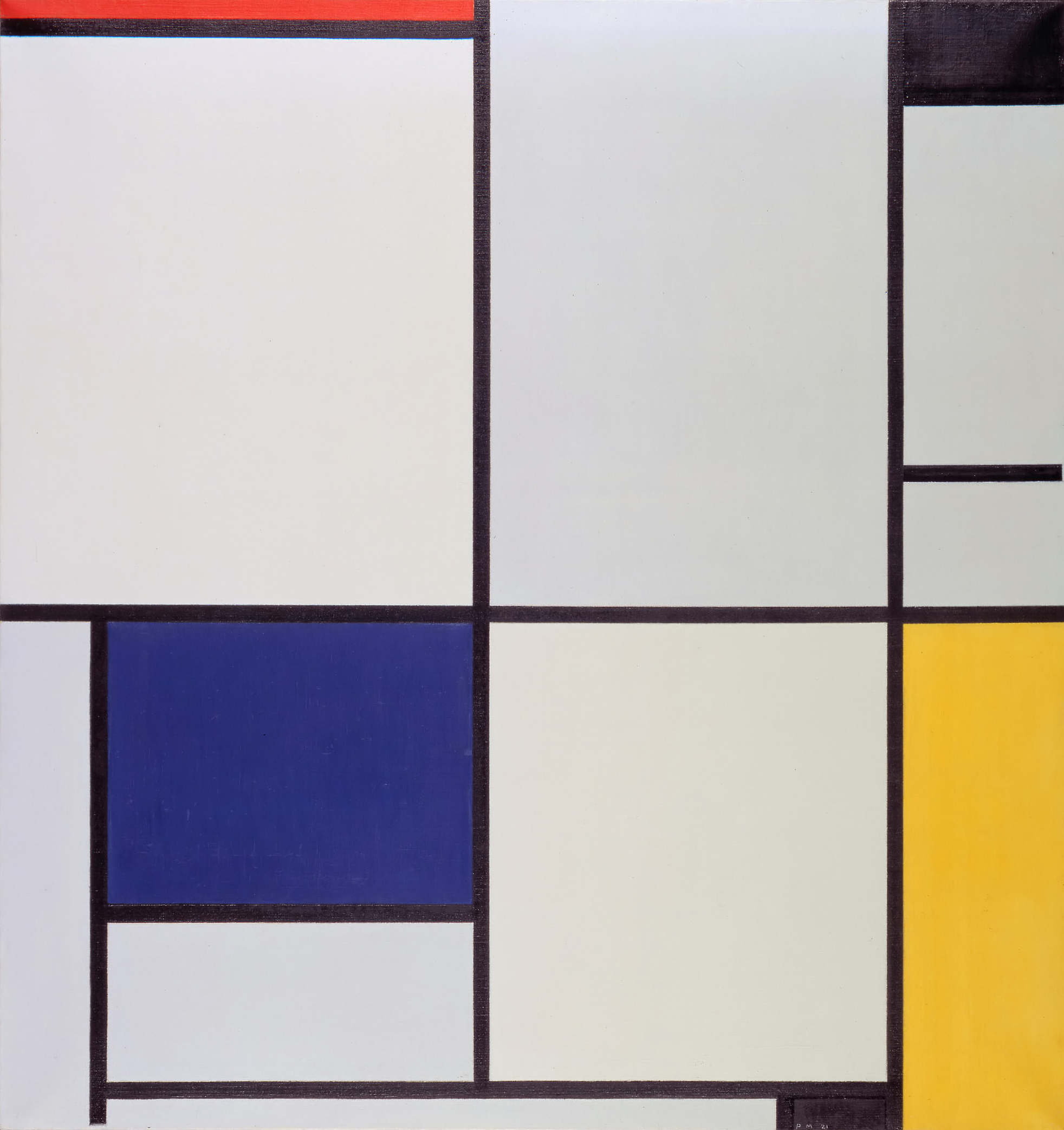
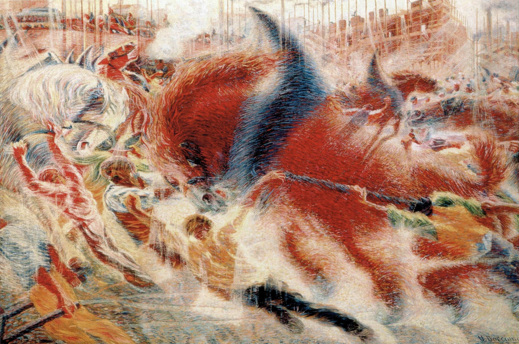
[Image: A stark visual contrast showing the serene silence of a Mondrian painting next to the aggressive, piercing geometry of El Lissitzky’s Beat the Whites with the Red Wedge.] The grid transformed from a philosophical cure into a political weapon.
In the wake of the 1917 revolution, the new regime required a radical new visual language to match its radical new politics.

The avant-garde completely rejected the traditional, elitist concept of “art for art’s sake”. They did not want to create beautiful paintings to hang in the private galleries of the wealthy. Instead, they boldly declared themselves constructors rather than artists.
If they were going to build a brand new communist society, design had to be strictly utilitarian. It had to serve a functional, social purpose. During the tumultuous years following the revolution, as factions fought for control, empty store windows were utilized to inform and exhort the populace.

The ROSTA (Russian Telegraph Agency) window-poster campaign became a primary tool for this communication. Vladimir Mayakovsky developed a satirical poster style featuring stock characters to maintain revolutionary fervor, proving that graphic design was no longer about quiet decoration—it was about functional engineering for the masses.
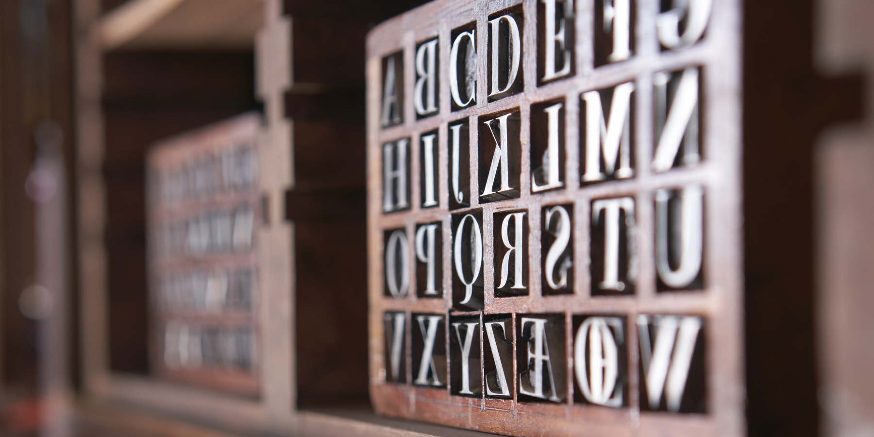
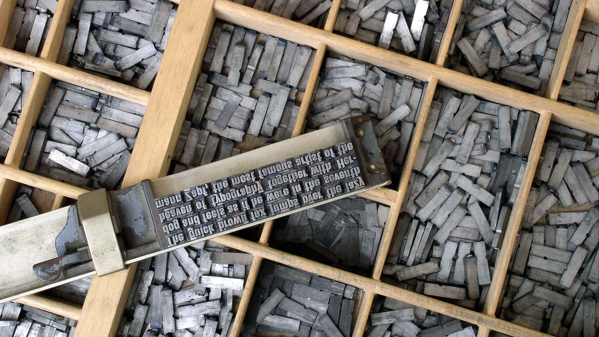
To execute this utilitarian vision, designers had to completely rethink typography. The designer who most successfully executed this utilitarian vision was El Lissitzky. He revolutionized layout by realizing that the printed page did not have to be a flat, static surface; it could be a dynamic, three-dimensional architectural space.

One of Lissitzky’s most groundbreaking achievements was his design for Vladimir Mayakovsky’s 1923 book of poems, For the Voice. Lissitzky treated the book like a building. He designed it exclusively with elements from the metal typecase, completely avoiding traditional illustration. To help the reader navigate the book functionally, he constructed a die-cut tab index along the right margin, allowing the audience to easily find specific poems.

Heavy sans-serifs, overlapping colors, and bold mathematical divisions of space dictated the reader’s physical experience of the text. He noted his intent was to interpret the poems as a violin accompanies a piano, treating the contrast between elements and the negative space of the page as paramount. Typography had officially become structural and kinetic.
Despite these typographic innovations, the constructors faced a massive challenge: how do you successfully communicate complex political ideas to a largely illiterate working-class population?

To reach the masses, designers like Alexander Rodchenko and Gustav Klutsis perfected the art of propaganda photomontage. While the Dadaists had previously used scissors and glue to create chaotic, nonsensical protests, the Constructivists used photomontage for highly structured, objective mass communication. They combined large, grainy photographic fragments with stark red and black geometric grids. Photography provided a visceral, unarguable “truth,” while the heavy geometry provided the necessary political structure and impact.

Gustav Klutsis mastered this technique in posters like Everyone Must Vote in the Election of Soviets (1930), creating an aggressive, unmistakable call to action utilizing a repetitive array of raised hands to signify mass unity. This kinetic, cut-and-paste montage energy quickly spilled over from political agitprop into culture and cinema. The Stenberg brothers adapted these photomontage techniques to create breathtaking film posters.

For films like Symphony of a Great City and Pounded Cutlet, they actually preferred to draw their images to achieve the sharpness and color they desired, adapting photography by using an early projection method to enlarge film frames. In doing so, they captured the dizzying speed of modern cinema—whether by drawing a machine-man hovering over a tilted skyscraper, or by purposely mimicking the flickering effect of film running out of synchronization to achieve an incredible sense of tension and movement on the printed page.
Constructivism was a brilliant, explosive era of design, but it was ultimately short-lived. The movement was eventually crushed by the very state that sponsored it, replaced by safe, traditional Social Realism.
However, the movement’s DNA escaped Russia. Its asymmetrical grids, its absolute dominance of sans-serif typography, and its fierce commitment to functional, utilitarian layouts permanently rewired graphic design. Much of the modern political poster and corporate advertising trace their visual force back to this specific era of Russian innovation.
These radical Russian theories, combined with the spiritual, mathematical geometry of the Dutch De Stijl movement, were about to collide in Germany. The stage was set for the most famous design school in history to synthesize these chaotic breakthroughs into a universal global doctrine: The Bauhaus.
Rejecting the elite concept of "art for art's sake," the Russian avant-garde transformed abstract geometry into a tool for mass...
Emerging from the psychological wreckage of World War I, the Dutch De Stijl movement sought to build a utopian society...
Traumatized by the senseless slaughter of World War I, a rebellious group of anti-war artists completely rejected the harmonious design...
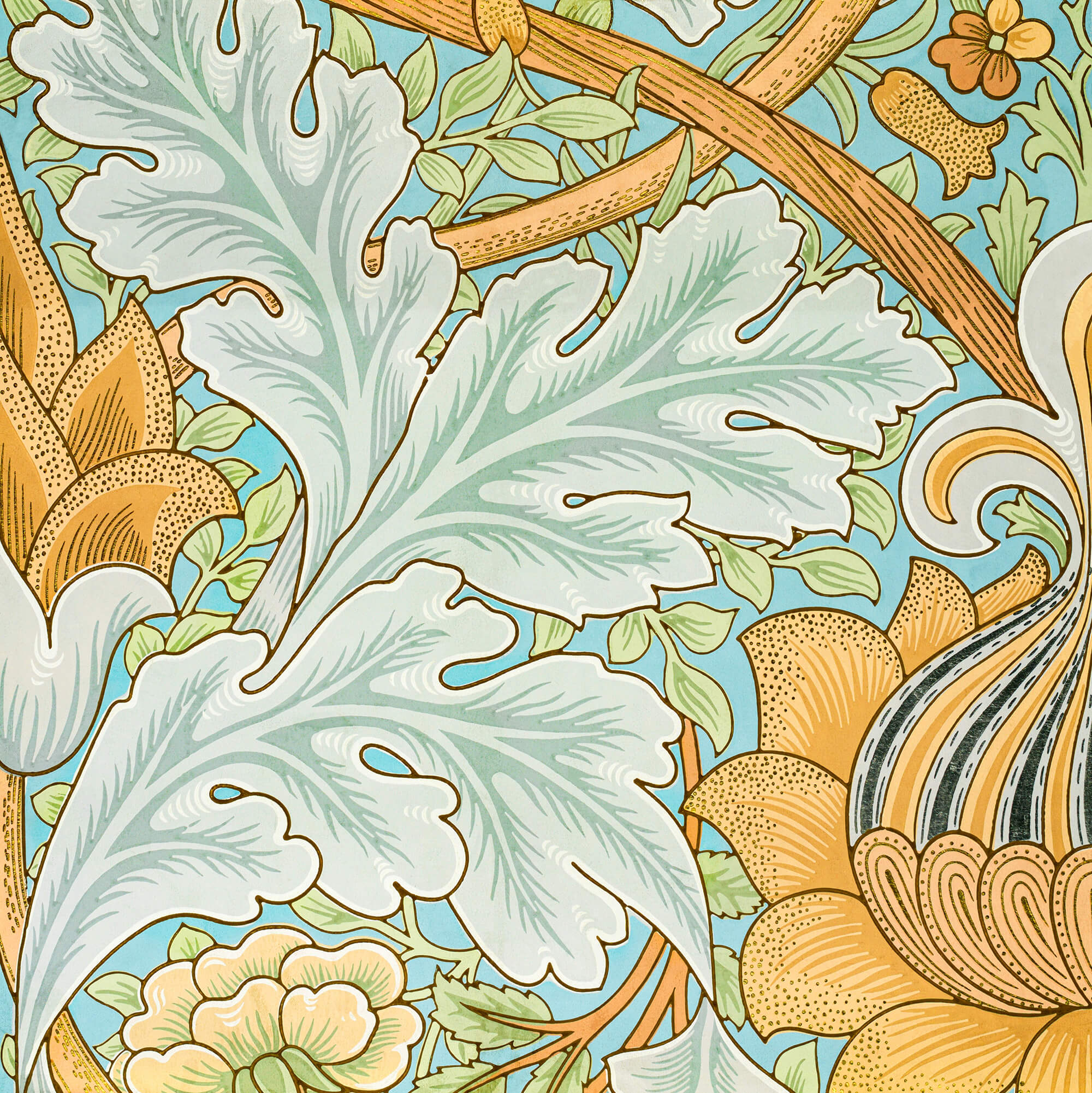
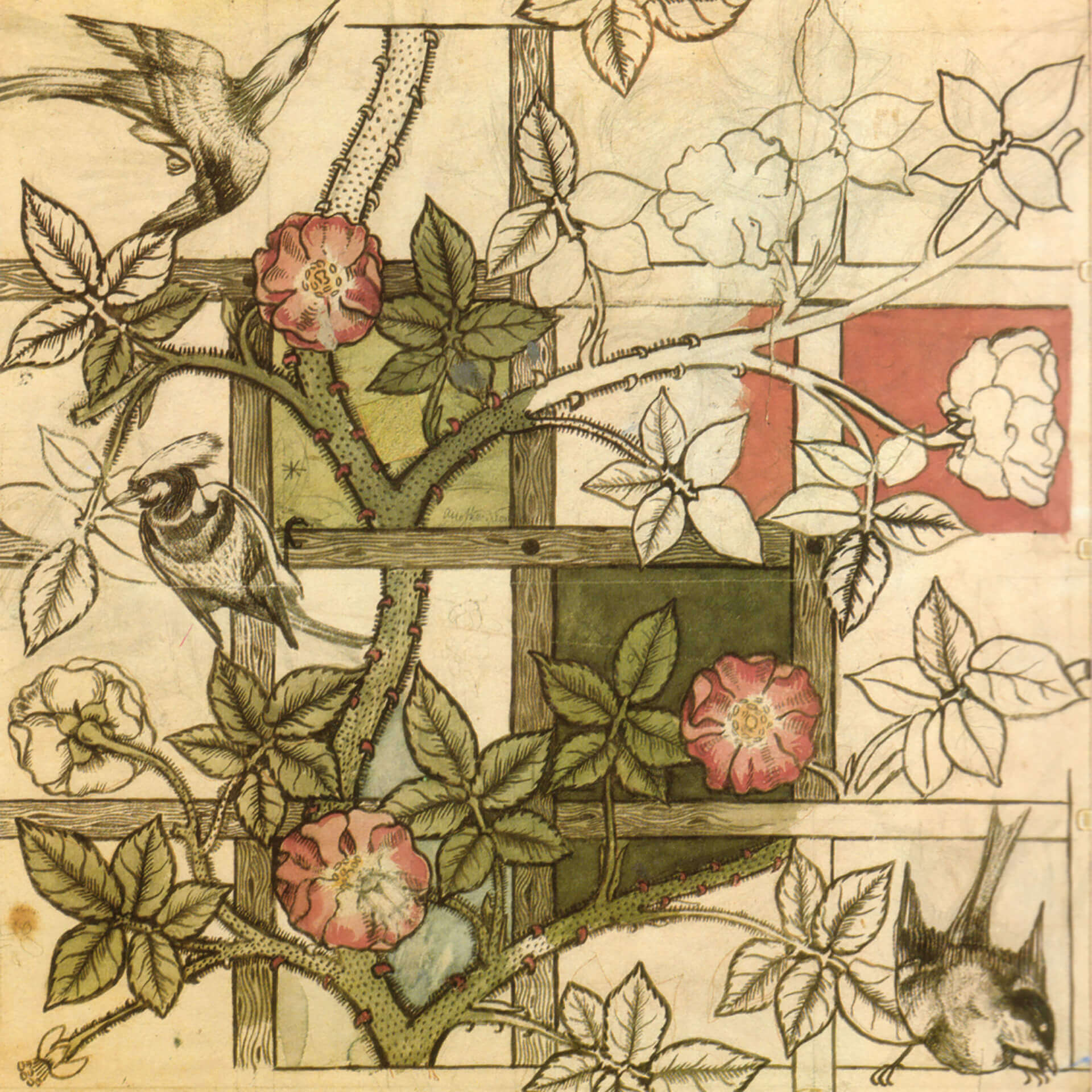
By the 1890s, graphic design was lost in a tangled, organic forest of twisting vines and dense Victorian clutter. Discover...
If you open your font menu today, you are looking at centuries of design history. Discover how the raw, heavy...

Long before Gutenberg developed the printing press, the foundations of the modern page were being masterfully engineered in the East....
In the tumultuous early 20th century, marked by a whirlwind of new inventions and a shift from agrarian to urban...
As the twentieth century unfolded, emerging artists sought inspiration beyond the intricate designs of the Victorian era, Art Nouveau, and...
The Art Nouveau movement, which flourished in the late 19th and early 20th centuries, was characterized by its ornamental and...
As the 19th century unfolded, the city of Paris became a hotbed of optimism and creativity, fueled by a confluence...
In the mid to late 19th century, the technological change was a big driving force, just like today. The new...
While these developments were happening, the deskilling of the craftsman and manufacturing of mass-produced items, expansion of factories and even...
Before industrialization, things were made in small numbers, carrying the emotions and fingerprints of its creator as a result of...
In 1400s AD, after several years of focused experiments, Johannes Gutenberg made the system scalable and led the way for...
The history of graphic design begins with the cave paintings. The prehistoric humans were marking their daily lives or the...

Starting from a simple stone ax, throughout the history we created a man-made environment, to survive and control the world...